Neutral Sans Workhorse

Bomera Experience + Noar
Lets Bomera Experience own the focal silhouette while handling secondary copy, sizing and subheads cleanly.
Inspect Noar specimenDisclosure: MakerFileHub may earn a commission from qualifying purchases via paid links on this page. How our links work.
Plain capitals interspersed with looped characters and crossing strokes
Bomera Experience shows two pale capital lines on orange, where selected characters turn yellow and bloom into loose looping structures with bulbous ends, while circular O and plain straight E forms sit beside curling shapes that cross themselves near the body line.
Paid link
Get this fontProject & layout blueprintsAt-a-glance maker compatibility
Sturdy stroke walls and open counters weed cleanly on adhesive vinyl, HTV apparel film, and cut cardstock.
Visual anatomy & craft review
The base caps stay geometric and even, the replacements stay fluid and rounded, the colour change separates the two systems and the loops cross over the baseline. That substitution is the character: the sample mixes a neutral sans with a drawn scribble inside the same word, which is why the orange field carries no other element. The cover names multilingual support and alternates, so check which characters have loop versions. Keep 44 pt so the loops stay distinct and do not use the face for a paragraph.
Plain capitals interspersed with looped characters and crossing strokes
Two-font hierarchy recipes
Tested contrast partners — pairing Bomera Experience with grounded secondary typography.
Bomera Experience + Noar
Lets Bomera Experience own the focal silhouette while handling secondary copy, sizing and subheads cleanly.
Inspect Noar specimen
Bomera Experience + Cronelo
Grounds bold display lettering with classic typographic authority on posters, badges and apparel.
Inspect Cronelo specimenPractical applications
Concrete hierarchy, scale and production guidance tailored to Bomera Experience’s stroke geometry.
The mixed system gives a studio a mark that reads playful without an illustration, and the loop letters carry the personality in one word.
Hierarchy & layout recipe
Print an 85 by 55 mm card: set the wordmark at 24 pt on one row, keep 14 mm of clear ground beneath before the address at 7 pt, and keep 10 mm of margin so the loops are not trimmed.
Pre-production check
Loop alternates may need manual selection; check the file and your app before the artwork starts.
The two systems let a cover line stay legible while one word breaks into drawing, which is a cheap way to look commissioned.
Hierarchy & layout recipe
Print a 210 by 280 mm cover: set the cover line at 60 pt across one row, keep 24 mm of clear ground beneath before the cover lines at 9 pt, and keep 20 mm of margin at each side.
Pre-production check
Loops closing on the following letter need tracking; check the proof and open the spacing by 20 units.
The bright field and the loop letters suit a design festival poster where the lettering itself has to carry the whole identity.
Hierarchy & layout recipe
Print an A2 poster: set the festival name at 100 pt across two rows, keep 30 mm between baselines so the loops do not touch, keep 28 mm of clear ground beneath before the date at 20 pt, and keep 24 mm of border.
Pre-production check
The yellow replacements can drop out on low-contrast printers; check the colour proof first.
Technical & licence verification
Confirm included OTF/TTF/WOFF formats, full glyph tables and licence coverage on the live store page before batch production.
Closest visual alternatives
Matched across letterform anatomy, stroke behaviour and craft applications.
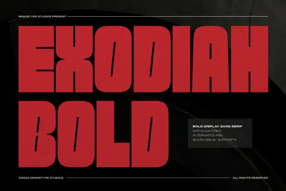
Very heavy block capitals with slanted slit counters and broad flat arm ends
Exodiah stacks dark red capitals on black, where huge squared bodies leave only fine slanted slits inside O, D and B, the X narrows sharply at its middle, flat-ended E arms and a wide L foot reinforce the block silhouette, and the curved letters keep rounded outer corners.
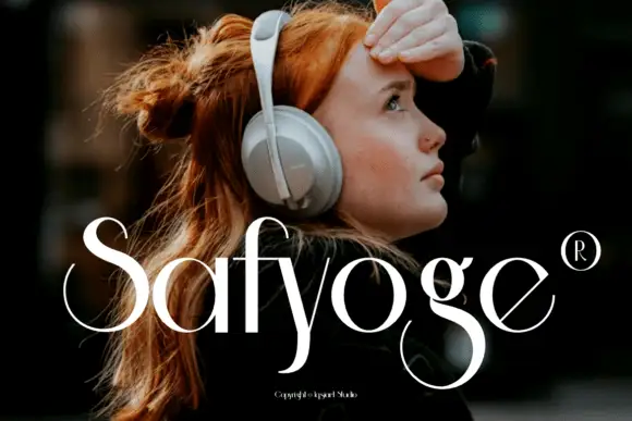
Fine contrast display with sweeping S
Safyoge is a fine contrast display in white over a street portrait: mixed case with a sweeping S, a long y descender that curls below the baseline and a broad lower g loop, with a registered mark at the right and a small credit at the foot.
Ideas for this font
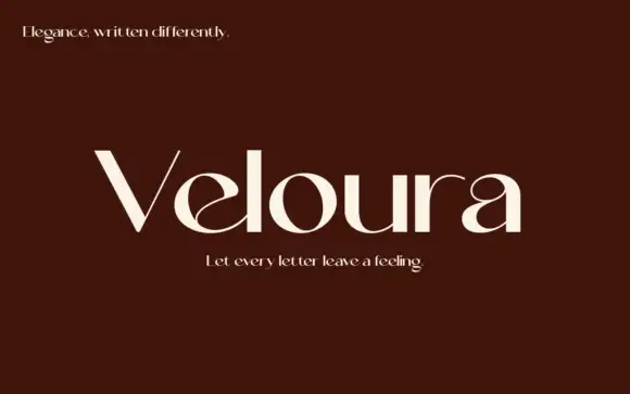
High-contrast display with curled interiors
Veloura is a high-contrast display in cream on deep maroon: mixed case with a curled e interior, a looping a upper bowl, fine joins and wide oval bowls, set as one large word between two small italic lines, one above and one below.
Ideas for this font
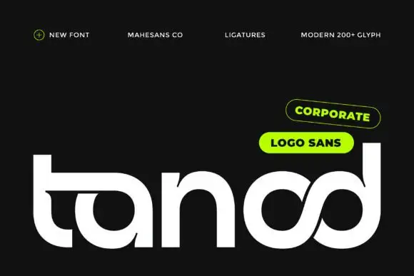
Heavy rounded logo display
Tanod is a heavy rounded lowercase display in white on near-black: wide strokes with squared outer corners, circular bowls, an extended t arm and a final pair of letters drawn as an interwoven knot, with two pill labels at the upper right naming the style and the glyph count.
Ideas for this font
Same independent foundry
Allow optional Google Analytics to measure visits and catalogue actions. Your search words and notes are not included. Privacy & storage