Editorial Serif Anchor

Dear Agatha + Cervelique
Anchors Dear Agatha's fluid strokes with crisp Roman proportions on wedding suites, headers and packaging.
Inspect Cervelique specimenDisclosure: MakerFileHub may earn a commission from qualifying purchases via paid links on this page. How our links work.
Tall rounded display capitals
Dear Agatha shows tall unjoined capitals with narrow oval bowls and softly rounded terminals, where the A, R and H stretch into long vertical proportions and the purple shadow sits behind the letters as part of the cover.
Paid link
Get this fontProject & layout blueprintsAt-a-glance maker compatibility
Weld or Unite overlapping script joins into one continuous vector path before sending to the blade.
Visual anatomy & craft review
The capitals stay separate rather than joining, the bowls compress into ovals, the terminals round off gently and the shadow repeats the whole word rather than one letter. The tall narrow cap is the character: the word reads as a personal inscription rather than a typeset headline, which is why the sample keeps a short name alone. Because the strokes are light, keep 26 pt as the floor and treat the offset shadow as layout art rather than a property of the file.
Narrow caps · Unjoined · Soft terminals
Two-font hierarchy recipes
Tested contrast partners — pairing Dear Agatha with grounded secondary typography.
Dear Agatha + Cervelique
Anchors Dear Agatha's fluid strokes with crisp Roman proportions on wedding suites, headers and packaging.
Inspect Cervelique specimen
Dear Agatha + Sailors
Keeps small-scale dates, URLs, nutrition facts and care instructions crisp and legible below script titles.
Inspect Sailors specimenPractical applications
Concrete hierarchy, scale and production guidance tailored to Dear Agatha’s stroke geometry.
The tall unjoined caps give a note an inscription feel, and the narrow bowls stay clear at 26 pt on an A6 card, so a first name carries the page on its own.
Hierarchy & layout recipe
Print an A6 card: set the name at 26 pt across the upper third, keep 16 mm of clear ground beneath before the message line at 11 pt, and leave the lower half blank for handwriting.
Pre-production check
A light cap printed at 18 pt thins out on textured card; check the proof and hold the name at 24 pt or above.
The narrow caps suit a modest ceremony sign, and the soft terminals keep a pair of names gentle at 40 pt on a printed card.
Hierarchy & layout recipe
Print a 148 by 105 mm sign: set the two names at 40 pt on one row with 12 mm between them, keep 18 mm of clear ground beneath for the date at 10 pt, and centre the block on the sheet.
Pre-production check
Two tall names set without an ampersand leave an odd gap; check the card and place a small mark between them.
The inscribed caps suit a florist's box, and the narrow proportions fit a short name at 24 pt on a 60 mm panel, where the tall letters need a small footprint.
Hierarchy & layout recipe
Print a 60 by 35 mm label: set the shop name at 24 pt, keep 6 mm of clear ground beneath for the town at 6 pt, and keep 5 mm of border so the rounded terminals stay whole.
Pre-production check
A tall narrow cap on a wide label looks lost; check the artwork and keep the name on a narrow panel.
Technical & licence verification
Confirm included OTF/TTF/WOFF formats, full glyph tables and licence coverage on the live store page before batch production.
Closest visual alternatives
Matched across letterform anatomy, stroke behaviour and craft applications.
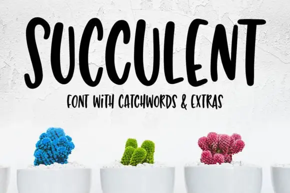
Tall bouncy uppercase handwriting
Succulent is a tall bouncy uppercase handwriting in black on white: narrow letters with uneven heights, a strong bounce across the line and a small companion line in the same face beneath.
Ideas for this font
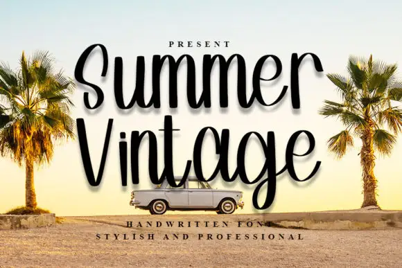
Tall narrow handwriting with high loops and a soft shadowed print finish
Summer Vintage is tall narrow handwriting in which the loops climb high above the smaller letters, the strokes stay even and the word is set with a soft shadow so it reads as a printed sticker rather than as flat lettering.
Ideas for this font
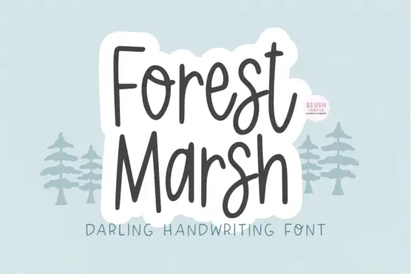
Loose upright handwriting with tall narrow frames and uneven baselines
Forest Marsh is loose upright handwriting in which the frames stay tall and narrow, the baselines drift a little and the strokes keep an even medium weight throughout.
Ideas for this font
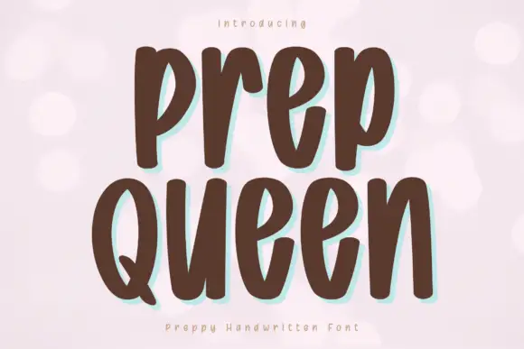
Tall heavy separate letters
Prep Queen is a tall heavy hand-drawn print in chocolate brown on pale pink: narrow letters with blunt ends, a light bounce, and a mint shadow behind each stroke.
Ideas for this font
Same independent foundry
Allow optional Google Analytics to measure visits and catalogue actions. Your search words and notes are not included. Privacy & storage