Editorial Serif Anchor

Cute Girls + Wolles Elegant Modern Serif
Anchors Cute Girls's fluid strokes with crisp Roman proportions on wedding suites, headers and packaging.
Inspect Wolles Elegant Modern Serif specimenDisclosure: MakerFileHub may earn a commission from qualifying purchases via paid links on this page. How our links work.
Heavy cursive with a long t crossbar
Cute Girls has thick slanted strokes with a deep g loop and tall l ascenders, where the t crossbar extends across neighbouring letters and the r keeps a compact angular shoulder.
Paid link
Get this fontProject & layout blueprintsAt-a-glance maker compatibility
Weld or Unite overlapping script joins into one continuous vector path before sending to the blade.
Visual anatomy & craft review
The strokes stay heavy and slanted, the ascenders rise tall, the descender loops deep and one crossbar reaches sideways over the letters beside it. That long crossbar is the character: the word looks quickly signed rather than carefully spaced, which is why the sample sets a short phrase. Because the crossbar and the loop occupy the neighbouring letters, keep 20 mm beneath from 28 pt, check the actual joins in your own wording and avoid setting a second script line underneath.
Heavy cursive · Deep loop · Long crossbar
Two-font hierarchy recipes
Tested contrast partners — pairing Cute Girls with grounded secondary typography.
Cute Girls + Wolles Elegant Modern Serif
Anchors Cute Girls's fluid strokes with crisp Roman proportions on wedding suites, headers and packaging.
Inspect Wolles Elegant Modern Serif specimen
Cute Girls + Lemon Milk Pro FTR
Keeps small-scale dates, URLs, nutrition facts and care instructions crisp and legible below script titles.
Inspect Lemon Milk Pro FTR specimenPractical applications
Concrete hierarchy, scale and production guidance tailored to Cute Girls’s stroke geometry.
The heavy cursive sets a party card, and the deep loop holds a short greeting at 30 pt on an A6 sheet, where the long crossbar ties the words.
Hierarchy & layout recipe
Print an A6 card: set the greeting at 30 pt on one row, keep 18 mm of clear ground beneath for the g loop, and set the details at 11 pt in a rounded sans at the foot.
Pre-production check
A long crossbar printed into the line above collides with it; check the card and keep 18 mm between rows.
The heavy script suits a small studio label, and the slanted word holds a two-word name at 22 pt on a 55 mm panel, clear at arm's length.
Hierarchy & layout recipe
Print a 55 by 40 mm label: set the studio name at 22 pt, keep 10 mm of clear ground beneath for the descender, and set the booking line at 6 pt in a plain sans.
Pre-production check
The crossbar cut by the border looks accidental; check the artwork and keep 6 mm of clear space at each end.
The cursive energy suits a class sign, and the tall ascenders hold a short name at 46 pt on a printed board, readable from the corridor.
Hierarchy & layout recipe
Print a 500 by 250 mm board: set the class name at 46 pt on one row, keep 22 mm of clear ground beneath for the loop, and set the times at 14 pt in a plain caps beneath.
Pre-production check
A heavy script at 26 pt seen across a hall turns into a smear; check the board and hold 40 pt or above.
Technical & licence verification
Confirm included OTF/TTF/WOFF formats, full glyph tables and licence coverage on the live store page before batch production.
Closest visual alternatives
Matched across letterform anatomy, stroke behaviour and craft applications.
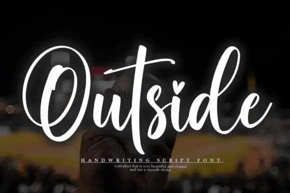
Tall script with an oversized O loop
Outside is a tall script in white over a dark photograph: a very large open capital O drawn as a single loop, a narrow connected body and a heart set into the counter of the i.
Ideas for this font
Rounded tall-stem script
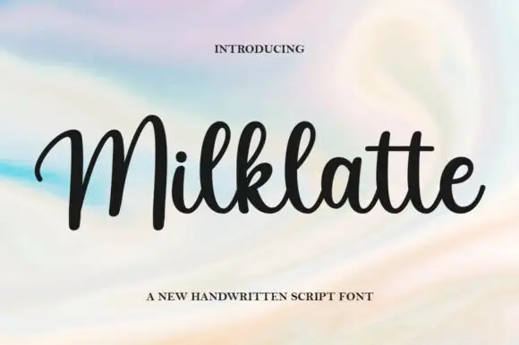
Milklatte is a rounded handwritten script in black on a pastel wash: high round bowls, very tall looped ascenders on the M, the l and the k, and a light slant that keeps a long word steady.
Ideas for this font
Tall high-contrast script with an oversized B
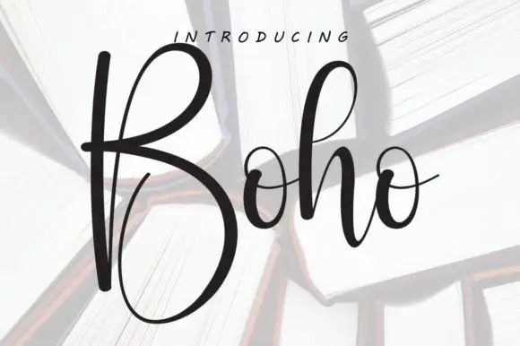
Boho opens with an oversized narrow B that drops a deep lower bowl, the h lifts a tall loop and the two small o forms join through fine crossing connectors, so a single short name reads as a tall written line.
Ideas for this font
Heavy upright script with a heart dot
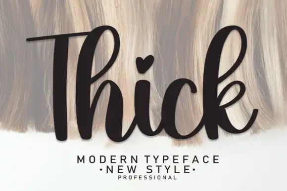
Thick is a heavy upright script in black over a pale textured ground: very fat even strokes, a tall narrow capital T drawn with a long bar, a heart in place of the dot on the i and a heavy leg on the k.
Same independent foundry
Allow optional Google Analytics to measure visits and catalogue actions. Your search words and notes are not included. Privacy & storage