Editorial Serif Anchor

Angela + The Bilstein Editorial
Anchors Angela's fluid strokes with crisp Roman proportions on wedding suites, headers and packaging.
Inspect The Bilstein Editorial specimenDisclosure: MakerFileHub may earn a commission from qualifying purchases via paid links on this page. How our links work.
High-contrast handwritten script
Angela has a sweeping capital A, thin connecting strokes and a long looped g below the baseline, where the narrow l rises well above the rounded lowercase and the left curl of the A reaches into the margin.
Paid link
Get this fontProject & layout blueprintsAt-a-glance maker compatibility
Weld or Unite overlapping script joins into one continuous vector path before sending to the blade.
Visual anatomy & craft review
The capitals sweep wide, the joins thin out, the lowercase stays round and one descender loops low. That reach into the margin is the character: the opening letter claims space before the word begins, which is why the sample leaves white around it. Plan 24 mm at the left edge, keep 28 pt for the hairline joins and check the g loop against anything set beneath it, especially a date line or a caption placed close under the word. The thin joins are the weak point: they break at about 28 pt and they snap in foil, so keep the script on a card or a decal rather than on a curved surface.
Tall ascenders and a long descending g
Two-font hierarchy recipes
Tested contrast partners — pairing Angela with grounded secondary typography.
Angela + The Bilstein Editorial
Anchors Angela's fluid strokes with crisp Roman proportions on wedding suites, headers and packaging.
Inspect The Bilstein Editorial specimen
Angela + Cenura
Keeps small-scale dates, URLs, nutrition facts and care instructions crisp and legible below script titles.
Inspect Cenura specimenPractical applications
Concrete hierarchy, scale and production guidance tailored to Angela’s stroke geometry.
The sweeping script suits an invitation, and the fine joins hold a pair of names at 30 pt on heavy card, where the looped g sits clear of the date.
Hierarchy & layout recipe
Print a 130 by 180 mm invitation: set the names at 30 pt on one row, keep 24 mm of clear ground beneath for the g loop, and keep 24 mm of margin at the left so the A curl is not cut.
Pre-production check
The A curl may need a specific alternate; check the map before the layout is finalised with the printer.
The handwritten tone gives a shop a personal mark, and the fine strokes hold a two-word name at 20 pt on a 55 by 45 mm label, where the tall l keeps the row airy.
Hierarchy & layout recipe
Print a 55 by 45 mm label: set the name at 20 pt on one row, keep 10 mm of clear ground beneath for the loop, and keep 5 mm of border so the curl stays inside the panel.
Pre-production check
Hairline joins at 14 pt break on textured stock; check the plate proof and hold the name at 18 pt.
The script keeps a note tender, and the rounded lowercase holds a short line at 28 pt on an A6 sheet, where the sweeping A opens the message.
Hierarchy & layout recipe
Print an A6 card: set the line at 28 pt across the upper half, keep 20 mm of clear ground beneath for the descender, and leave the lower third blank for a handwritten signature.
Pre-production check
Two script rows on one card tangle; check the card and keep the second line in a plain hand.
Technical & licence verification
Confirm included OTF/TTF/WOFF formats, full glyph tables and licence coverage on the live store page before batch production.
Closest visual alternatives
Matched across letterform anatomy, stroke behaviour and craft applications.
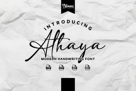
Handwritten script with a crossing baseline stroke
Athaya is a loose handwritten script whose capital sweeps a long flat horizontal stroke across the whole word, crossing beneath the lowercase to finish in a small curl.

Fine extended signature script
Lovely sets a fine signature script in a single dark weight over a pale city photograph, where a wide entry curve opens low at the left, the letters rise into tall slender loops through the middle and a large descending y plus an extended closing sweep make the lower right part of the footprint.
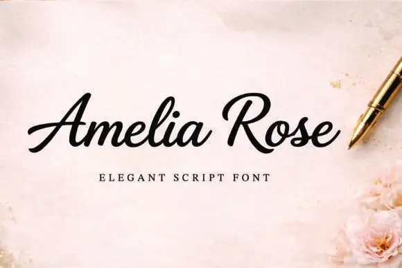
Slanted weighty script with a sweeping capital R and connected joins
Amelia Rose is a slanted script in which the strokes stay weighty through the joins, the capital R sweeps wide and the letters lean together, so a name reads as a confident handwritten signature.
Ideas for this font
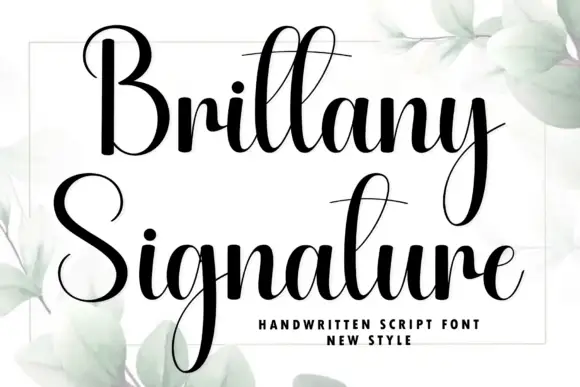
Heavy high-contrast script with very long descenders and narrow loops
Brittany Signature is a heavy high-contrast script in which the ascenders and descenders run far beyond the letter body, the loops stay narrow and the joins thin to hairline between thick stems.
Ideas for this font
Same independent foundry
Allow optional Google Analytics to measure visits and catalogue actions. Your search words and notes are not included. Privacy & storage