Editorial Serif Anchor

Forest Marsh + Medvilea Editorial
Anchors Forest Marsh's fluid strokes with crisp Roman proportions on wedding suites, headers and packaging.
Inspect Medvilea Editorial specimenDisclosure: MakerFileHub may earn a commission from qualifying purchases via paid links on this page. How our links work.
Loose upright handwriting with tall narrow frames and uneven baselines
Forest Marsh is loose upright handwriting in which the frames stay tall and narrow, the baselines drift a little and the strokes keep an even medium weight throughout.
Paid link
Get this fontProject & layout blueprintsAt-a-glance maker compatibility
Weld or Unite overlapping script joins into one continuous vector path before sending to the blade.
Visual anatomy & craft review
The capital F is drawn as a tall narrow frame with a short middle arm, and the lowercase that follows keeps the same proportion: the o closes an oblong counter, the r holds a short arm, the e loops back high and the s reverses through two tight curves. The t crosses with a single bar set high, which is what gives the face its hand-drawn rhythm, and the letters on the second word repeat the pattern with a wide M and a closing h. Nothing is connected and the slant is close to upright, so the face reads as something written quickly with a fine marker. Because the frames are narrow, a long word holds a single line at 30 pt. The white panel, the pale trees, the masked brush shape and the small caption are presentation; the handwriting is the two words.
Loose · Narrow · Upright
Two-font hierarchy recipes
Tested contrast partners — pairing Forest Marsh with grounded secondary typography.
Forest Marsh + Medvilea Editorial
Anchors Forest Marsh's fluid strokes with crisp Roman proportions on wedding suites, headers and packaging.
Inspect Medvilea Editorial specimen
Forest Marsh + Prime Nordic
Keeps small-scale dates, URLs, nutrition facts and care instructions crisp and legible below script titles.
Inspect Prime Nordic specimenPractical applications
Concrete hierarchy, scale and production guidance tailored to Forest Marsh’s stroke geometry.
The loose narrow hand gives a journal page a written voice, and the tall frames keep a long header inside a single column at 22 pt.
Hierarchy & layout recipe
Print an A5 journal page: set the header at 22 pt across a 95 mm measure, set the body in a 9.5 pt serif at 13 pt leading, and hold 10 mm below the header before the first paragraph.
Pre-production check
A drifting baseline printed larger than intended looks like an error; check the page at final size and keep the header under 24 pt.
The narrow upright lettering chalk-writes cleanly in a narrow line, and the even weight stays visible at 5 cm on a dark board.
Hierarchy & layout recipe
Chalk a 500 by 700 mm board: set the welcome at 5 cm, set the names at 7 cm beneath it, and leave 6 cm of margin on each side so the tall frames stay clear of the frame edge.
Pre-production check
Chalk thickens every stroke and closes the narrow counters; check the board from two metres and open the o and e before writing the final version.
The upright hand reads at 10 pt on a small label and looks written rather than manufactured, which is the point of a home-made gift.
Hierarchy & layout recipe
Print on a 45 by 60 mm label: set the contents at 10 pt, set the date in a 5 pt sans along the bottom, and leave 4 mm of margin so the tall ascenders are not cut.
Pre-production check
A narrow upright hand on a curved jar can look squeezed at the edges; check one labelled jar and keep the text block within 60 percent of the label width.
Technical & licence verification
Confirm included OTF/TTF/WOFF formats, full glyph tables and licence coverage on the live store page before batch production.
Closest visual alternatives
Matched across letterform anatomy, stroke behaviour and craft applications.
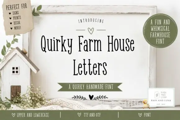
Tall narrow irregular serif letters
Quirky Farm House Letters is a tall narrow hand-drawn face with small irregular serifs, set on a painted signboard with a tiny house, sprigs and a heart, in a farmhouse palette of olive and cream.
Ideas for this font
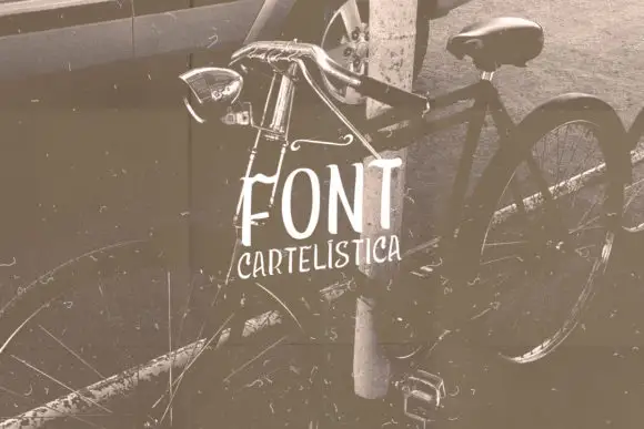
Narrow uneven vintage print
Cartelística puts narrow, unevenly weighted block capitals over a sepia bicycle photograph, with the second word set smaller and tucked beneath.
Ideas for this font
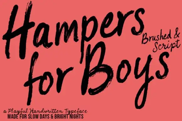
Loose brushed handwriting with slanted bodies and dry swept ends
Hampers for Boys is loose brushed handwriting in which the letters lean forward, the strokes sweep through each letter and the ends lift dry off the page.
Ideas for this font
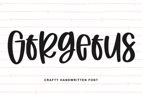
Heavy narrow handwriting with tight counters
Gorgeous is a heavy narrow handwriting that keeps a tall x-height and nearly closed counters, so a single word reads as a dense band with a lively, uneven baseline running under it.
Ideas for this font
Same independent foundry
Allow optional Google Analytics to measure visits and catalogue actions. Your search words and notes are not included. Privacy & storage