Modern Grotesque Body

Western Rodeo + Olline
Creates crisp high-hierarchy contrast beneath Western Rodeo headlines across menus, websites and labels.
Inspect Olline specimenDisclosure: MakerFileHub may earn a commission from qualifying purchases via paid links on this page. How our links work.
Distressed western slab in a ruled frame
Western Rodeo is a distressed western slab in navy on tan: heavy condensed capitals with flat serifs and worn edges, printed inside a double rule frame, with the first line in a lighter weight than the second.
Paid link
Get this fontProject & layout blueprintsAt-a-glance maker compatibility
Open counter bridges hold interior islands intact on laser-cut wood, acrylic, and mylar stencils.
Visual anatomy & craft review
Two words are stacked inside a rectangular frame and the face is a western slab with wear: the letters are heavy and condensed, the serifs are flat and squared, the A comes to a flat apex, the R has a straight leg and the D closes into a squared shoulder. The first line is drawn slightly lighter and cleaner, the second heavier and more eaten away, which is what gives the block its two-level look, and the wear is spread evenly across the strokes rather than collected in patches, so the word still reads at a few metres. A double rule frame sits outside the block with a small gap between the rules, and the ground is a flat tan with no other element. The palette is navy on tan, which is the classic fairground pairing. Western Rodeo is a display face for posters, tickets, packaging and apparel with a rodeo or fairground theme, and it needs capitals at a large size and a warm ground.
Distressed, framed, fairground
Two-font hierarchy recipes
Tested contrast partners — pairing Western Rodeo with grounded secondary typography.
Western Rodeo + Olline
Creates crisp high-hierarchy contrast beneath Western Rodeo headlines across menus, websites and labels.
Inspect Olline specimen
Western Rodeo + Coastal Honey
Adds a warm human signature touch for 1-to-3-word callouts without competing against structured serif capitals.
Inspect Coastal Honey specimenPractical applications
Concrete hierarchy, scale and production guidance tailored to Western Rodeo’s stroke geometry.
A distressed slab on tan reads as a printed ticket rather than a receipt, and the ruled frame holds a small format together without artwork.
Hierarchy & layout recipe
Print a 90 by 50 mm ticket: set the event at 16 pt over one line, keep 5 mm of clear ground beneath before the date at 7 pt, and hold 6 mm of border on all four sides.
Pre-production check
Fine wear at sixteen points can read as a printing fault; keep the distressed line for the largest word and use a clean face for details.
A fairground pair of colours is visible from a distance, and the heavy condensed capitals carry across a field where a wide face would blur.
Hierarchy & layout recipe
Print a 1000 by 400 mm banner: set the name at 170 pt over two lines, keep 35 mm of clear ground beneath before the dates at 32 pt, and hold 28 mm of border on all four sides.
Pre-production check
Distress on banner vinyl can look like a dirty print; view one section at final size before approving the run.
A worn slab gives a small bottle a fairground identity, and the condensed forms keep a long brand inside a narrow label.
Hierarchy & layout recipe
Print a 55 by 85 mm label: set the brand at 17 pt on one line, keep 6 mm of clear ground beneath before the flavour at 5.5 pt, and hold 4 mm of margin on all four sides.
Pre-production check
A heavy condensed face on a curved label can distort at the edges; print one on the real bottle and check the ends.
Technical & licence verification
Confirm included OTF/TTF/WOFF formats, full glyph tables and licence coverage on the live store page before batch production.
Closest visual alternatives
Matched across letterform anatomy, stroke behaviour and craft applications.
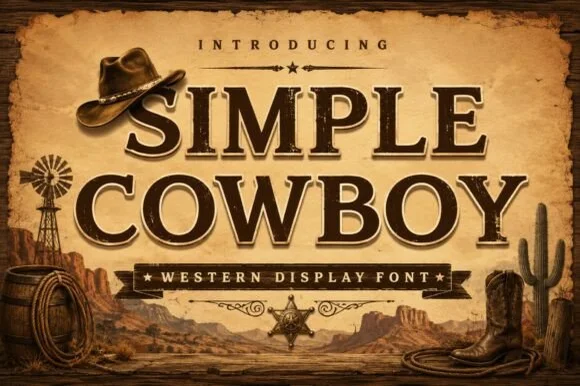
Inline-chiseled Western frontier slab serif
Simple Cowboy is a wide, authoritative Western slab serif featuring crisp bracketed block feet and fine interior inline bevel lines.
Ideas for this font
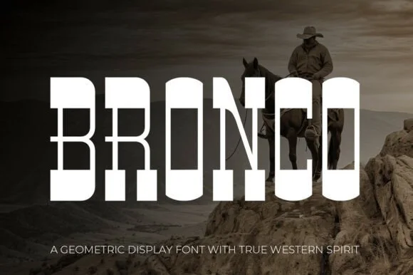
Tall architectural geometric spur-slab Western display
Bronco is a tall, clean-lined geometric Western slab serif pairing crisp rectangular counters with razor-sharp horizontal waist spurs.
Ideas for this font
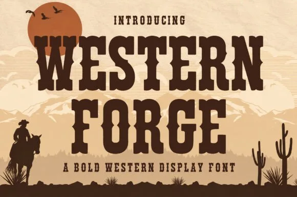
Tuscan western slab display
Western Forge is a tuscan western slab in dark brown on tan: bifurcated serifs, spurred stems, a notched crossbar on the F, and heavy bracketed slabs, set against a desert scene with a low sun, mountains and a rider, so the pair reads as a wood-type poster.
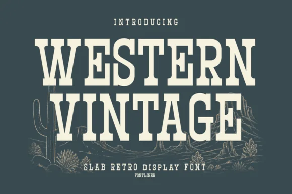
Tall condensed Western saloon slab serif
Western Vintage is a bold, condensed slab serif with crisp bracketed block feet and tall frontier poster proportions.
Ideas for this font
Same independent foundry
Allow optional Google Analytics to measure visits and catalogue actions. Your search words and notes are not included. Privacy & storage