Neutral Sans Workhorse

Circus + Modern Limited
Lets Circus own the focal silhouette while handling secondary copy, sizing and subheads cleanly.
Inspect Modern Limited specimenDisclosure: MakerFileHub may earn a commission from qualifying purchases via paid links on this page. How our links work.
Tall concave-sided display capitals with flared tips and worn letterpress-like texture
Circus revives a wood-type display face whose letters pinch in at the waist, flare into heavy bracket serifs at the top and bottom, and carry a worn ink texture that looks rolled rather than rendered.
Paid link
Get this fontProject & layout blueprintsAt-a-glance maker compatibility
Fine grain and micro-texture excel in 300 DPI print, sublimation, and screen print rather than small vinyl weeding.
Visual anatomy & craft review
CIRCUS runs in deep red across a cream panel between two striped border bands, the letters tall with curved concave sides and slab ends that spread out like a bracket, the red mottled where the ink skipped. Under the panel a photograph shows the actual wooden blocks that made the letters, standing in a tray with worn faces and purple-blue ink in the grain. Stars sit either side of the word and the top band credits the letterpress method. The worn edges are the whole appeal and also the risk: the texture is broad enough to show at poster size and disappears into flat red when the lettering is small.
Tall concave-sided display capitals with flared tips and worn letterpress-like texture
Two-font hierarchy recipes
Tested contrast partners — pairing Circus with grounded secondary typography.
Circus + Modern Limited
Lets Circus own the focal silhouette while handling secondary copy, sizing and subheads cleanly.
Inspect Modern Limited specimen
Circus + Brenco
Grounds bold display lettering with classic typographic authority on posters, badges and apparel.
Inspect Brenco specimenPractical applications
Concrete hierarchy, scale and production guidance tailored to Circus’s stroke geometry.
The wood-type weight gives a themed party a printed fairground poster feel, and the red on cream reads from across a room.
Hierarchy & layout recipe
Print an A2 poster: set the title at 100 pt on one row, keep 30 mm of clear ground beneath before the date at 18 pt, and keep 28 mm of border so the striped frame keeps its clearance.
Pre-production check
The worn texture prints unevenly at small sizes; check the proof and keep the title at 60 pt or above.
The letterpress texture suits a printed programme that people keep, and the tall capitals hold a short festival name at cover scale.
Hierarchy & layout recipe
Print a 148 by 210 mm booklet cover: set the name at 64 pt across one row, keep 18 mm of clear ground beneath before the year at 12 pt, and keep 16 mm of margin from the trim on all sides.
Pre-production check
Fine mottling fills in on uncoated stock; check a proof on the final paper before the print run.
The warm red and the slab weight suit a table card for a community meal, and the short greeting stays clear at a place setting.
Hierarchy & layout recipe
Print a 105 by 148 mm card: set the greeting at 34 pt on one row, keep 14 mm of clear ground beneath before the time at 10 pt, and keep 12 mm of margin so the flared serifs keep their air.
Pre-production check
Ink texture is part of the file; check the artwork before planning a flat one-colour print of the card.
Technical & licence verification
Confirm included OTF/TTF/WOFF formats, full glyph tables and licence coverage on the live store page before batch production.
Closest visual alternatives
Matched across letterform anatomy, stroke behaviour and craft applications.
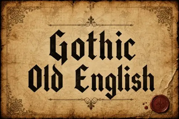
Upright broken-stroke blackletter with diamond dots
Gothic Old English is a classic textura blackletter in mixed case, with dense vertical strokes, diamond feet and a rhythm that reads as print rather than as lettering.
Ideas for this font
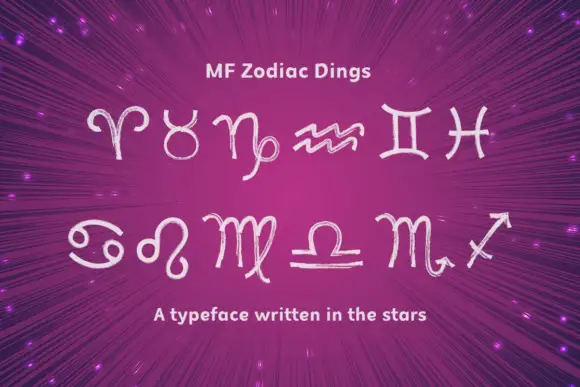
Hand-drawn zodiac dingbat set
Mf Zodiac Dings is a set of twelve hand-drawn zodiac glyphs in pale lilac on a magenta burst ground: uneven light strokes, loose curls and an open hand-drawn quality, arranged in two rows of six with a plain title above and a single line beneath.
Ideas for this font
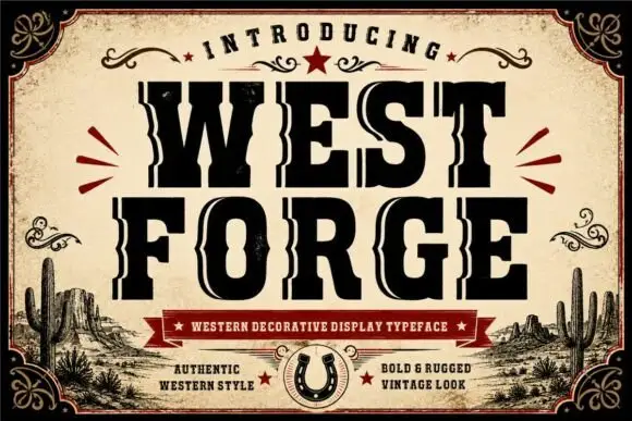
Heavy notched western slab
Westforge is a heavy western slab in black on an aged cream sheet: fat capitals with long pale inset tracks running through each stem, notched side contours, blunt serifs and a slight swell, framed by a thick ornamental border, a ribbon line and a horseshoe, with a desert scene along the foot.
Ideas for this font
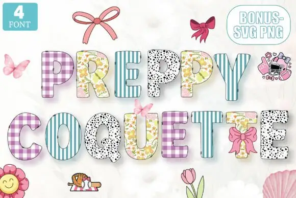
Patterned patchwork blocks
Preppy Coquette is a patterned block display on white: narrow caps each filled with a different pattern — purple and blue gingham, striped teal, black speckle, floral — with a contour around every letter, and a corner label naming the count of faces plus bonus art.
Ideas for this font
Same independent foundry
Allow optional Google Analytics to measure visits and catalogue actions. Your search words and notes are not included. Privacy & storage