Neutral Sans Workhorse

Preppy Coquette + Inkora
Lets Preppy Coquette own the focal silhouette while handling secondary copy, sizing and subheads cleanly.
Inspect Inkora specimenDisclosure: MakerFileHub may earn a commission from qualifying purchases via paid links on this page. How our links work.
Patterned patchwork blocks
Preppy Coquette is a patterned block display on white: narrow caps each filled with a different pattern — purple and blue gingham, striped teal, black speckle, floral — with a contour around every letter, and a corner label naming the count of faces plus bonus art.
Paid link
Get this fontProject & layout blueprintsAt-a-glance maker compatibility
Sturdy stroke walls and open counters weed cleanly on adhesive vinyl, HTV apparel film, and cut cardstock.
Visual anatomy & craft review
The word is set one letter per pattern, which is the arrangement this kind of product is sold in, and the drawing is a narrow block: the contour carries the shape and the fill changes from letter to letter, so the word reads as a patchwork at a glance. That construction sets a size floor, because the gingham and the speckle close when the letters shrink, and the plate sets the block large enough that each pattern is legible as a pattern. The bows, butterflies and shells scattered around the sheet are supplied decoration files rather than glyphs, and the corner label states the count and the bonus formats, which is the information a crafter checks. It suits a card, a shirt or a tumbler wrap rather than a longer heading.
Decorative, pattern, preppy, novelty
Two-font hierarchy recipes
Tested contrast partners — pairing Preppy Coquette with grounded secondary typography.
Preppy Coquette + Inkora
Lets Preppy Coquette own the focal silhouette while handling secondary copy, sizing and subheads cleanly.
Inspect Inkora specimen
Preppy Coquette + Evoire
Grounds bold display lettering with classic typographic authority on posters, badges and apparel.
Inspect Evoire specimenPractical applications
Concrete hierarchy, scale and production guidance tailored to Preppy Coquette’s stroke geometry.
A patterned display gives a party shirt the patchwork look without hand-mixing artwork, and the contour keeps each letter separate.
Hierarchy & layout recipe
Print a 240 mm chest graphic: the slogan at 55 mm cap height, the year at 28 mm, and four inks on a light shirt. Keep the smallest pattern repeat at 4 mm and place the graphic 80 mm below the collar.
Pre-production check
Check the screen at actual mesh, where a 4 mm repeat can fill; enlarge it. Wash-test one shirt and confirm the contours stay closed after five cycles.
A patterned face reads as a paper brand, and the contour keeps a small label legible where a plain fill would look unfinished.
Hierarchy & layout recipe
Print a 55 by 55 mm label: the brand at 12 pt, the product at 8 pt, and three colours on a white stock. Keep 4 mm inside the die and keep the patterns above 2 mm.
Pre-production check
Check the 12 pt brand on a small label, where a pattern can close; simplify the fill at that size. Confirm the 8 pt product reads at arm's length and that the label peels cleanly.
A patchwork display makes a small tag feel made, and the varied patterns let one tag carry several colours without a second design.
Hierarchy & layout recipe
Print 45 by 70 mm tags: the name at 12 pt, the date at 7 pt, and four colours on a cream card. Keep 5 mm inside the die and punch the hole clear of the patterns.
Pre-production check
Check the 12 pt name on a 45 mm tag, where a pattern can reach the hole; keep 8 mm clearance. Confirm the tags tie cleanly and that the inks stay registered.
Technical & licence verification
Confirm included OTF/TTF/WOFF formats, full glyph tables and licence coverage on the live store page before batch production.
Closest visual alternatives
Matched across letterform anatomy, stroke behaviour and craft applications.
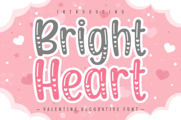
Rounded narrow mixed case with slim inner highlights and vertical rows of small heart openings
Bright Heart is a hand-drawn display face in which every stroke is drawn twice, with a chain of small hearts running down the middle of each stroke, and the whole word sits inside a white sticker outline.
Ideas for this font
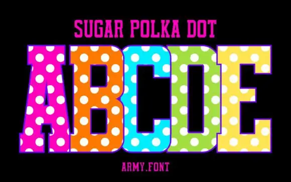
Slab capitals with polka dots
Sugar Polka Dot is a colour display on a black ground: tall slab-like capitals in vivid pink, orange, blue, green and yellow, each covered with large white dots, with a thin outline, a plain name line above and a studio credit beneath.
Ideas for this font
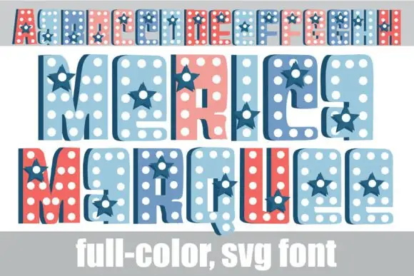
Dotted star-inset colour display
merica Marquee is a colour display on white: condensed rounded capitals filled with white dots and inset navy stars, shown in three rows at three sizes — a small banner row, a middle row and a large bottom row in red, pale blue and navy — with a plain caption along the foot.
Ideas for this font

Rider-silhouette block display
Motocross is a novelty display on a pale ground beside a photograph of a rider mid-jump: heavy rounded capitals with pale motorcycle silhouettes cut into the fill, plus a second red block line beneath that names the file formats.
Ideas for this font
Same independent foundry
Allow optional Google Analytics to measure visits and catalogue actions. Your search words and notes are not included. Privacy & storage