Editorial Serif Anchor

Brushmaker + Raffined
Anchors Brushmaker's fluid strokes with crisp Roman proportions on wedding suites, headers and packaging.
Inspect Raffined specimenDisclosure: MakerFileHub may earn a commission from qualifying purchases via paid links on this page. How our links work.
Bold forward-slanted brush lettering with blunt rounded ends
Brushmaker is white on black with a small gold-like underline below, where thick slanted strokes carry soft rounded ends and occasional rough edges, the opening B stays open and broad and tall h and k ascenders rise above a compact lowercase.
Paid link
Get this fontProject & layout blueprintsAt-a-glance maker compatibility
Sturdy stroke walls and open counters weed cleanly on adhesive vinyl, HTV apparel film, and cut cardstock.
Visual anatomy & craft review
The strokes slant forward together, the ends blunt off, the edges roughen slightly and the letters sit close while staying separable. The compact brush rhythm is the character: it reads as a quick marker line rather than elaborate calligraphy, which is why the presentation keeps one word and one underline. No full alphabet is shown and the underline is probably separate artwork, so proof repeated letters and spacing in the real phrase and keep 24 pt before the rough edges blur into noise.
Brush · Slanted · Blunt ends
Two-font hierarchy recipes
Tested contrast partners — pairing Brushmaker with grounded secondary typography.
Brushmaker + Raffined
Anchors Brushmaker's fluid strokes with crisp Roman proportions on wedding suites, headers and packaging.
Inspect Raffined specimen
Brushmaker + Swaraga
Keeps small-scale dates, URLs, nutrition facts and care instructions crisp and legible below script titles.
Inspect Swaraga specimenPractical applications
Concrete hierarchy, scale and production guidance tailored to Brushmaker’s stroke geometry.
The slanted brush line gives a roaster a handmade mark, and the compact rhythm holds a shop name at 24 pt on a 55 mm panel.
Hierarchy & layout recipe
Print a 55 by 40 mm label: set the shop name at 24 pt on one line, keep 8 mm of clear ground beneath for the underline, and set the roast at 7 pt in small caps at the foot.
Pre-production check
The underline drawn by hand drifts off the baseline; check the artwork and use the supplied stroke if it exists.
The brush weight reads across a counter, and the blunt ends hold a stall name at 48 pt on a printed board, where the rough stroke edges still look deliberate at distance.
Hierarchy & layout recipe
Print a 500 by 250 mm board: set the stall name at 48 pt on one row, keep 20 mm of clear ground beneath for the underline, and keep 24 mm of border so no ascender is clipped.
Pre-production check
Rough stroke edges at 30 pt look like a scan fault; check the mounted board and hold the name at 42 pt or above.
The marker rhythm suits a short note, and the compact letters keep a phrase clear at 26 pt on an A6 card, so the written reply underneath stays the main event.
Hierarchy & layout recipe
Print an A6 card: set the phrase at 26 pt across the upper half, keep 14 mm of clear ground beneath, and leave the lower half blank for a message written by hand.
Pre-production check
A single brush line can look under-set on a large card; check the sheet and keep the phrase within the upper third.
Technical & licence verification
Confirm included OTF/TTF/WOFF formats, full glyph tables and licence coverage on the live store page before batch production.
Closest visual alternatives
Matched across letterform anatomy, stroke behaviour and craft applications.
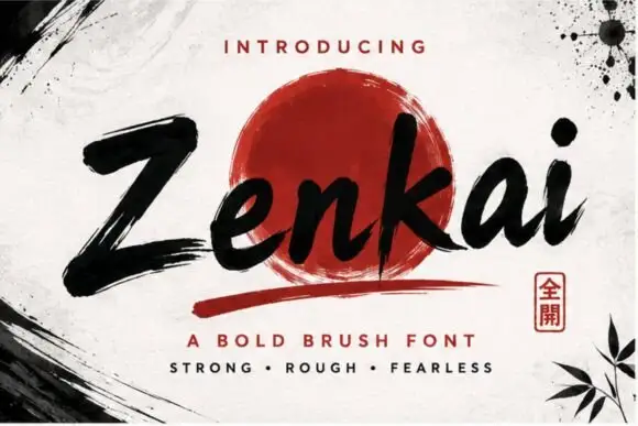
Extended spectral display sans
Zenkai is an extended display sans in dark ink on a pale ground: wide letters with squared bowls, slashed details cut through several strokes, a high waist and even spacing, set in two lines with small tracked labels at the corners and a fine rule at the foot.
Ideas for this font
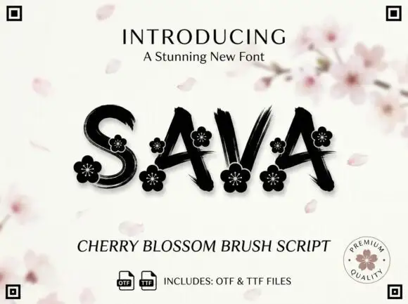
Dry-brush capitals with flowers
Sava is a black brush script on a pale ground: capitals with dry streaks, uneven joins and small flower ornaments set into the wide strokes, with a cherry blossom branch blurred behind, a lined introducing line above and a script descriptor and file note beneath.
Ideas for this font
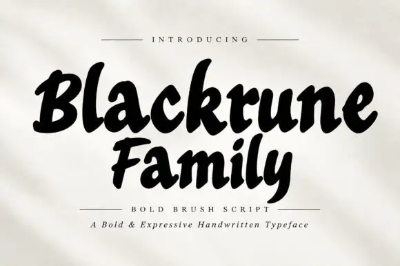
Heavy rounded brush lettering with loose fit and a soft forward lean
Blackrune Family is heavy rounded brush lettering with a soft forward lean, thick strokes that swell through the middle and a fit loose enough to keep each letter distinct.
Ideas for this font
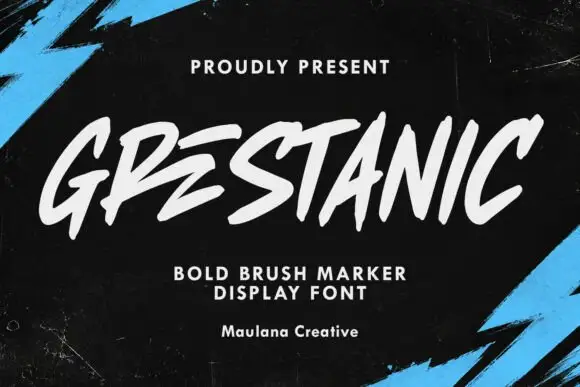
Sharp slanted marker capitals
Grestanic sets narrow marker capitals at a hard slant, with terminals that taper to sharp points, uneven tops and edges that break rather than curve.
Ideas for this font
Same independent foundry
Allow optional Google Analytics to measure visits and catalogue actions. Your search words and notes are not included. Privacy & storage



