Editorial Serif Anchor

Sava + Aureline
Anchors Sava's fluid strokes with crisp Roman proportions on wedding suites, headers and packaging.
Inspect Aureline specimenDisclosure: MakerFileHub may earn a commission from qualifying purchases via paid links on this page. How our links work.
Dry-brush capitals with flowers
Sava is a black brush script on a pale ground: capitals with dry streaks, uneven joins and small flower ornaments set into the wide strokes, with a cherry blossom branch blurred behind, a lined introducing line above and a script descriptor and file note beneath.
Paid link
Get this fontProject & layout blueprintsAt-a-glance maker compatibility
Sturdy stroke walls and open counters weed cleanly on adhesive vinyl, HTV apparel film, and cut cardstock.
Visual anatomy & craft review
The plate is a soft mock-up, and the blossom behind is defocused so it does not compete with the lettering. The drawing is a brush capital with dry streaks and a small flower set into the stroke, so the word reads as painted with a loaded brush rather than as type, and the flowers turn the display into a decorative piece rather than a plain script. That construction sets a moderate size floor, because the dry streaks and the small flowers close first. The introducing line, the descriptor and the file note are product copy. It suits a card, a label and a shirt for a wedding, a beauty or a spring subject.
Brush, dry, floral, hand-lettered
Two-font hierarchy recipes
Tested contrast partners — pairing Sava with grounded secondary typography.
Sava + Aureline
Anchors Sava's fluid strokes with crisp Roman proportions on wedding suites, headers and packaging.
Inspect Aureline specimen
Sava + Saltriver Grotesk
Keeps small-scale dates, URLs, nutrition facts and care instructions crisp and legible below script titles.
Inspect Saltriver Grotesk specimenPractical applications
Concrete hierarchy, scale and production guidance tailored to Sava’s stroke geometry.
A brush script names a spring wedding, and the flowers inside the strokes give the greeting detail without an illustration.
Hierarchy & layout recipe
A6 card: the greeting at 30 pt, the names in a 10 pt serif, and the date at 9 pt. Keep 15 mm margins, print one ink on a heavy card and leave 12 mm at the foot for a line.
Pre-production check
Check the 30 pt greeting at home-print resolution, where a flower closes; keep it above 1.2 mm. Confirm the names read at arm's length and that the card folds flat.
A brush label reads as a studio, and the dry strokes hold on a small die where a fine script would break up. It reads as a florist brand.
Hierarchy & layout recipe
Print a 55 by 80 mm label: the studio at 12 pt, the service at 8 pt, and the contact at 7 pt. Keep 5 mm inside the die and keep the flowers above 0.6 mm.
Pre-production check
Check the 12 pt studio on a small die, where a flower fills; keep it above 0.6 mm. Confirm the 7 pt contact reads in hand and that the label takes a fold.
A brush display prints as fair kit, and the black strokes read on a light shirt where a pale script would look weak. It reads as fair kit.
Hierarchy & layout recipe
Print a 250 mm chest graphic: the fair at 55 mm cap height, the year at 24 mm, and one ink on a light shirt. Keep the smallest flower at 4 mm and place the graphic 80 mm below the collar.
Pre-production check
Check the screen at actual mesh, where a 4 mm flower can fill; enlarge it. Wash-test one shirt and confirm the dry streaks stay visible after five cycles.
Technical & licence verification
Confirm included OTF/TTF/WOFF formats, full glyph tables and licence coverage on the live store page before batch production.
Closest visual alternatives
Matched across letterform anatomy, stroke behaviour and craft applications.
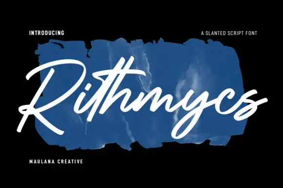
Fast slanted connected brush strokes
Rithmycs is a fast slanted brush script in white over a smear of blue paint: thick connected strokes, tight loops and a forward lean that makes a seven-letter word look signed rather than set.
Ideas for this font
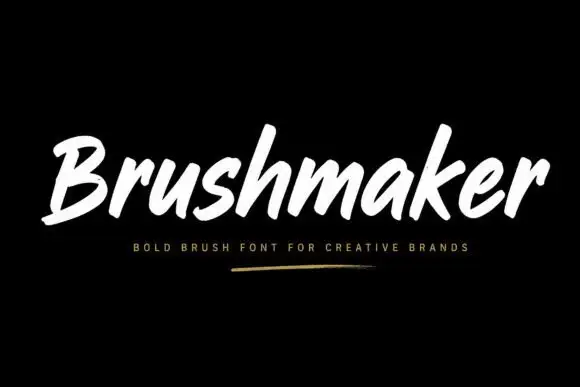
Bold forward-slanted brush lettering with blunt rounded ends
Brushmaker is white on black with a small gold-like underline below, where thick slanted strokes carry soft rounded ends and occasional rough edges, the opening B stays open and broad and tall h and k ascenders rise above a compact lowercase.
Ideas for this font
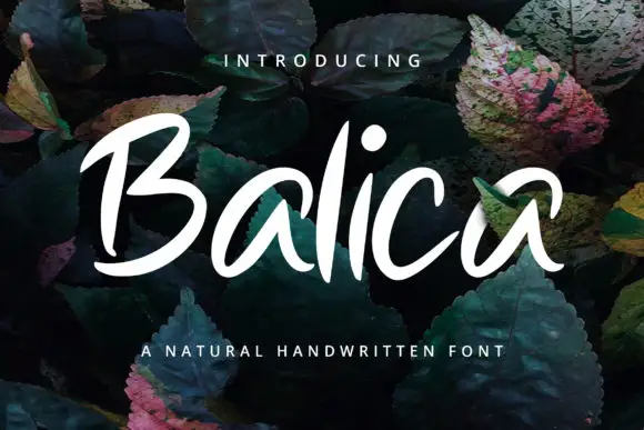
Broad slanted brush lettering with open counters and a light connective stroke
Balica is broad slanted brush lettering in which the strokes are wide and open, the joins are light, and the letters lean together without losing their separate counters.
Ideas for this font
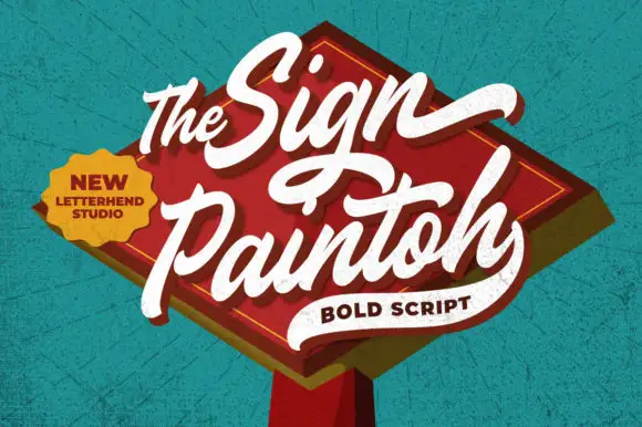
Bold rising sign-painter script
The Sign Paintoh is a bold brush script in cream on a red painted diamond: thick swelled strokes, spiral terminals and a rising baseline, presented as a hanging shop sign against a teal wall.
Ideas for this font
Same independent foundry
Allow optional Google Analytics to measure visits and catalogue actions. Your search words and notes are not included. Privacy & storage