Editorial Serif Anchor

Zenkai + Askinо
Anchors Zenkai's fluid strokes with crisp Roman proportions on wedding suites, headers and packaging.
Inspect Askinо specimenDisclosure: MakerFileHub may earn a commission from qualifying purchases via paid links on this page. How our links work.
Extended spectral display sans
Zenkai is an extended display sans in dark ink on a pale ground: wide letters with squared bowls, slashed details cut through several strokes, a high waist and even spacing, set in two lines with small tracked labels at the corners and a fine rule at the foot.
Paid link
Get this fontProject & layout blueprintsAt-a-glance maker compatibility
Fine grain and micro-texture excel in 300 DPI print, sublimation, and screen print rather than small vinyl weeding.
Visual anatomy & craft review
The two words are stacked and the drawing is an extended sans with cut details: the bowls are squared, the diagonals carry slashes, and the width is stretched, which gives the block a technical, near-futuristic tone. The slashes are cut from the strokes rather than drawn on them, so the letter keeps its outline, and the spacing is even enough that the block reads as a grid. Because the face is wide and the details are fine, it needs a large size and a plain ground, and the specimen sets it big with a small label in each corner and a hairline rule beneath. The palette is a single ink on a pale ground, which lets the slashes read as structure rather than texture.
Extended, futuristic, display, technical
Two-font hierarchy recipes
Tested contrast partners — pairing Zenkai with grounded secondary typography.
Zenkai + Askinо
Anchors Zenkai's fluid strokes with crisp Roman proportions on wedding suites, headers and packaging.
Inspect Askinо specimen
Zenkai + Cenura
Keeps small-scale dates, URLs, nutrition facts and care instructions crisp and legible below script titles.
Inspect Cenura specimenPractical applications
Concrete hierarchy, scale and production guidance tailored to Zenkai’s stroke geometry.
An extended sans reads as technical before any copy is read, and the wide letters fill a fascia without a photograph or a second display face.
Hierarchy & layout recipe
Fabricate a 1,200 by 320 mm sign: the studio at 140 mm cap height, the floor in a 30 mm sans, and a 5 mm rule. Keep 30 mm margins and specify a matte finish so the slashes do not glare.
Pre-production check
Check the 140 mm sign, where a slash can weaken a stem; keep the remaining stroke above 6 mm. Confirm the 30 mm floor reads at four metres and that the rule clears the fixings.
A wide technical face signals the subject before the subtitle is read, and the squared bowls let a long title hold a cover width on a single line.
Hierarchy & layout recipe
Set the title at 100 mm cap height across 240 mm, the subtitle in a 12 pt sans, and the date at 8 pt. Print two colours on a pale stock and keep the slashes out of the subtitle.
Pre-production check
Check the title at thumbnail size, where the slashes can read as damage; keep them coarse. Confirm the 8 pt date survives lamination and that the title clears the trim by 12 mm.
An extended display gives a festival poster a graphic identity, and the single-colour version keeps a large run inexpensive.
Hierarchy & layout recipe
A2 portrait: the festival at 120 mm cap height, the programme in a 16 mm sans, and the dates at 22 mm. Keep 30 mm margins and print one ink on a coloured ground.
Pre-production check
Check the poster at five metres, where the slashes can disappear; widen them. Confirm the 16 mm programme reads at two metres and that the dates align to the title block.
Technical & licence verification
Confirm included OTF/TTF/WOFF formats, full glyph tables and licence coverage on the live store page before batch production.
Closest visual alternatives
Matched across letterform anatomy, stroke behaviour and craft applications.
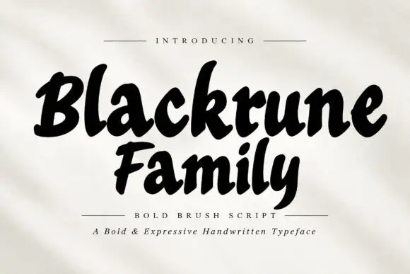
Heavy rounded brush lettering with loose fit and a soft forward lean
Blackrune Family is heavy rounded brush lettering with a soft forward lean, thick strokes that swell through the middle and a fit loose enough to keep each letter distinct.
Ideas for this font

Slanted brush capitals with torn ends
Temur Amorak Urban Bold Brush Font sets two rows of heavy white capitals that lean hard to the right, with torn ragged stroke ends, long diagonal cuts through the thick stems and a small green brush subtitle underneath on a dark grainy field.
Ideas for this font
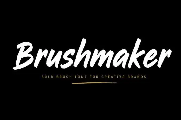
Bold forward-slanted brush lettering with blunt rounded ends
Brushmaker is white on black with a small gold-like underline below, where thick slanted strokes carry soft rounded ends and occasional rough edges, the opening B stays open and broad and tall h and k ascenders rise above a compact lowercase.
Ideas for this font
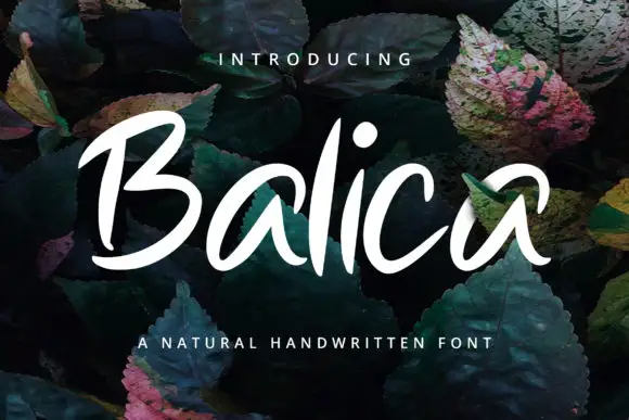
Broad slanted brush lettering with open counters and a light connective stroke
Balica is broad slanted brush lettering in which the strokes are wide and open, the joins are light, and the letters lean together without losing their separate counters.
Ideas for this font
Same independent foundry
Allow optional Google Analytics to measure visits and catalogue actions. Your search words and notes are not included. Privacy & storage