Modern Grotesque Body

West Postage + Saltriver Grotesk
Creates crisp high-hierarchy contrast beneath West Postage headlines across menus, websites and labels.
Inspect Saltriver Grotesk specimenDisclosure: MakerFileHub may earn a commission from qualifying purchases via paid links on this page. How our links work.
Rough sketch serif
West Postage is a rough sketch serif in near-black on aged cream: uneven stems, sketchy serifs, a drifting baseline and a seeded texture, set on two lines over a period envelope with a green stamp and a postmark, with a small tracked credit beneath.
Paid link
Get this fontProject & layout blueprintsAt-a-glance maker compatibility
Fine grain and micro-texture excel in 300 DPI print, sublimation, and screen print rather than small vinyl weeding.
Visual anatomy & craft review
The two words are stacked and the drawing is a hand-sketched serif: the stems waver, the serifs are drawn with a single wobbling stroke, and the counters are irregular, which gives the face the look of lettering done with a brush pen rather than cut in metal. The aged envelope, the stamp and the postmark are period furniture that set the subject honestly, and the small credit beneath is set in the same rough face at a fraction of the size. Because the strokes are uneven, the face works at display sizes and on textured stock, and the specimen keeps the composition sparse so the wobble reads as intended. The palette is one ink on aged paper, and the texture in the letters matches the texture of the sheet, which is what makes the print convincing rather than a filter.
Serif, sketch, vintage, warm
Two-font hierarchy recipes
Tested contrast partners — pairing West Postage with grounded secondary typography.
West Postage + Saltriver Grotesk
Creates crisp high-hierarchy contrast beneath West Postage headlines across menus, websites and labels.
Inspect Saltriver Grotesk specimen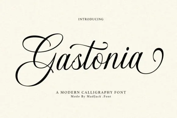
West Postage + Gastonia Script
Adds a warm human signature touch for 1-to-3-word callouts without competing against structured serif capitals.
Inspect Gastonia Script specimenPractical applications
Concrete hierarchy, scale and production guidance tailored to West Postage’s stroke geometry.
A rough serif reads as a hand-stamped label, and the seeded edges hide the imperfections that an uncoated sticker would show anyway.
Hierarchy & layout recipe
Print a 70 by 50 mm label: the maker at 13 pt, the product in a 7 pt serif, and the batch at 6 pt. Keep 4 mm inside the die and print one ink on a natural kraft stock.
Pre-production check
Check the 13 pt maker on kraft, where the seeded edge can fill; keep the size above 11 pt. Confirm the 6 pt batch reads at arm's length and that the label peels cleanly.
A rough serif gives a personal history the look of a letter rather than a printed book, and the uneven stems survive a matte cover stock.
Hierarchy & layout recipe
Set the title at 80 mm cap height across 190 mm, the subtitle in a 11 pt serif, and the author at 9 pt. Print one ink on a textured stock and keep the title in the upper half.
Pre-production check
Check the title at 80 mm, where the rough edge can clot at the joins; open the spacing. Confirm the 9 pt author survives lamination and that the title clears the trim by 12 mm.
A sketch serif suits a celebration where everything is handwritten, and the seeded texture reads as letterpress without the plate cost.
Hierarchy & layout recipe
A5 menu: the heading at 20 pt, the courses at 9 pt with 14 pt leading, and the date at 8 pt. Keep 20 mm margins and print one ink on a cream card so the texture stays visible.
Pre-production check
Check the 9 pt courses on uncoated card, where the seeded edge can break the stroke; keep them above 8 pt. Confirm the heading reads across the table and that the date clears the trim.
Technical & licence verification
Confirm included OTF/TTF/WOFF formats, full glyph tables and licence coverage on the live store page before batch production.
Closest visual alternatives
Matched across letterform anatomy, stroke behaviour and craft applications.
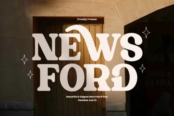
Retro serif with sweeping curved details
News Ford is a retro serif in cream over a warm doorway photograph: fat letters with a moderate contrast, curved details that sweep out of the W and the O, and rounded serifs, with small capital lines above and below.
Ideas for this font
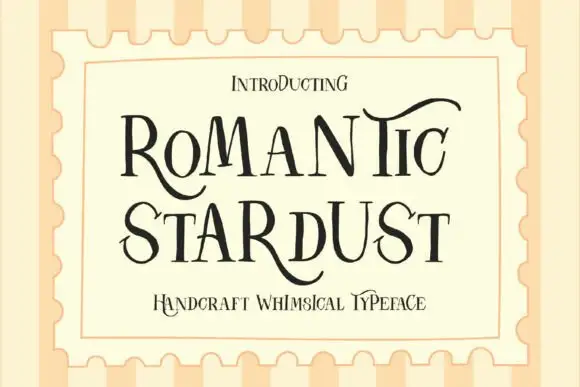
Whimsical serif with mixed proportions
Romantic Stardust is a whimsical serif in black on cream inside a postage-stamp frame: tall thin letters with small serifs, mixed proportions where some letters grow into swashy ascenders, and a lowercase that sits high, so the word reads as hand-lettered stationery rather than as set type.
Ideas for this font

Tall light capitals with long overlapping crossbars
Beach Dates is a tall light capital face in which the C and D open broad curves, the serifs taper finely and the H crossbar reaches left into the C while the T bar stretches across the row below, so two stacked words lock into one form.
Ideas for this font
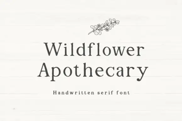
Handwritten serif with slight irregularity
Wildflower Apothecary is a handwritten serif in charcoal on a white board: serif letterforms drawn by hand with a slight wobble, a moderate contrast and open counters, with a fine line drawing of a wildflower sprig above the words.
Same independent foundry
Allow optional Google Analytics to measure visits and catalogue actions. Your search words and notes are not included. Privacy & storage