Neutral Sans Workhorse

Aref + Base Edge
Lets Aref own the focal silhouette while handling secondary copy, sizing and subheads cleanly.
Inspect Base Edge specimenDisclosure: MakerFileHub may earn a commission from qualifying purchases via paid links on this page. How our links work.
Liquid-wave cutout psychedelic caps with an inner contour and bold mass
Aref is a psychedelic capital alphabet in which the stems bend into liquid waves, the counters run as slices and an inner contour traces the outline, so a word reads as a cut paper shape floating on colour.
Paid link
Get this fontProject & layout blueprintsAt-a-glance maker compatibility
Sturdy stroke walls and open counters weed cleanly on adhesive vinyl, HTV apparel film, and cut cardstock.
Visual anatomy & craft review
The A splits into two wavy legs joined by a curved bar, the R bends its bowl into a wave and drops a hooked leg, the E carries three undulating arms and the F follows the same rhythm, all at a heavy weight with an inner line offset from the contour. That inner line is the practical detail: it traces the cut path, so the shape can be plotted as one piece at 40 mm and still read. Because the letters are wide and irregular, the fit is generous and a short word spans a panel at 80 pt. The ink-cloud background, the white fill, the black contour and the two badges are presentation; the display face is the word shown.
Trippy · Waved · Cutout
Two-font hierarchy recipes
Tested contrast partners — pairing Aref with grounded secondary typography.
Aref + Base Edge
Lets Aref own the focal silhouette while handling secondary copy, sizing and subheads cleanly.
Inspect Base Edge specimen
Aref + The Simple Editorial
Grounds bold display lettering with classic typographic authority on posters, badges and apparel.
Inspect The Simple Editorial specimenPractical applications
Concrete hierarchy, scale and production guidance tailored to Aref’s stroke geometry.
The wavy mass reads as a cut shape at 30 mm on a die-cut sticker, and the inner line keeps the contour clean at that size.
Hierarchy & layout recipe
Print a 60 mm die-cut sticker: set the word at 30 mm, keep the inner contour as the cut path at 2 mm, and leave 4 mm between the wave tips and the die line so the shape does not tear at a point.
Pre-production check
A wave tip under 2 mm tears on vinyl; check the cut file at full size and blunt the two sharpest tips before ordering.
The liquid letters carry a poster at 90 pt, and the irregular mass gives the page the period energy a straight face cannot.
Hierarchy & layout recipe
Print an A2 poster: set the event name at 90 pt across the middle, set the details in a 14 pt caps sans beneath, and keep 25 mm of margin so the wavy edges stay inside the bleed.
Pre-production check
An irregular silhouette over a busy background reads as noise; check the poster and keep the lettering on a plain field.
The single cut contour works in acrylic, and the heavy waves stay rigid at 40 mm where a thin psychedelic face would snap.
Hierarchy & layout recipe
Cut a 140 mm topper: set the word at 40 mm tall with the waves intact, keep 6 mm of material at the thinnest point, and leave a 20 mm stem so the topper stands without a support.
Pre-production check
A narrow wave waist under 4 mm cracks in acrylic; check the vector at full size and widen the waist rather than simplifying the wave.
Technical & licence verification
Confirm included OTF/TTF/WOFF formats, full glyph tables and licence coverage on the live store page before batch production.
Closest visual alternatives
Matched across letterform anatomy, stroke behaviour and craft applications.
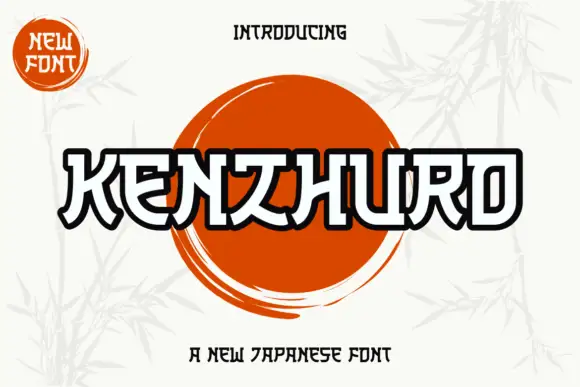
Outlined angular display with bridge cuts and heavy contours
Kenzhuro is an angular display alphabet in which every stroke is a heavy outline with bridge cuts at the joints, so a word reads as a brushed sign where the interior of each stroke stays open.
Ideas for this font

Bold sans with ligature alternates
Think Loved is a bold sans in orange on a pale ground: wide geometric caps with flat terminals, a very high waist and tight spacing, with a ligature that fuses two letters into a single drawn shape, set in two lines with a small tracked note beneath naming the alternate.
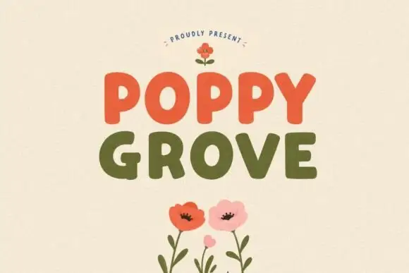
Simple rounded block capitals
Poppy Grove is a rounded block capital display in two warm inks: Poppy in vermilion and Grove in olive on a cream ground, with flat-sided letters, soft corners and a small drawn poppy above and below.
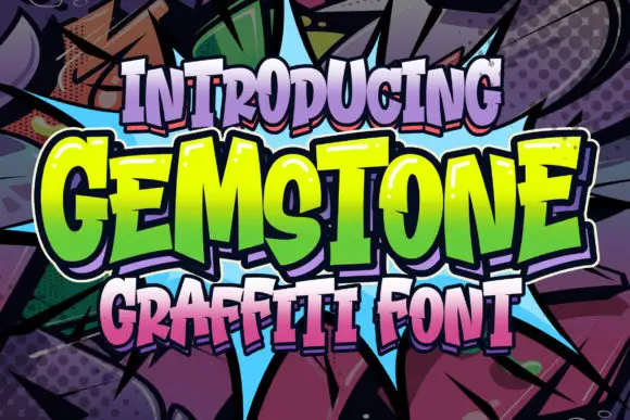
Uneven graffiti blocks with pointed edges
Gemstone sets bold irregular letters with sharply angled joins, where the heights vary across the word and narrow inward cuts break up the outer silhouette instead of leaving one flat block.
Ideas for this font
Same independent foundry
Allow optional Google Analytics to measure visits and catalogue actions. Your search words and notes are not included. Privacy & storage