Neutral Sans Workhorse

Gemstone + Inkora
Lets Gemstone own the focal silhouette while handling secondary copy, sizing and subheads cleanly.
Inspect Inkora specimenDisclosure: MakerFileHub may earn a commission from qualifying purchases via paid links on this page. How our links work.
Uneven graffiti blocks with pointed edges
Gemstone sets bold irregular letters with sharply angled joins, where the heights vary across the word and narrow inward cuts break up the outer silhouette instead of leaving one flat block.
Paid link
Get this fontProject & layout blueprintsAt-a-glance maker compatibility
Sturdy stroke walls and open counters weed cleanly on adhesive vinyl, HTV apparel film, and cut cardstock.
Visual anatomy & craft review
The weight stays heavy, the joins cut in at a point, the letters rise and fall along the line and several strokes slice inward toward the middle of the word. The broken silhouette is the character: the name reads as sprayed rather than set, which is why the sample stretches one long word across the frame. Because the pointed cuts are thin, keep 34 pt before they fill in, and avoid adding a heavy outline, which would blunt every sharp corner the face already builds.
Graffiti · Pointed · Uneven heights
Two-font hierarchy recipes
Tested contrast partners — pairing Gemstone with grounded secondary typography.
Gemstone + Inkora
Lets Gemstone own the focal silhouette while handling secondary copy, sizing and subheads cleanly.
Inspect Inkora specimen
Gemstone + Resquel
Grounds bold display lettering with classic typographic authority on posters, badges and apparel.
Inspect Resquel specimenPractical applications
Concrete hierarchy, scale and production guidance tailored to Gemstone’s stroke geometry.
The uneven blocks suit a small sticker, and the pointed joins stay sharp at 26 mm on a die-cut shape in one colour, so the silhouette does the branding work without a second graphic.
Hierarchy & layout recipe
Cut a 90 mm sticker: set the word at 26 mm, keep every pointed join at 2 mm minimum, and keep 8 mm of clear vinyl around the outermost edge so the cut does not clip a corner.
Pre-production check
A point cut under 1 mm breaks on a small sticker; check the cut file and hold the word at 24 mm or above.
The graffiti letters give a card attitude, and the varied heights still read at 36 pt on an A6 sheet, where the in-cuts keep their points because the sheet is printed flat.
Hierarchy & layout recipe
Print an A6 card: set the name at 36 pt on one row, keep 16 mm of clear ground beneath for the details at 11 pt, and keep 12 mm of margin so the in-cuts stay whole.
Pre-production check
An uneven word set beside a straight second line looks misaligned; check the card and keep the second line in a plain face.
The pointed letters set a workshop poster, and the heavy forms hold a two-word title at 48 pt across an A3 sheet, big enough that every inward cut stays visible from across a room.
Hierarchy & layout recipe
Print an A3 poster: set the title at 48 pt on one row, keep 22 mm beneath before the date block at 14 pt, and keep 20 mm of margin for the ragged outer edges.
Pre-production check
Points printed at 30 pt on a distant poster read as damage; check the sheet and keep the title at 42 pt or above.
Technical & licence verification
Confirm included OTF/TTF/WOFF formats, full glyph tables and licence coverage on the live store page before batch production.
Closest visual alternatives
Matched across letterform anatomy, stroke behaviour and craft applications.
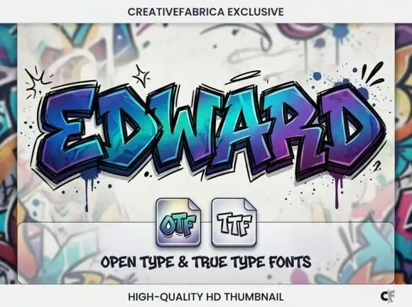
Angular graffiti capitals with overlapping facets and a dripped edge
Edward is an angular graffiti display alphabet in capitals only, built from overlapping faceted strokes in two colours, with short drips running off the lower edges and a hard shadow behind each letter.
Ideas for this font
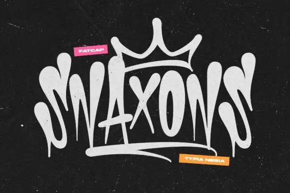
Graffiti tag logo display
Snaxons is a graffiti tag in white on black: letters written as one continuous dripping line, a crown drawn above the word, and a heavy baseline shadow that turns the tag into a logo rather than a scrawl.
Ideas for this font
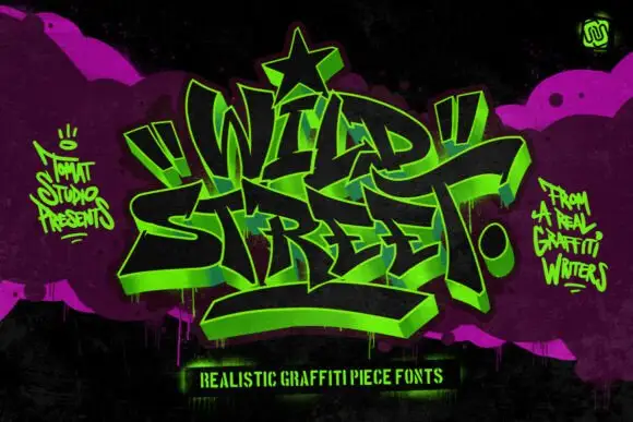
Graffiti piece display
Wild Street is a graffiti piece display in acid green on black and magenta: interlocking letters with a 3D block shadow, heavy outlines, exaggerated arrows and a star at the apex, surrounded by spray marks and a hand-lettered caption, so the plate reads as a wall piece rather than a typeface.
Ideas for this font
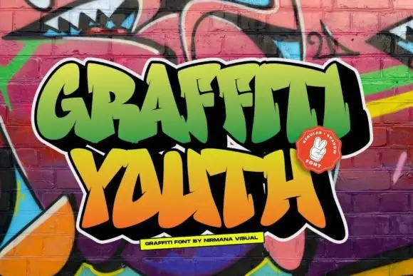
Broad graffiti capitals with sharp projecting joins
Graffiti Youth shows dense irregular capitals with angular tips, slanted crossbars and closely fitted side strokes, and the lower word leans and spreads differently from the upper row.
Same independent foundry
Allow optional Google Analytics to measure visits and catalogue actions. Your search words and notes are not included. Privacy & storage