Modern Grotesque Body

Noisera + Miniplate
Creates crisp high-hierarchy contrast beneath Noisera headlines across menus, websites and labels.
Inspect Miniplate specimenDisclosure: MakerFileHub may earn a commission from qualifying purchases via paid links on this page. How our links work.
Distressed detailed serif display
Noisera is a distressed serif display in near-black on orange paper: very tall narrow letters with high-contrast stems, thin slab-like serifs cut with notches and small punctures through the bowls, with a stack of bracketed captions and a spray of black botanical shapes at the foot.
Paid link
Get this fontProject & layout blueprintsAt-a-glance maker compatibility
Fine grain and micro-texture excel in 300 DPI print, sublimation, and screen print rather than small vinyl weeding.
Visual anatomy & craft review
The word is set once, wide, and the drawing is a detailed serif: the stems are heavy and narrow, the serifs are thin and squared, and the distress is built into the outlines rather than overlaid, so the notches and punctures land in the same place on every impression. That detail makes the face a display cut for large sizes only, and the specimen sets it at a size where each puncture is visible. The captions beneath are set in the same skeleton at small sizes, bracketed in parentheses, and they name the two versions — clean and rough — which is a fair way to describe a distressed family. The ground is a flat orange sheet with black botanical shapes, and the palette is two colours throughout.
Serif, distressed, detailed, editorial
Two-font hierarchy recipes
Tested contrast partners — pairing Noisera with grounded secondary typography.
Noisera + Miniplate
Creates crisp high-hierarchy contrast beneath Noisera headlines across menus, websites and labels.
Inspect Miniplate specimen
Noisera + Rebel Marks
Adds a warm human signature touch for 1-to-3-word callouts without competing against structured serif capitals.
Inspect Rebel Marks specimenPractical applications
Concrete hierarchy, scale and production guidance tailored to Noisera’s stroke geometry.
A detailed serif gives an art journal a cover that reads as a printed object, and the distressed outlines sit well on an uncoated stock where a smooth face would look digital.
Hierarchy & layout recipe
Set the title at 100 mm cap height across 230 mm, the issue details in a 10 pt serif, and the contributors at 8 pt. Print two colours on an uncoated stock and keep the title in the upper two thirds.
Pre-production check
Check the title at 100 mm, where a puncture can weaken a thin serif; use the clean version for the smallest sizes. Confirm the 8 pt contributors survive the press and that the title clears the trim by 10 mm.
A detailed display reads as a gallery poster rather than an advert, and the two-colour print keeps a short run cheap while the distress supplies the texture.
Hierarchy & layout recipe
A2 portrait: the exhibition at 130 mm cap height, the dates in a 22 mm serif, and the address at 14 mm. Keep 30 mm margins, print two colours on a coloured stock, and keep the botanical shapes away from the small type.
Pre-production check
Check the poster at five metres, where the punctures can look like print defects; use the clean cut for anything under 20 mm. Confirm the 14 mm address reads at three metres and that the shapes do not cross the type block.
A distressed serif carries a gothic mood without the cliché of a blackletter, and the high contrast keeps the words legible at card size.
Hierarchy & layout recipe
A6 card: the event at 26 pt in the clean cut, the details in a 9 pt serif, and a 3 mm border. Keep 12 mm margins and print one ink on a pale card so the notches read as ink texture.
Pre-production check
Check the 26 pt event in the rough cut, where a puncture can close a counter; switch to clean below 30 pt. Confirm the 9 pt details keep a 4.5:1 contrast and that the border clears the serifs.
Technical & licence verification
Confirm included OTF/TTF/WOFF formats, full glyph tables and licence coverage on the live store page before batch production.
Closest visual alternatives
Matched across letterform anatomy, stroke behaviour and craft applications.

Bold transitional display serif with overhead canopy swash
Vanielst is a substantial, medium-high-contrast display serif highlighted by graceful overhead swash loops and crisp bracketed feet.
Ideas for this font

Warm contemporary medium-bold book & coffeehouse serif
Brenco is a grounded, medium-bold contemporary serif with sturdy bracketed feet and warm, approachable lowercase curves.
Ideas for this font
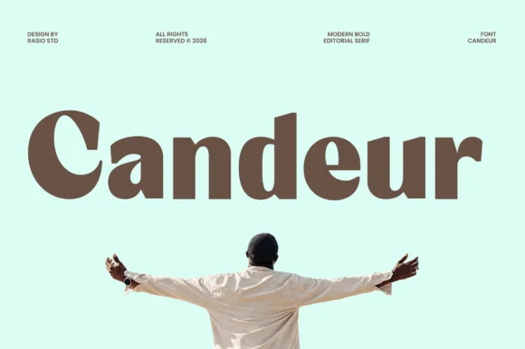
Ultra-bold reverse-stress & high-contrast modern display serif
Candeur is an ultra-bold modern editorial serif pairing massive teardrop bowls and thick stems with razor-thin horizontal connectors.
Ideas for this font
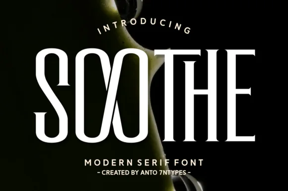
High-contrast condensed serif
Soothe is a modern serif in cream on a dark botanical ground: very high contrast, condensed caps with hairline joins, sharp flat serifs and a circular O, set in two lines with a tracked caption beneath, so the pair reads as a fashion or beauty masthead.
Ideas for this font
Same independent foundry
Allow optional Google Analytics to measure visits and catalogue actions. Your search words and notes are not included. Privacy & storage