Modern Grotesque Body

Night Stright + Homies
Creates crisp high-hierarchy contrast beneath Night Stright headlines across menus, websites and labels.
Inspect Homies specimenDisclosure: MakerFileHub may earn a commission from qualifying purchases via paid links on this page. How our links work.
High-contrast horror serif display
Night Stright is a horror display serif in bone cream on blood red: very high contrast, tall pointed serifs that flare into thorns, a splayed M and sharp wedge terminals, set over a graveyard silhouette, so the pair reads as a film title rather than as an editorial serif.
Paid link
Get this fontProject & layout blueprintsAt-a-glance maker compatibility
Crisp hairline serifs shine on stationery, foil stamping, and packaging; add slight offset for small decals.
Visual anatomy & craft review
The two words are stacked and the drawing takes a serif skeleton and sharpens it: the serifs flare into points, the stems swell and the hairlines drop to a line, which gives the letters a gothic silhouette without turning them into blackletter. The flare is consistent on every letter, so the word reads as one plate, and the counters stay open enough that the type is legible at a distance. Because the hairlines are thin, the face needs a large size and a high-contrast ground, and the specimen supplies both: the red is dark enough for the cream to sit on, and the graveyard silhouette along the bottom gives the plate its scene. Two small tracked lines above and below name the studio and the category, in a light roman.
Horror, contrasted, sharp, cinematic
Two-font hierarchy recipes
Tested contrast partners — pairing Night Stright with grounded secondary typography.
Night Stright + Homies
Creates crisp high-hierarchy contrast beneath Night Stright headlines across menus, websites and labels.
Inspect Homies specimen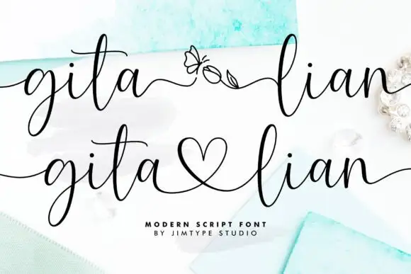
Night Stright + Gita Lian
Adds a warm human signature touch for 1-to-3-word callouts without competing against structured serif capitals.
Inspect Gita Lian specimenPractical applications
Concrete hierarchy, scale and production guidance tailored to Night Stright’s stroke geometry.
A horror serif sets a genre instantly without an illustration, and the high contrast reads at poster size where a gothic blackletter would clot into a texture.
Hierarchy & layout recipe
A2 portrait: the title at 130 mm cap height, the screening details in a 14 mm sans, and the date at 22 mm. Keep 30 mm margins, print bone on a deep red, and keep the silhouette clear of the small type.
Pre-production check
Check the poster at five metres, where the hairlines can disappear; keep them above 0.4 mm at final size. Confirm the 14 mm details read at three metres and that the flares do not merge with the ground.
A horror serif signals genre before the reader reaches the subtitle, and the flared serifs give a cover an illustrated quality without commissioning artwork.
Hierarchy & layout recipe
Set the title at 100 mm cap height across 230 mm, the author in a 12 pt roman, and the imprint at 7 pt. Print two inks on a dark matte stock and let the graveyard illustration run along the bottom edge.
Pre-production check
Check the title at thumbnail size, where the hairlines can vanish; keep the contrast high. Confirm the 7 pt imprint survives lamination and that the title clears the illustration by 12 mm.
A horror serif turns a seasonal release into a collectable, and the two-colour build keeps a small brewery's label affordable where a foil would raise the cost.
Hierarchy & layout recipe
Print a 70 by 90 mm label: the beer at 18 pt, the style in a 7 pt roman, and the strength at 6 pt. Keep 5 mm clear inside the die so the flares are never cut and print bone on a dark uncoated stock.
Pre-production check
Check the 18 pt name against the die at 5 mm; pull the lockup in if a flare narrows the margin. Confirm the 6 pt strength reads on the shelf and that the hairlines hold on the uncoated paper.
Technical & licence verification
Confirm included OTF/TTF/WOFF formats, full glyph tables and licence coverage on the live store page before batch production.
Closest visual alternatives
Matched across letterform anatomy, stroke behaviour and craft applications.
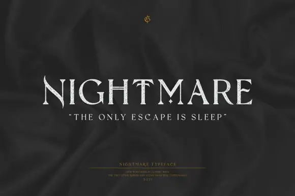
Fine uppercase serifs with blade-like points and a diamond separator
Nightmare is a refined display serif with very wide capitals, high stroke contrast and small sharp spurs at the ends of the stems, set quiet and pale on a dark ground.
Ideas for this font
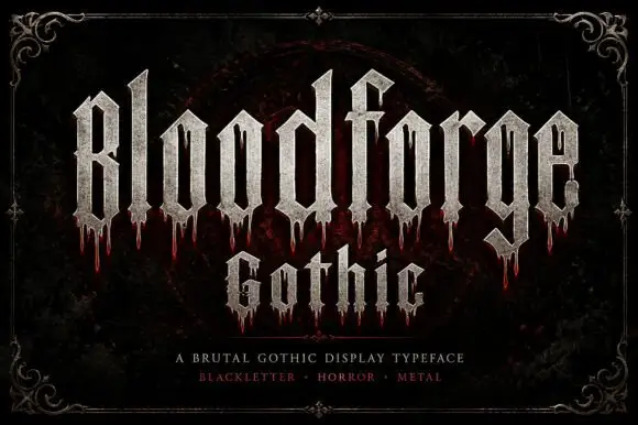
Narrow Gothic strokes with long drip-like lower extensions
Bloodforge Gothic is a brutal gothic display face: tall narrow letters with a stone texture, sharp spurs that end in points, and drip marks hanging from several of the stems.
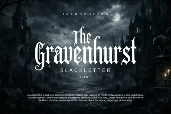
Slim blackletter with curled capital terminals and tall ascenders
Gravenhurst sets a condensed blackletter in white against a moonlit churchyard, its capitals hooked, its ascenders drawn to fine points and its counters kept narrow enough to feel carved.
Ideas for this font
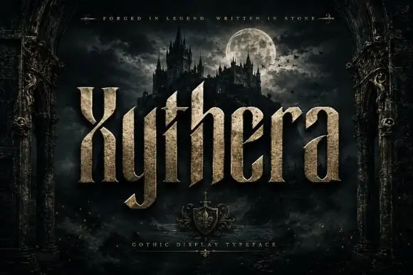
Textured gothic display
Xythera is a textured gothic display in gold on a dark scene: tall capitals with sharp spurs, a carved surface, and a stone-like speckle inside the strokes, framed by an arched stone border with a moonlit castle behind, so the plate reads as a fantasy title rather than a blackletter.
Ideas for this font
Same independent foundry
Allow optional Google Analytics to measure visits and catalogue actions. Your search words and notes are not included. Privacy & storage