Modern Grotesque Body

Reinhardt + Mango Dream
Creates crisp high-hierarchy contrast beneath Reinhardt headlines across menus, websites and labels.
Inspect Mango Dream specimenDisclosure: MakerFileHub may earn a commission from qualifying purchases via paid links on this page. How our links work.
Angular notched display serif
Reinhardt is a display serif in rose pink with a layered maroon shadow on a warm grey ground: tall caps with angular, flared spurs, cut notches on the stem ends and a narrow waist, with a small tracked label above and a copyright line beneath.
Paid link
Get this fontProject & layout blueprintsAt-a-glance maker compatibility
Sturdy stroke walls and open counters weed cleanly on adhesive vinyl, HTV apparel film, and cut cardstock.
Visual anatomy & craft review
The word is set once, wide, and the drawing is a display serif with a constructed edge: the spurs flare into points, the stems are cut flat, and the waist is pinched, which gives the letters a theatrical, almost architectural silhouette. The layered shadow sits behind at a fixed offset and a darker tone, which makes the block read as a cut object rather than a flat word. Because the details are sharp and the counters narrow, the face works at display sizes, and the specimen sets it across the plate with a small tracked label above and a credit line beneath. The palette is three tones on a warm ground, and there is nothing else on the plate, which keeps the silhouette as the subject.
Display, angular, notched, theatrical
Two-font hierarchy recipes
Tested contrast partners — pairing Reinhardt with grounded secondary typography.
Reinhardt + Mango Dream
Creates crisp high-hierarchy contrast beneath Reinhardt headlines across menus, websites and labels.
Inspect Mango Dream specimen
Reinhardt + Wishful Women
Adds a warm human signature touch for 1-to-3-word callouts without competing against structured serif capitals.
Inspect Wishful Women specimenPractical applications
Concrete hierarchy, scale and production guidance tailored to Reinhardt’s stroke geometry.
An angular display reads as a playbill, and the layered shadow gives the title depth on a dark poster where a flat face would look thin.
Hierarchy & layout recipe
A2 portrait: the show at 120 mm cap height with a 6 mm shadow offset, the dates in a 20 mm serif, and the venue at 12 mm. Keep 30 mm margins and print three colours on a dark ground.
Pre-production check
Check the poster at five metres, where the notches can read as damage; keep them consistent across letters. Confirm the 12 mm venue reads at three metres and that the shadow clears the letters.
A theatrical display gives a bar a mark with silhouette, and the flat shadow reproduces in paint or vinyl without a fabrication step.
Hierarchy & layout recipe
Fabricate a 900 by 320 mm sign: the name at 120 mm cap height, a 5 mm shadow, and the hours in a 20 mm serif. Keep 25 mm margins and paint three colours on a dark board with a matte finish.
Pre-production check
Check the sign at 120 mm, where a flared spur can become a spike that catches light; keep the flutes even. Confirm the 20 mm hours read at four metres and that the shadow stays registered.
An angular display frames a gothic title as a playbill, and the sharp silhouette holds at thumbnail size where a textured face would clot.
Hierarchy & layout recipe
Set the title at 90 mm cap height across 210 mm, the author in a 10 pt serif, and the imprint at 7 pt. Print three colours on a dark matte stock and keep the title in the upper half.
Pre-production check
Check the title at thumbnail size, where the notches can blur; keep the contrast high. Confirm the 7 pt imprint survives lamination and that the title clears the trim by 12 mm.
Technical & licence verification
Confirm included OTF/TTF/WOFF formats, full glyph tables and licence coverage on the live store page before batch production.
Closest visual alternatives
Matched across letterform anatomy, stroke behaviour and craft applications.
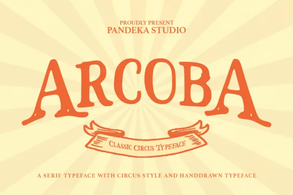
Warm hand-drawn vintage circus & carnival poster serif
Arcoba is a charming, hand-crafted vintage circus serif with flared wedge terminals, playful arched rhythm, and zero fragile hairlines!
Ideas for this font
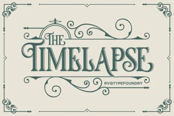
Swashed Victorian storybook & apothecary display serif
Timelapse is an ornate Victorian display serif crowned with spiraling vine swashes, teardrop terminals, and vintage apothecary charm.
Ideas for this font
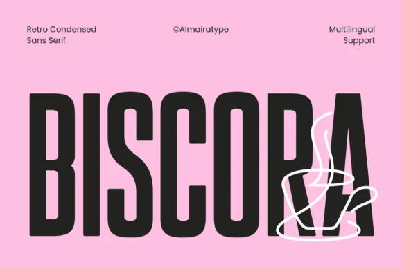
Diagonal-sliced retro café condensed sans (Multilingual)
Biscora is a stylish condensed sans distinguished by crisp diagonal stencil-like angle cuts across the joints of 'S', 'R', and 'A' (Multilingual)!
Ideas for this font
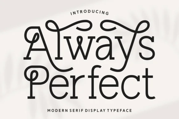
Looped monoline Art-Nouveau & storybook swash serif
Always Perfect is a playful monoline swash serif whose tall stems curl into sweeping overhead loops, ball-tipped hooks, and linked ligatures.
Ideas for this font
Same independent foundry
Allow optional Google Analytics to measure visits and catalogue actions. Your search words and notes are not included. Privacy & storage