Editorial Serif Anchor

Summer Faith + Alerigue
Anchors Summer Faith's fluid strokes with crisp Roman proportions on wedding suites, headers and packaging.
Inspect Alerigue specimenDisclosure: MakerFileHub may earn a commission from qualifying purchases via paid links on this page. How our links work.
Monoline signature script
Summer Faith is a thin monoline signature script in white on a muted blue-green ground: a single stroke weight, long flowing crossbars, a looped S and a T whose arm crosses far past the letter, set under a shadow of window bars.
Paid link
Get this fontProject & layout blueprintsAt-a-glance maker compatibility
Weld or Unite overlapping script joins into one continuous vector path before sending to the blade.
Visual anatomy & craft review
The two words are written as one continuous line: the upstrokes and downstrokes hold the same hairline width, so the face reads as a felt-tip signature rather than a pointed-pen calligraphy, and the joins between letters are visible as fine links. The capital T opens with a wide flat arm that sweeps back over the whole word, the h and the k rise into narrow loops, and the second word closes with a w that finishes in a small forward flick instead of a descender loop. Above and below, tracked capitals in a light serif name the face and the designer, and the only other element on the page is the shadow of a window frame falling across the ground. That flatness is the point of the face: it stays quiet on a photograph, so a wedding stationer can place it over an image without a plate, provided the value contrast is strong enough.
Signature, monoline, quiet, personal
Two-font hierarchy recipes
Tested contrast partners — pairing Summer Faith with grounded secondary typography.
Summer Faith + Alerigue
Anchors Summer Faith's fluid strokes with crisp Roman proportions on wedding suites, headers and packaging.
Inspect Alerigue specimen
Summer Faith + Base Edge
Keeps small-scale dates, URLs, nutrition facts and care instructions crisp and legible below script titles.
Inspect Base Edge specimenPractical applications
Concrete hierarchy, scale and production guidance tailored to Summer Faith’s stroke geometry.
A monoline signature reads as a personal note rather than printed type, which is the tone a save-the-date needs when the photograph is already doing the work.
Hierarchy & layout recipe
A6 card: set the phrase at 26 pt centred in the upper third, in white over a photograph darkened by 40 percent, and put the names in small spaced serif caps 12 mm below. Keep the whole card free of a second script so the signature stays the only handwritten element.
Pre-production check
Check the hairline against the lightest part of the photograph, because a single-weight script disappears first where the image is bright. Print a proof on the actual card stock and confirm the strokes do not break up at 26 pt.
A single-weight signature closes a note the way a handwritten line does, and on letterpress the monoline relief prints cleanly without the ink spread that ruins a contrasted script.
Hierarchy & layout recipe
Set the phrase at 18 pt at the foot of a 100 by 150 mm card, aligned right, with the body in a 9.5 pt serif and 12 mm of clear space above. Specify a deep or blind deboss so the thin stroke registers as a groove rather than a printed line.
Pre-production check
Check the die at 100 percent: a hairline under 0.4 mm will not hold a deep impression and should be brought up to 0.5 mm. Confirm the phrase does not sit within 8 mm of the trim edge and that the deboss depth clears the paper's calliper.
A signature mark signals a personal service, and a thin monoline face stays quiet next to a portfolio image where a bold script would compete with the photographer's own subject.
Hierarchy & layout recipe
Place the signature at 28 pt over the lower right of a web hero image, in white with a 25 percent shadow lift, and stack the discipline below in spaced caps at 9 pt. Keep 24 px of clear space around the mark at every breakpoint.
Pre-production check
Check the mark at 320 px wide, where the loops of the capital S can merge, and confirm the white stroke holds a 4.5:1 contrast ratio over the brightest image in the set. Verify the signature still reads when the photograph is cropped square.
Technical & licence verification
Confirm included OTF/TTF/WOFF formats, full glyph tables and licence coverage on the live store page before batch production.
Closest visual alternatives
Matched across letterform anatomy, stroke behaviour and craft applications.
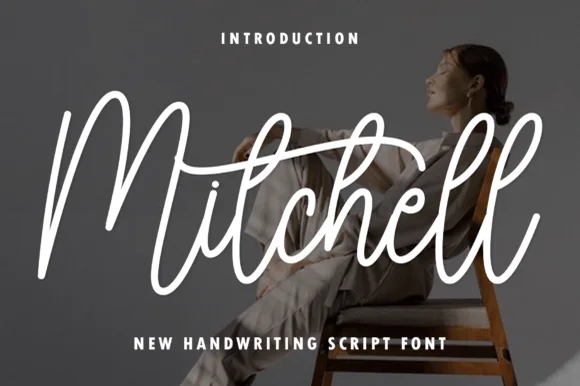
Tall upright brush-pen signature calligraphy script
Mitchell is a stylish, tall-looped brush-signature script pairing high editorial ascenders ('M', 't', 'h', 'l') with smooth, vinyl-friendly stroke weight.
Ideas for this font
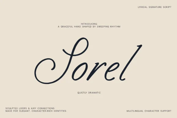
Lyrical monoline-shaded calligraphic signature script
Sorel is a poised, slanted lyrical signature script defined by an expansive double-curled S-loop and crisp high-rising ascenders.
Ideas for this font
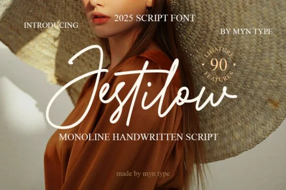
Flowing signature monoline script with 90 ligature features
Jestilow is an expressive monoline signature script packed with 90 custom ligatures, soaring t-crossbars, and sweeping initial loops.
Ideas for this font
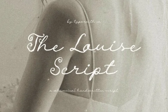
Whimsical handwritten script
The Louise Script is a whimsical handwritten script in white over a grainy black-and-white photograph: a thin even stroke, uneven letter heights, loops that overshoot on the h and the s, and a spacing wide enough that the word reads as written by hand on a whim.
Ideas for this font
Same independent foundry
Allow optional Google Analytics to measure visits and catalogue actions. Your search words and notes are not included. Privacy & storage