Neutral Sans Workhorse

JP Mirror + Homies
Lets JP Mirror own the focal silhouette while handling secondary copy, sizing and subheads cleanly.
Inspect Homies specimenDisclosure: MakerFileHub may earn a commission from qualifying purchases via paid links on this page. How our links work.
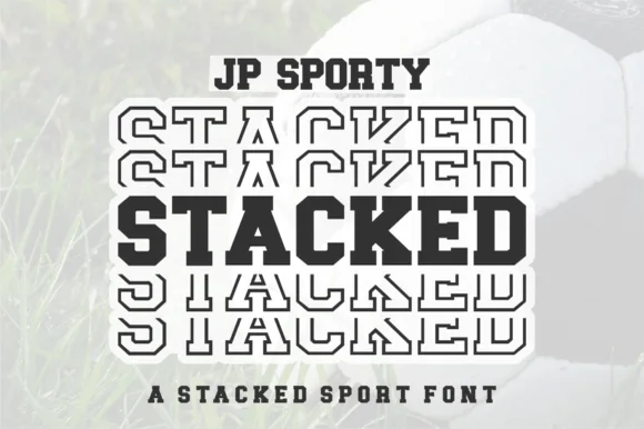
Clipped varsity slab capitals repeated in outline around one solid middle row
JP Mirror repeats a red uppercase name in seven tightly stacked rows on a pale wood ground, where six rows are hollow outlines and one central row is solid red, clipped corners and squared slab feet define the letters and the P and R carry large rectangular counters.
Paid link
Get this fontProject & layout blueprintsAt-a-glance maker compatibility
Sturdy stroke walls and open counters weed cleanly on adhesive vinyl, HTV apparel film, and cut cardstock.
Visual anatomy & craft review
The blocks stay square, the corners clip, the feet square off and the rows stack so closely that the outlines nearly touch. That mirrored stack is the character: the solid centre row anchors a pattern made from outline rows, which is why the sample fills the frame edge to edge. The wood ground is presentation, and the format caption is not a cutting test. Keep 44 pt so the outlines stay separate, check that the outline version is a separate member and proof a cut file before promising a decal.
Clipped varsity slab capitals repeated in outline around one solid middle row
Two-font hierarchy recipes
Tested contrast partners — pairing JP Mirror with grounded secondary typography.
JP Mirror + Homies
Lets JP Mirror own the focal silhouette while handling secondary copy, sizing and subheads cleanly.
Inspect Homies specimen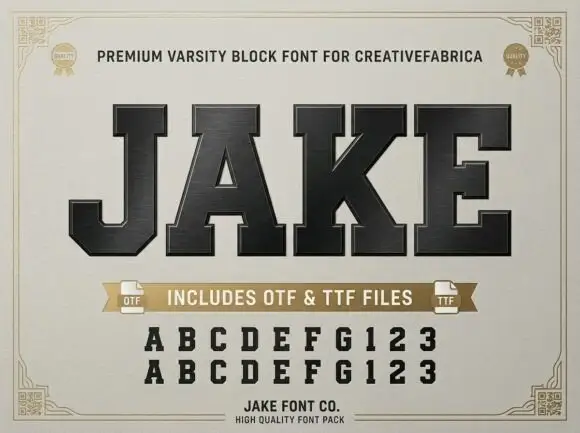
JP Mirror + Jake
Grounds bold display lettering with classic typographic authority on posters, badges and apparel.
Inspect Jake specimenPractical applications
Concrete hierarchy, scale and production guidance tailored to JP Mirror’s stroke geometry.
The mirrored stack makes a bold shirt back print, and the solid centre row keeps the team name readable inside the pattern.
Hierarchy & layout recipe
Print a 300 mm back panel: set five outline rows at 46 mm and one solid row at 52 mm, keep 4 mm of clear space between rows, and keep 20 mm of margin from each seam.
Pre-production check
Outline rows blur when cut in vinyl; check the cut file and keep every outline stroke above 2 mm.
The stacked pattern fills a gym opening poster, and the single solid row gives the eye an anchor in the middle of the block.
Hierarchy & layout recipe
Print an A2 poster: set four outline rows at 60 mm and one solid row at 70 mm, keep 8 mm between rows, keep 28 mm of clear ground beneath before the date at 18 pt, and keep 24 mm of border.
Pre-production check
Tight row spacing can merge at press size; check a scaled proof before the poster is printed.
The blocky stack reads from a distance, and the alternating solid and outline rows give a plain sports camp name some rhythm.
Hierarchy & layout recipe
Print a 700 by 300 mm panel: set three rows at 54 mm with the centre solid, keep 10 mm between rows, keep 24 mm of clear ground beneath, and keep 26 mm of border all round.
Pre-production check
The wood ground is cover art only; check the panel artwork before planning a printed texture.
Technical & licence verification
Confirm included OTF/TTF/WOFF formats, full glyph tables and licence coverage on the live store page before batch production.
Closest visual alternatives
Matched across letterform anatomy, stroke behaviour and craft applications.
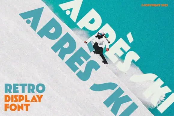
Heavy angular capitals with small round counters and a detached acute accent
Apres Ski sets a retro grotesque at a steep angle across a snowy slope, its capitals wide, its corners notched and its counters cut with shapes that look borrowed from ski graphics of the seventies.
Ideas for this font
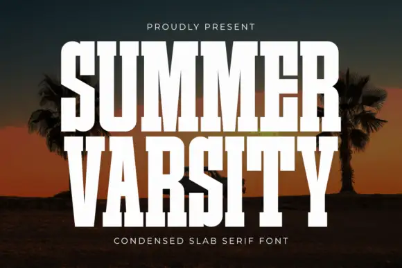
Condensed varsity slab
Summer Varsity is a condensed varsity slab in white on a sunset photograph of palms: tall narrow caps with heavy flat serifs, a high waist and narrow counters, set in two stacked lines with small tracked captions above and below, so the block reads as a team banner.
Ideas for this font
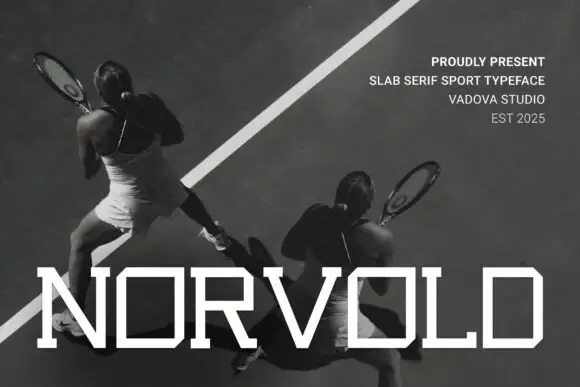
Thin wide geometric slab
Novoid is a thin wide geometric slab in white over a black-and-white photograph of tennis players: capitals with square bowls, small slab ends and thin even strokes, set as one large word across the foot with a four-line credits block at the upper right.
Ideas for this font
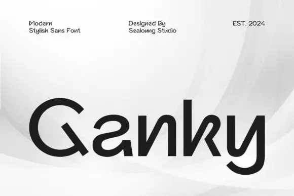
Geometric mixed case with reversed-looking a curves and angular open n and k forms
Ganky draws a modern geometric sans with wide round bowls, cut joins and a few letters that open where the join should close, so a short name looks engineered rather than drawn.
Ideas for this font
Same independent foundry
Allow optional Google Analytics to measure visits and catalogue actions. Your search words and notes are not included. Privacy & storage