Neutral Sans Workhorse

Tattoo Master + Base Edge
Lets Tattoo Master own the focal silhouette while handling secondary copy, sizing and subheads cleanly.
Inspect Base Edge specimenDisclosure: MakerFileHub may earn a commission from qualifying purchases via paid links on this page. How our links work.
Ornamental label capitals
Tattoo Master is a tall ornamental label display in magenta and teal on near-black: capitals with inset parallel lines, pointed spurs and a heavy outline, plus a small arched line above and a second line beneath, framed by a moth, roses and a plain yellow strip at the foot.
Paid link
Get this fontProject & layout blueprintsAt-a-glance maker compatibility
Sturdy stroke walls and open counters weed cleanly on adhesive vinyl, HTV apparel film, and cut cardstock.
Visual anatomy & craft review
The plate is a tattoo flash sheet, and the ornaments belong to the same tradition as the letters: the moth in the centre and the roses at the sides are drawn in the same line weight as the capitals, so the word and the imagery read as one engraved plate. The drawing is a tall label capital with an inset line and pointed spurs, which sets a moderate size floor, because the inset fills first, and the plate sets the words large enough that the inset reads as a fine line rather than as a tone. The arched line above and the line beneath are product copy in the same style, and the yellow strip names a bonus. It suits a shirt, a patch and a sign.
Display, label, ornamental, vintage
Two-font hierarchy recipes
Tested contrast partners — pairing Tattoo Master with grounded secondary typography.
Tattoo Master + Base Edge
Lets Tattoo Master own the focal silhouette while handling secondary copy, sizing and subheads cleanly.
Inspect Base Edge specimen
Tattoo Master + The Lumina Awesome
Grounds bold display lettering with classic typographic authority on posters, badges and apparel.
Inspect The Lumina Awesome specimenPractical applications
Concrete hierarchy, scale and production guidance tailored to Tattoo Master’s stroke geometry.
An ornamental label face prints as flash art, and the inset line reads on a dark shirt where a plain display would look flat.
Hierarchy & layout recipe
Print a 280 mm chest graphic: the studio at 60 mm cap height, the year at 24 mm, and three inks on a dark shirt. Keep the inset line at 1.5 mm and place the graphic 80 mm below the collar.
Pre-production check
Check the screen at actual mesh, where a 1.5 mm inset can fill; thicken it to 2 mm. Wash-test one shirt and confirm the spurs stay pointed after five cycles.
An ornamental sign reads as traditional craft, and the pointed spurs hold on a window in vinyl at night. It reads as a trade sign.
Hierarchy & layout recipe
Cut 900 by 320 mm vinyl: the shop at 110 mm cap height, the line in a 22 mm serif, and a 4 mm contour. Keep 25 mm margins and apply to a clean pane at dusk so bubbles show.
Pre-production check
Check the cut at 110 mm, where a 4 mm spur can tear on weeding; widen it to 6 mm. Confirm the 22 mm line reads at two metres and that the inset stays even.
An ornamental label gives a small bottle presence on a shelf, and the inset line survives a small die where a hairline would not.
Hierarchy & layout recipe
Print a 45 by 80 mm label: the brand at 12 pt, the heat level at 8 pt, and three colours on a coated stock. Keep 4 mm inside the die and keep the inset above 0.4 mm.
Pre-production check
Check the 12 pt brand on a small die, where the inset can close; keep it above 0.4 mm. Confirm the 8 pt heat level reads at arm's length and that the label wipes clean.
Technical & licence verification
Confirm included OTF/TTF/WOFF formats, full glyph tables and licence coverage on the live store page before batch production.
Closest visual alternatives
Matched across letterform anatomy, stroke behaviour and craft applications.
Heavy rounded logo display
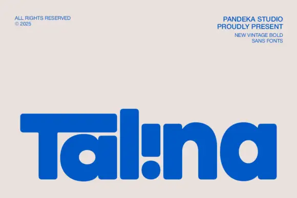
Talina is a heavy rounded display in royal blue on a pale sheet: a short name set in very heavy rounded letters with an extended T arm, wide round bowls and an inverted dot-and-stem i that reads as a cut counter, with three small credits in the corners.
Ideas for this font
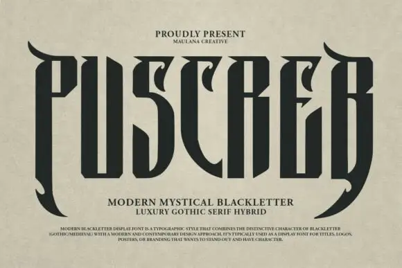
Tall narrow display with curved blades
Puscreb is a very tall narrow display in near-black on an aged paper ground: capitals with curved blades at the outer edges, deep pointed shoulders and narrow bodies, set as one large word above two plain lines and a small paragraph of description.
Ideas for this font
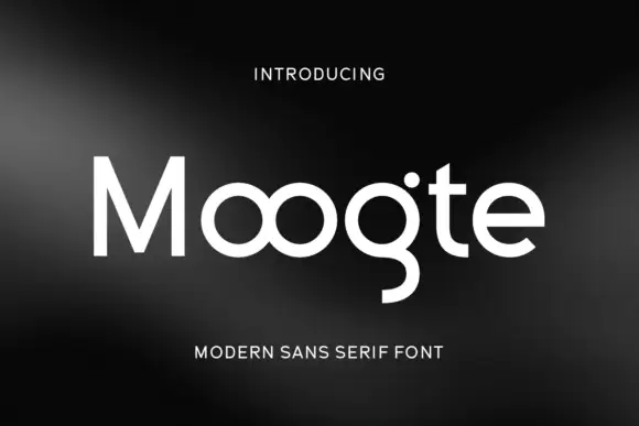
Joined circular display
Moogte is a joined circular display in white on a black ground: mixed case built from near-perfect circles, with the two o bowls fused into a single loop, a curling g descender and a cut on the t, set as one word with a small tracked line above and beneath.
Ideas for this font
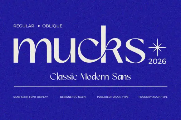
Contrast lowercase with curling arm
Mucks is a contrast lowercase in white on a saturated blue: deep rounded bowls, a curling k arm that crosses toward the following letter, a fine join between two letters and a tall ascender, with a small line above, a subtitle beneath and a credits row along the foot.
Ideas for this font
Same independent foundry
Allow optional Google Analytics to measure visits and catalogue actions. Your search words and notes are not included. Privacy & storage