Neutral Sans Workhorse

Wild Crimson + Prime Nordic
Lets Wild Crimson own the focal silhouette while handling secondary copy, sizing and subheads cleanly.
Inspect Prime Nordic specimenDisclosure: MakerFileHub may earn a commission from qualifying purchases via paid links on this page. How our links work.
Rough angular display with ligatures
Wild Crimson is a bold rough-edged display in crimson on a textured white sheet: chunky capitals with chopped corners and off-square bowls, some letters replaced by drawn ligature shapes, with a small note above and a ledged note at the left naming the ligatures.
Paid link
Get this fontProject & layout blueprintsAt-a-glance maker compatibility
Fine grain and micro-texture excel in 300 DPI print, sublimation, and screen print rather than small vinyl weeding.
Visual anatomy & craft review
The two words are stacked and the drawing is a bold display: the strokes are heavy, the corners are chopped rather than rounded, and the bowls are deliberately off-square, which gives the face a hand-painted, poster-paste character. Some letter pairs are drawn as ligatures that turn a letter into a shape, and the note at the left names them, which is the detail that matters when a buyer wants a word to read as a mark rather than as typesetting. That construction sets a size floor, because the chopped details close when the letters shrink. The textured ground and the drawn skull are staging that suits the subject. Because the letters are heavy and irregular, the face works for a title, a shirt and a poster rather than a paragraph.
Display, rough, bold, characterful
Two-font hierarchy recipes
Tested contrast partners — pairing Wild Crimson with grounded secondary typography.
Wild Crimson + Prime Nordic
Lets Wild Crimson own the focal silhouette while handling secondary copy, sizing and subheads cleanly.
Inspect Prime Nordic specimen
Wild Crimson + Things
Grounds bold display lettering with classic typographic authority on posters, badges and apparel.
Inspect Things specimenPractical applications
Concrete hierarchy, scale and production guidance tailored to Wild Crimson’s stroke geometry.
A bold rough display reads as pasted type, which suits a themed night better than a clean gothic face. Chopped corners read as intent at poster scale, not as damage.
Hierarchy & layout recipe
A2 poster: the night at 100 mm cap height, the details in a 14 mm serif, and the venue at 11 mm. Keep 30 mm margins and print two colours on a light stock.
Pre-production check
Check the A2 at five metres, where the chopped corners can read as damage; keep the cuts consistent. Confirm the 11 mm venue reads at two metres and that the ligature reads as intended.
A rough display prints in one screen and looks worn in, which suits a band shirt sold at a show. A worn face sells at a merch table where a clean one looks like stock art.
Hierarchy & layout recipe
Print a 260 mm chest graphic: the band at 60 mm cap height, the tour line at 26 mm, and one ink on a light shirt. Keep the narrowest counter at 4 mm and place the graphic 80 mm below the collar.
Pre-production check
Check the screen at actual mesh, where a 4 mm counter can fill; open the spacing. Wash-test one shirt and confirm the chopped corners stay crisp after five cycles.
A rough display gives a studio a mark with attitude, and the heavy strokes hold on a window in vinyl. The mark has to shout from across the street, and it does.
Hierarchy & layout recipe
Cut 700 by 300 mm vinyl: the studio at 100 mm cap height, the hours in a 20 mm sans, and a 4 mm contour. Keep 25 mm margins and apply to a clean pane.
Pre-production check
Check the cut at 100 mm, where a chopped corner can tear on weeding; simplify the ligature. Confirm the 20 mm hours read at two metres and that the mark clears the door frame.
Technical & licence verification
Confirm included OTF/TTF/WOFF formats, full glyph tables and licence coverage on the live store page before batch production.
Closest visual alternatives
Matched across letterform anatomy, stroke behaviour and craft applications.
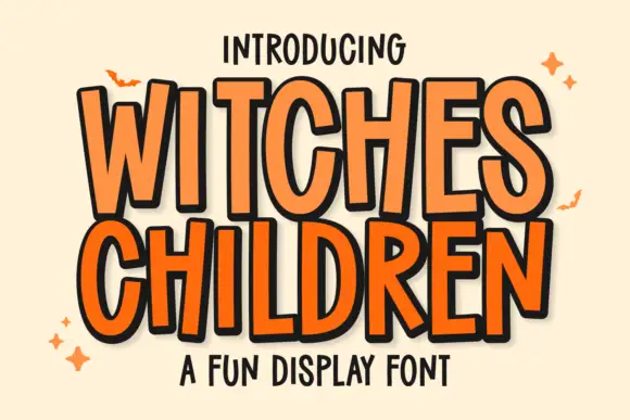
Tall uneven narrow comic capitals
Witches Children shows tall narrow capitals with rounded curves and slightly leaning stems, where the W opens a deep narrow middle, the C and D use long oval bowls and the R stays compact beside them.
Ideas for this font
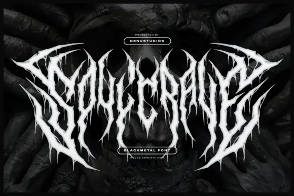
Thorn-spiked black-metal display
Soulcrave is a white black-metal display over a dark mirrored photograph: thorn-like letterforms with long spikes at the terminals, ragged drips below the shapes, mirrored halves and near-symmetrical composition, set as one word with a small presenting line above and two badges at the foot.
Ideas for this font
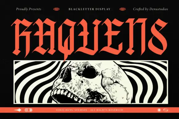
Angular blackletter display
Raquens is a tall angular blackletter in coral red on black: capitals with sharp joins, diamond-like ends on the strokes and narrow bodies, set as one large word above a framed black-and-white illustration of a skull, with a thin orange band along the foot that carries the credit.
Ideas for this font

Narrow pointed blackletter with a long straight p descender
Darkspire is a gothic blackletter display face with sharp calligraphic strokes, splattered edges and a rough texture, built for dark posters and tattoo-inspired lettering.
Ideas for this font
Same independent foundry
Allow optional Google Analytics to measure visits and catalogue actions. Your search words and notes are not included. Privacy & storage