High-Contrast Display Serif

Whiskey + Amor Hadena
Pairs sculptural editorial warmth with Whiskey's clean modern geometry.
Inspect Amor Hadena specimenDisclosure: MakerFileHub may earn a commission from qualifying purchases via paid links on this page. How our links work.
Handmade rounded condensed display
Whisky is a handmade rounded display in black on off-white: heavy condensed caps with soft corners, a Y that drops a curled tail, an S with a flat spine, and a slight lean, so the word reads as lettering cut from card rather than as a drawn typeface.
Paid link
Get this fontProject & layout blueprintsAt-a-glance maker compatibility
Sturdy stroke walls and open counters weed cleanly on adhesive vinyl, HTV apparel film, and cut cardstock.
Visual anatomy & craft review
The word is set once, large, and the drawing is a heavy condensed sans with the edges softened: the stems are thick, the counters narrow, and the corners are rounded just enough to take the hardness off, which is what gives the face its handmade quality. Two letters break the pattern, the Y with a tail that curls under the following letter and the S with a spine that stays flat, and those exceptions are what keep the word from reading as a generic bold sans. Spacing is tight, so the letters form a block, and the counters stay open enough that the face holds at label size. The ground is a white studio backdrop with two small tracked captions in a light roman, above and below, so the specimen is almost entirely about the drawing.
Handmade, rounded, condensed, bold
Two-font hierarchy recipes
Tested contrast partners — pairing Whiskey with grounded secondary typography.
Whiskey + Amor Hadena
Pairs sculptural editorial warmth with Whiskey's clean modern geometry.
Inspect Amor Hadena specimen
Whiskey + Silken Luxe
Introduces organic movement on pull-quotes, signatures and gift tags.
Inspect Silken Luxe specimenPractical applications
Concrete hierarchy, scale and production guidance tailored to Whiskey’s stroke geometry.
A handmade condensed display reads as a label printed in small batches, and the narrow letters fit a long product name onto a bottle where a wide sans would have to wrap.
Hierarchy & layout recipe
Print a 70 by 100 mm label: the product at 22 pt, the age statement in a 7 pt roman, and the volume at 6 pt. Keep 6 mm clear inside the die and print one ink on an uncoated stock so the rounded edges read.
Pre-production check
Check the 22 pt product on uncoated stock, where the soft corners can fill; keep the size above 18 pt. Confirm the 6 pt volume reads on the shelf and that the condensed letters stay distinct at that size.
A heavy condensed display fits a long event name on a banner without shrinking the height, and the rounded edges keep the tone relaxed rather than corporate.
Hierarchy & layout recipe
Print 800 by 400 mm: the event name at 140 mm cap height, the times in a 28 mm sans, and a 5 mm rule. Keep 25 mm margins and print one colour on a pale ground so the counters stay open.
Pre-production check
Check the banner at five metres, where the narrow counters can close into slits; open the tracking slightly. Confirm the 28 mm times read at three metres and that the curled tail of the Y does not touch the rule.
A handmade display gives a guide a cover that looks printed by a small press, and the condensed width lets the title hold the top of a cover while a bottle photograph fills the rest.
Hierarchy & layout recipe
Set the title at 150 mm cap height across 210 mm, the subtitle in a 10 pt roman, and the publisher at 8 pt. Keep the title in the upper third and let the photograph run full bleed beneath it.
Pre-production check
Check the title at 150 mm, where the soft corners can look blurred on uncoated stock; proof the cover. Confirm the 10 pt subtitle reads at newsstand distance and that the title holds at thumbnail size online.
Technical & licence verification
Confirm included OTF/TTF/WOFF formats, full glyph tables and licence coverage on the live store page before batch production.
Closest visual alternatives
Matched across letterform anatomy, stroke behaviour and craft applications.
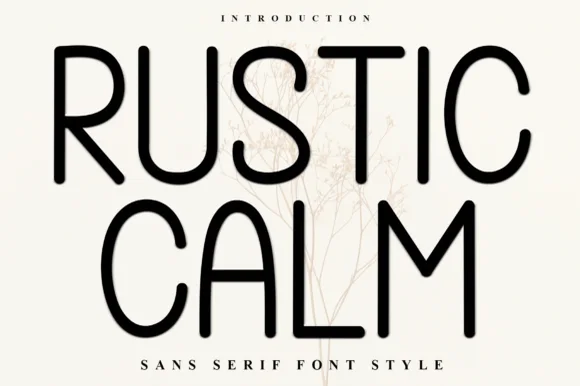
Clean tall rounded monoline geometric sans serif
Rustic Calm is a serene, 100% smooth tall monoline sans serif (zero rustic distressing!) with rounded terminals and wide open bowls.
Ideas for this font
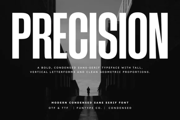
Tall ultra-condensed geometric headline grotesk
Precision is a bold, ultra-condensed sans serif typeface with tall vertical pillars, tight flat-sided counters, and clean modernist snap.
Ideas for this font
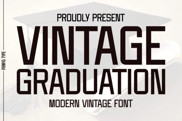
Condensed modern vintage sans
Vintage Graduation is a condensed sans in near-black on a pale ground, set over a graduation cap: tall narrow caps with flat terminals, a high waist, closed counters and tight spacing, arranged on two lines with a tracked label above and beneath in the same face.
Ideas for this font
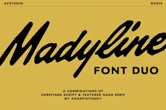
Unrefined brush script with a textured sans
Madyline is a duo in black on ochre: an unrefined brush script with heavy rough strokes and a slanted body, and a plain capital sans that sits beneath it in the same ink, presented as a combination rather than two separate products.
Same independent foundry
Allow optional Google Analytics to measure visits and catalogue actions. Your search words and notes are not included. Privacy & storage