High-Contrast Display Serif

Madyline + Svara
Pairs sculptural editorial warmth with Madyline's clean modern geometry.
Inspect Svara specimenDisclosure: MakerFileHub may earn a commission from qualifying purchases via paid links on this page. How our links work.
Unrefined brush script with a textured sans
Madyline is a duo in black on ochre: an unrefined brush script with heavy rough strokes and a slanted body, and a plain capital sans that sits beneath it in the same ink, presented as a combination rather than two separate products.
Paid link
Get this fontProject & layout blueprintsAt-a-glance maker compatibility
Weld or Unite overlapping script joins into one continuous vector path before sending to the blade.
Visual anatomy & craft review
The pairing is deliberate: the script runs across the full width with a heavy brush stroke that frays at the ends, the letters lean hard and the joins are tight, while the sans beneath is a clean narrow capital set with even spacing. One face supplies the movement and the other supplies the structure, which is what makes the pair work on a label where a name has to shout and a specification has to be read. Both are set in one ink, so the sheet reads as a single design rather than a catalogue, and small tracked lines at the top and foot name the studio and the year. Madyline is a duo for packaging, labels and apparel, and it needs a wide measure for the script and short words for the sans line.
A rough brush script over a plain capital line
Two-font hierarchy recipes
Tested contrast partners — pairing Madyline with grounded secondary typography.
Madyline + Svara
Pairs sculptural editorial warmth with Madyline's clean modern geometry.
Inspect Svara specimen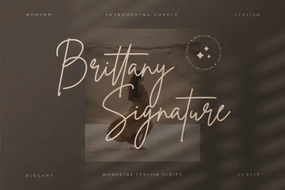
Madyline + Brittany Signature Script
Introduces organic movement on pull-quotes, signatures and gift tags.
Inspect Brittany Signature Script specimenPractical applications
Concrete hierarchy, scale and production guidance tailored to Madyline’s stroke geometry.
A rough script over a clean capital line gives a bottle two registers, and the pair covers the name and the heat level without a third purchase.
Hierarchy & layout recipe
Print a 50 by 80 mm label: set the brand at 16 pt in the script, set the heat at 7 pt in the sans with 6 mm of clear ground, and hold 4 mm of margin on all four sides of the label.
Pre-production check
A frayed brush edge fills in on a coated label; print one on the real material and check the splits before the order.
The script reads at a distance and the sans carries the practical line, which is exactly the split a market sign needs to do in one glance.
Hierarchy & layout recipe
Print a 600 by 400 mm board: set the market name at 96 pt in the script, set the times at 26 pt in the sans with 24 mm of clear ground, and hold 22 mm of border on all four sides.
Pre-production check
A rough script scaled to a board can look damaged; print one at the final size and judge the texture before the set.
A textured brush script and a plain sans both survive screen printing, and the two-colour layout is easy to separate for a small run.
Hierarchy & layout recipe
Print a 260 by 300 mm chest graphic: set the name at 66 pt in the script, set the line at 14 pt in the sans with 14 mm of clear ground, and check the print area on the smallest shirt in the run.
Pre-production check
A thin sans can fill on a cotton weave; print one sample on the real shirt and check the letters before the batch.
Technical & licence verification
Confirm included OTF/TTF/WOFF formats, full glyph tables and licence coverage on the live store page before batch production.
Closest visual alternatives
Matched across letterform anatomy, stroke behaviour and craft applications.
Handmade rounded condensed display
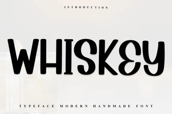
Whisky is a handmade rounded display in black on off-white: heavy condensed caps with soft corners, a Y that drops a curled tail, an S with a flat spine, and a slight lean, so the word reads as lettering cut from card rather than as a drawn typeface.
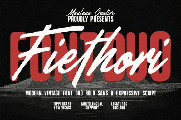
Heavy soft-cornered retro block sans + fast street-brush script duo
Fiethori is a punchy retro-streetwear font duo slamming a massive soft-cornered block sans behind an energetic slanted brush script (Multilingual + Ligatures)!
Ideas for this font
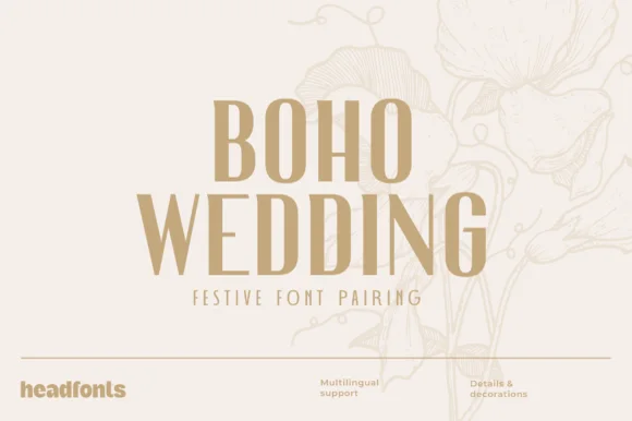
Tall condensed Art-Deco serif & ultra-light geometric sans duo
Boho Wedding Duo pairs a tall, sculptural Art-Deco high-contrast display serif with a whisper-light geometric sans plus decorative extras.
Ideas for this font
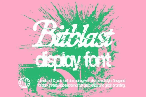
Pixel-glitch distressed Y2K serif & sans font duo
Bitblastserif Regular (Bitblast) is an edgy neo-Y2K font duo pairing a pixelated-edge italic serif with a matching bit-crunched sans!
Ideas for this font
Same independent foundry
Allow optional Google Analytics to measure visits and catalogue actions. Your search words and notes are not included. Privacy & storage