Neutral Sans Workhorse

Better Silent + Kohilo
Lets Better Silent own the focal silhouette while handling secondary copy, sizing and subheads cleanly.
Inspect Kohilo specimenDisclosure: MakerFileHub may earn a commission from qualifying purchases via paid links on this page. How our links work.
Spurred Victorian Tuscan & Western saloon display
Better Silent is a bold Victorian-Tuscan display font (more saloon-Victorian than medieval blackletter) armed with bifurcated spurs and curls.
Paid link
Get this fontProject & layout blueprintsAt-a-glance maker compatibility
Sturdy stroke walls and open counters weed cleanly on adhesive vinyl, HTV apparel film, and cut cardstock.
Visual anatomy & craft review
Better Silent is a spurred Victorian Tuscan display in which the stems carry a medial spur and the caps are ornamented with split serifs, small spurs and a hollowed centre stroke on some letters. The ornament sits on the silhouette, so the word box widens and the smallest spur is what closes first. It needs roughly 32 mm for the spur and the split serif to read, and it is best in one dense ink on cream or a warm sand ground, with the hollow stems kept open on uncoated stock.
Victorian-saloon · Spurred · Bold
Two-font hierarchy recipes
Tested contrast partners — pairing Better Silent with grounded secondary typography.
Better Silent + Kohilo
Lets Better Silent own the focal silhouette while handling secondary copy, sizing and subheads cleanly.
Inspect Kohilo specimen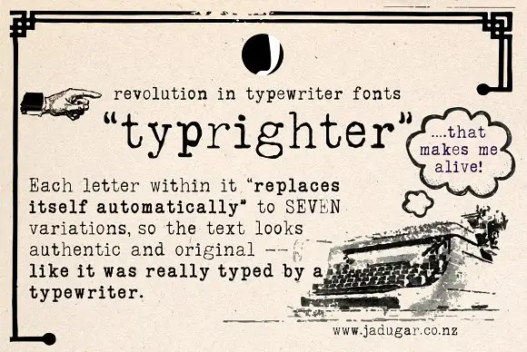
Better Silent + Typrighter
Grounds bold display lettering with classic typographic authority on posters, badges and apparel.
Inspect Typrighter specimenPractical applications
Concrete hierarchy, scale and production guidance tailored to Better Silent’s stroke geometry.
A spurred Tuscan reads as a Victorian saloon sign rather than a modern bar logo, which is what a themed venue wants on its mirror and its bottle. The split serifs give the name ornament at 34 mm, and one dark ink on a warm ground keeps the hollow stems open where a reversed print would close them.
Hierarchy & layout recipe
Mirror decal 600 x 300 mm, word 100 mm with 12 mm spur clearance, 25 mm margins. Bottle label 90 x 70 mm, word 20 mm, 5 mm margins. Card 85 x 55 mm, word 14 mm, 5 mm margins.
Pre-production check
Reversed white out of a dark label at 20 mm the hollowed centre stroke fills and the name reads as a solid plate. Print the label dark on light or raise the word to 26 mm, and check one label on the bottle before the run.
A spurred Victorian display reads as a period signboard rather than a modern horror flyer, which is what a themed fright night wants at the entrance. The spurs and the hollow stems give the title menace at 120 mm, and one ink on aged paper prints the poster, the ticket and the tin label as a set.
Hierarchy & layout recipe
Poster A2, word 130 mm with 14 mm spur clearance, times 40 mm, 20 mm margins. Ticket 100 x 50 mm, word 14 mm, 4 mm perforation. Tin label 120 x 80 mm, word 20 mm, 6 mm die margin.
Pre-production check
A 100 x 50 mm ticket at 14 mm closes the split serif into a blob and the word loses its Victorian character at reading distance. Raise the ticket word to 18 mm or use fewer letters, and check one printed ticket before the batch.
A spurred Tuscan reads as a printed handbill from an old harvest social, which is exactly the tone a community autumn event wants. The ornamented caps hold at 90 mm across a poster, and one warm ink on sand prints the poster, the tickets and the pie-box label without a second plate.
Hierarchy & layout recipe
Poster A2, word 110 mm with 12 mm spur clearance, details 34 mm, 20 mm margins. Ticket 100 x 50 mm, word 14 mm, 4 mm perforation. Pie-box label 90 x 60 mm, word 16 mm, 5 mm margins.
Pre-production check
On a 90 x 60 mm box label at 16 mm the 0.4 mm spur touches the paper edge and gets trimmed off with the dieline. Keep the word inside a 5 mm die margin, and cut one label from the actual dieline before the batch.
Technical & licence verification
Confirm included OTF/TTF/WOFF formats, full glyph tables and licence coverage on the live store page before batch production.
Closest visual alternatives
Matched across letterform anatomy, stroke behaviour and craft applications.
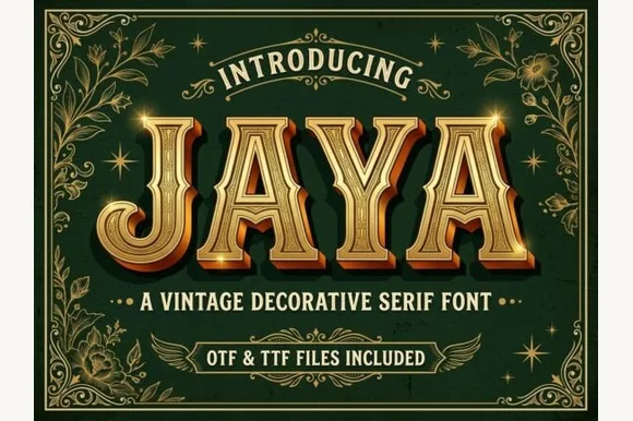
3D chiseled gold Western saloon & Victorian Tuscan serif (OTF & TTF)
Jaya is an opulent Western saloon & Victorian Tuscan display font sporting sharp median spurs and chiseled golden bevels (OTF & TTF)!
Ideas for this font
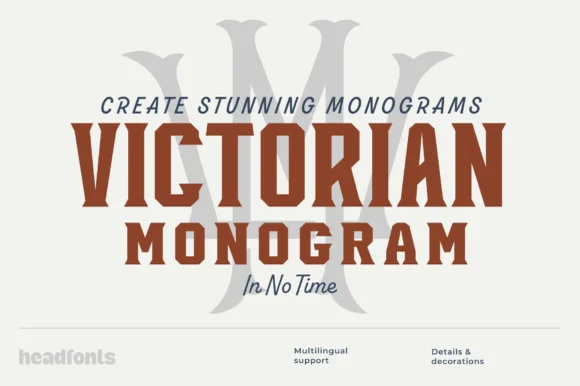
Condensed bold serif for monograms
Victorian Monogram is a condensed bold serif in brick red: tall narrow capitals with sharp bracketed serifs, a high waist, a tight inner counter and flat terminals, shown over a large ghosted monogram letter with a script accent line beneath, so the plate reads as a monogram kit.
Ideas for this font
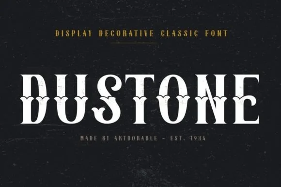
Weathered Victorian Tuscan saloon & gravestone serif
Dustone is a bold vintage Tuscan display serif combining split fishtail serifs, diamond median spurs, and subtle stone-worn texture.
Ideas for this font
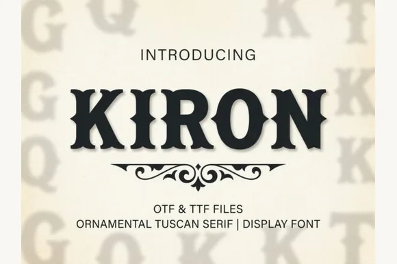
Classic median-spurred Western Tuscan slab-serif
Kiron is a clean, heavy Western Tuscan display serif with crisp diamond median spurs, flared bracketed serifs, and solid single-layer geometry.
Ideas for this font
Same independent foundry
Allow optional Google Analytics to measure visits and catalogue actions. Your search words and notes are not included. Privacy & storage