Modern Grotesque Body

Western Sports + Clyne Sans
Creates crisp high-hierarchy contrast beneath Western Sports headlines across menus, websites and labels.
Inspect Clyne Sans specimenDisclosure: MakerFileHub may earn a commission from qualifying purchases via paid links on this page. How our links work.
Layered distressed jersey sports display
Western Sports is a layered jersey display shown in two weights of wear: a tan line with light distress and a much larger cream line with heavy pitting, both built on the same wide slab skeleton and printed on a dark leather ground.
Paid link
Get this fontProject & layout blueprintsAt-a-glance maker compatibility
Fine grain and micro-texture excel in 300 DPI print, sublimation, and screen print rather than small vinyl weeding.
Visual anatomy & craft review
The two words share a skeleton: wide caps with big triangular slab serifs, thick stems and a nearly square O, which is the athletic lettering of a team jersey. What changes between them is the wear, because the upper word carries a light speckle and the lower word is eaten away in large flakes, so the pair demonstrates the range the cut offers rather than two different faces. The lower word is set much larger and nearly touches the edges, which gives the composition its hierarchy, and the tracking is tight so the serifs of adjacent letters almost meet. The ground is a dark textured brown that reads as leather or felt, and the supporting lines are spaced capitals in the same family at a small size, so the specimen stays inside one voice from top to bottom.
Athletic, distressed, layered, gritty
Two-font hierarchy recipes
Tested contrast partners — pairing Western Sports with grounded secondary typography.
Western Sports + Clyne Sans
Creates crisp high-hierarchy contrast beneath Western Sports headlines across menus, websites and labels.
Inspect Clyne Sans specimen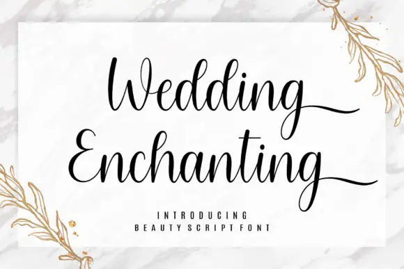
Western Sports + Wedding Enchanting
Adds a warm human signature touch for 1-to-3-word callouts without competing against structured serif capitals.
Inspect Wedding Enchanting specimenPractical applications
Concrete hierarchy, scale and production guidance tailored to Western Sports’s stroke geometry.
A layered distressed jersey face reads as team kit from the gate, and using the lighter wear for the small lines keeps the details legible while the headline carries the grit.
Hierarchy & layout recipe
Print 1,500 by 700 mm: the main word at 300 mm cap height in the heavy wear, the school name in the light wear at 60 mm, and the date at 30 mm. Keep the distressed areas at least 200 mm from the eyelets so no hole lands on a fixing point.
Pre-production check
Check the heavy wear at full size, where flaking that reads as texture on screen can look like damage on a banner; proof the actual material. Confirm the 60 mm school name stays legible and that the 30 mm date sits outside the distress's darkest patches.
A jersey face with two wear levels lets one screen print look like a garment that has been through a season, which is the point of a vintage team line.
Hierarchy & layout recipe
Print a 300 mm chest graphic: the team word at 80 mm in the heavy wear, the town in the light wear at 16 mm beneath, and a 2 mm keyline around the pair. Use one ink on a dark shirt so the wear shows as the shirt colour coming through.
Pre-production check
Check the screen at actual mesh, where the heavy wear needs a lower mesh to hold the flakes; confirm the shop burns two screens for the two wear levels. Wash-test one shirt and verify the flakes do not grow until the word stops reading.
An athletic slab with real wear suits an outdoor event that wants the look of painted plywood, and the two wear levels give the sign a hierarchy without a second colour.
Hierarchy & layout recipe
Print a 1,000 by 600 mm board: the event word at 220 mm in the heavy wear, the town and date in the light wear at 40 mm, and a 10 mm border at 35 mm from the edge. Keep the border solid so the wear does not seem to eat the frame.
Pre-production check
Check the border and the wear together, where a distressed letter next to a solid rule can look like a mistake; keep 12 mm between the two. Confirm the 40 mm lines read from eight metres and that the board's mounting points clear the lettering.
Technical & licence verification
Confirm included OTF/TTF/WOFF formats, full glyph tables and licence coverage on the live store page before batch production.
Closest visual alternatives
Matched across letterform anatomy, stroke behaviour and craft applications.
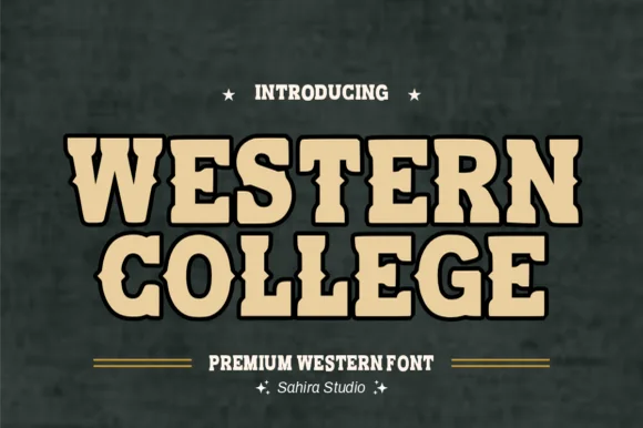
Collegiate-meets-frontier spurred athletic slab serif
Western College fuses stout collegiate varsity block slabs with pointed frontier waist spurs for Texas/Montana campus and rodeo gear.
Ideas for this font
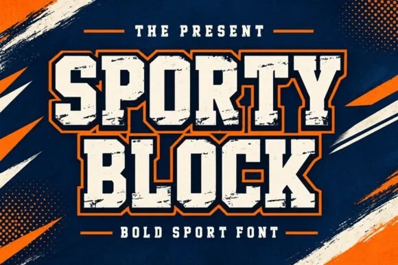
Heavy chamfered collegiate varsity block slab
Sporty Block is a classic heavy collegiate athletic slab serif built for 2- and 3-color layered jersey outlines, banners, and spirit wear.
Ideas for this font
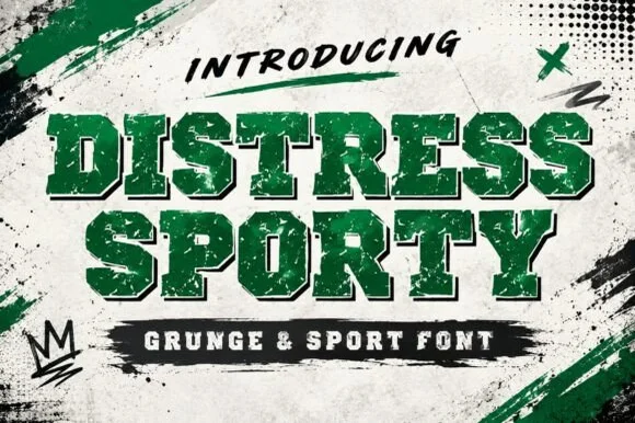
Heavy cracked-plastisol grunge varsity slab serif
Distress Sporty is a rugged collegiate varsity slab serif pre-weathered with cracked plastisol-ink splits and rough turf grit.
Ideas for this font
Softly rounded vintage collegiate fleece slab serif
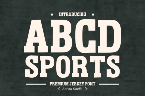
Abcd Sports is a clean, softly rounded athletic slab serif channeling 1980s Russell/Champion reverse-weave sweatshirt lettering.
Ideas for this font
Same independent foundry
Allow optional Google Analytics to measure visits and catalogue actions. Your search words and notes are not included. Privacy & storage