Editorial Serif Anchor

Black Letter + Lumera Editorial
Anchors Black Letter's fluid strokes with crisp Roman proportions on wedding suites, headers and packaging.
Inspect Lumera Editorial specimenDisclosure: MakerFileHub may earn a commission from qualifying purchases via paid links on this page. How our links work.
Old script display with quill-like thick and thin strokes
Black Letter is an old script display in which the strokes swell on the downstroke, the capitals carry hooked ascenders and the joins break, so a word reads as something written with a quill on laid paper.
Paid link
Get this fontProject & layout blueprintsAt-a-glance maker compatibility
Weld or Unite overlapping script joins into one continuous vector path before sending to the blade.
Visual anatomy & craft review
The B opens a hooked capital, the l rises into a pointed ascender, the a closes a small bowl, the c turns a broken crescent, the k splays two strokes and the T spreads a cross-shaped arm, all at a calligraphic contrast with pointed entry strokes and a slight forward lean. The broken join is the character: the face does not connect every letter, which is why the sample sets two words with air between them and lets the pointed ascenders carry the rhythm. Because the hairlines are fine, the face needs 26 pt upward and a smooth stock, and it prints best in one dark ink. The parchment, the quill, the wax seal and the small centred lines are presentation; the black script words are the face.
Old script · Calligraphic · Quill
Two-font hierarchy recipes
Tested contrast partners — pairing Black Letter with grounded secondary typography.
Black Letter + Lumera Editorial
Anchors Black Letter's fluid strokes with crisp Roman proportions on wedding suites, headers and packaging.
Inspect Lumera Editorial specimen
Black Letter + Helina
Keeps small-scale dates, URLs, nutrition facts and care instructions crisp and legible below script titles.
Inspect Helina specimenPractical applications
Concrete hierarchy, scale and production guidance tailored to Black Letter’s stroke geometry.
The quill contrast gives a formal invitation a hand-written feel, and the pointed ascenders hold both names at 28 pt on a smooth card.
Hierarchy & layout recipe
Print a 130 by 180 mm card: set both names at 28 pt on two lines with 1.5 line spacing, set the details in an 8 pt caps serif beneath, and keep 20 mm of margin for the hooked capitals.
Pre-production check
Hooked ascenders on stacked lines collide at tight leading; check the printed card and open the spacing before reducing the size.
The old script register suits a small letterpress studio, and the broken joins between letters stay open at 20 pt on a paper label.
Hierarchy & layout recipe
Print a 70 by 45 mm label: set the shop name at 20 pt, set the address in a 6 pt serif beneath, and keep 5 mm from the die so the pointed ascender is not clipped.
Pre-production check
A pointed ascender cut by a die loses its tip; check the imposed label and lower the word 2 mm.
The quill script marks a period feature without a literal blackletter, and the fine hairlines hold at 44 pt on an uncoated page.
Hierarchy & layout recipe
Print an A4 opener: set the title at 44 pt across the upper third, set the standfirst in a 10 pt serif beneath, and keep 20 mm of clearance so the ascenders have air.
Pre-production check
Fine hairlines on an uncoated sheet break at 44 pt; check the proof and keep the title at 50 pt or specify a smoother sheet.
Technical & licence verification
Confirm included OTF/TTF/WOFF formats, full glyph tables and licence coverage on the live store page before batch production.
Closest visual alternatives
Matched across letterform anatomy, stroke behaviour and craft applications.
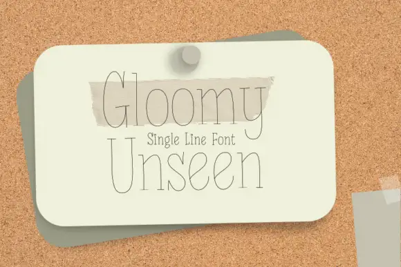
Single-line display serif drawn as one even hairline contour
Gloomy Unseen is a single-line display serif in which every letter is drawn as one even hairline, the serifs thin to points and the bowls stay wide open, so a two-word title reads as a pencil sketch rather than a printed line.
Ideas for this font

Tall fine script with large heart outlines
Autography sets a narrow handwritten word framed by a large heart at the right and a smaller heart above the opening letters, where the capital A carries a long thin diagonal and a looping lower stroke, a broad cross stroke runs across the upper middle and the final y descends deeply beside the large heart.
Ideas for this font

Tall condensed handwriting with light shadow
Simple Planner is a tall condensed hand-drawn display in near-black on a pale desk: narrow letters with blunt ends, a small light shadow and a level rhythm, drawn as two uppercase rows.
Ideas for this font
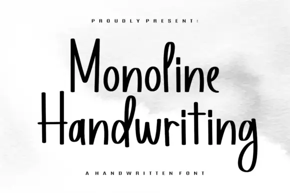
Tall narrow monoline hand
Monoline Handwriting is a tall narrow hand in black on white: fine even strokes, high ascenders, a small x-height and a quick forward rhythm that keeps an eleven-letter word inside a card.
Ideas for this font
Same independent foundry
Allow optional Google Analytics to measure visits and catalogue actions. Your search words and notes are not included. Privacy & storage