Modern Grotesque Body

Distress Sporty + Corven
Creates crisp high-hierarchy contrast beneath Distress Sporty headlines across menus, websites and labels.
Inspect Corven specimenDisclosure: MakerFileHub may earn a commission from qualifying purchases via paid links on this page. How our links work.
Heavy cracked-plastisol grunge varsity slab serif
Distress Sporty is a rugged collegiate varsity slab serif pre-weathered with cracked plastisol-ink splits and rough turf grit.
Paid link
Get this fontProject & layout blueprintsAt-a-glance maker compatibility
Fine grain and micro-texture excel in 300 DPI print, sublimation, and screen print rather than small vinyl weeding.
Visual anatomy & craft review
Distress Sporty is a heavyweight varsity slab pre-weathered with cracked plastisol splits and turf grit, so the face reads as a print that has been through a season. The slabs are massive with generous counters, which keeps a word legible while the cracks break the surface, and the distress is internal rather than an edge effect. It needs roughly 25 mm for the cracks to read as ink rather than dirt, and it is at its best in one colour on a garment where the print will actually crease in wear.
Cracked-ink · Locker-room · Vintage-turf
Two-font hierarchy recipes
Tested contrast partners — pairing Distress Sporty with grounded secondary typography.
Distress Sporty + Corven
Creates crisp high-hierarchy contrast beneath Distress Sporty headlines across menus, websites and labels.
Inspect Corven specimen
Distress Sporty + Wishful Women
Adds a warm human signature touch for 1-to-3-word callouts without competing against structured serif capitals.
Inspect Wishful Women specimenPractical applications
Concrete hierarchy, scale and production guidance tailored to Distress Sporty’s stroke geometry.
Cracked plastisol is what a school shirt looks like after a season, so the face gives a new shirt history. Heavy slabs keep a long team name legible from the stand.
Hierarchy & layout recipe
Shirt print 300 x 170 mm, word 60 mm, 50 mm from the collar. Patch 110 x 45 mm, word 18 mm, 4 mm merrowed border. Banner 1500 x 400 mm, word 250 mm, 100 mm margins.
Pre-production check
A crack pattern printed on a plastisol screen closes when the ink is pressed too hot and the shirt looks new. Approve a strike-off, and keep the press at the lower end of the temperature range.
Worn slabs read as kit that has been earned, which is the register a club sells to its own members. One ink keeps a banner affordable.
Hierarchy & layout recipe
Chest print 260 x 140 mm, word 45 mm, 40 mm margins. Banner 2000 x 600 mm, word 320 mm, 120 mm margins. Sticker 80 x 50 mm, word 16 mm, 3 mm die margin.
Pre-production check
Banners printed at 720 dpi band a fine crack texture into visible steps at 320 mm. Request a 1:1 crop proof, and increase the crack scale rather than the resolution if stepping shows.
Weathered slabs suit a summer tournament where every team has been playing in the same kit for weeks. The face holds on corrugated plastic from a car.
Hierarchy & layout recipe
Shirt print 280 x 160 mm, word 55 mm, 40 mm margins. Field sign 900 x 600 mm, word 180 mm, 60 mm margins. Print 300 x 400 mm, word 80 mm, 30 mm margins.
Pre-production check
Field signs face sun and rain for a weekend and a heavy dark fill absorbs heat and warps corrugated plastic. Use a lighter ground, and check one sign after a day in direct sun.
Technical & licence verification
Confirm included OTF/TTF/WOFF formats, full glyph tables and licence coverage on the live store page before batch production.
Closest visual alternatives
Matched across letterform anatomy, stroke behaviour and craft applications.
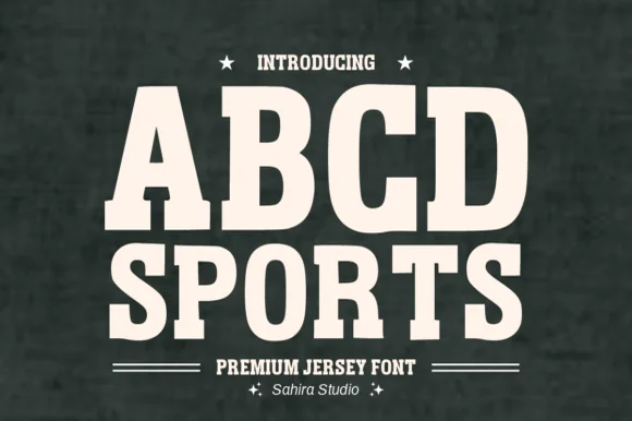
Softly rounded vintage collegiate fleece slab serif
Abcd Sports is a clean, softly rounded athletic slab serif channeling 1980s Russell/Champion reverse-weave sweatshirt lettering.
Ideas for this font
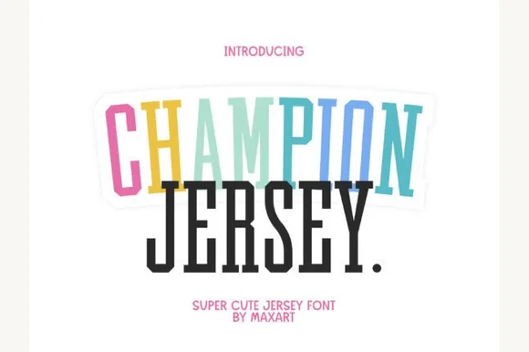
Tall extra-condensed athletic & pastel varsity slab serif
Champion Jersey is a tall, slim extra-condensed varsity slab serif packing long team names, Taylor-era tour titles, and slogans into narrow spaces.
Ideas for this font
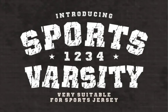
Arched distressed varsity & jersey-number slab serif
Sports Varsity is a bold, grunge-textured collegiate slab serif with matching athletic numerals ('1 2 3 4') built for vintage arched team shirts.
Ideas for this font
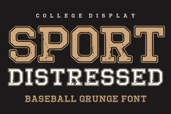
College slab block in layered grunge cuts
Sport Distressed is a college slab block shown in two treatments on one page: a tan filled cap with a thin keyline, and a white outline cap with a worn, speckled fill, both built on the same squared athletic skeleton.
Ideas for this font
Same independent foundry
Allow optional Google Analytics to measure visits and catalogue actions. Your search words and notes are not included. Privacy & storage