Modern Grotesque Body

Bronco + Monure
Creates crisp high-hierarchy contrast beneath Bronco headlines across menus, websites and labels.
Inspect Monure specimenDisclosure: MakerFileHub may earn a commission from qualifying purchases via paid links on this page. How our links work.
Tall architectural geometric spur-slab Western display
Bronco is a tall, clean-lined geometric Western slab serif pairing crisp rectangular counters with razor-sharp horizontal waist spurs.
Paid link
Get this fontProject & layout blueprintsAt-a-glance maker compatibility
Sturdy stroke walls and open counters weed cleanly on adhesive vinyl, HTV apparel film, and cut cardstock.
Visual anatomy & craft review
Bronco is a tall geometric slab with flat-sided capitals, rectangular counters and a razor-sharp horizontal spur at the waist of B, R, E and similar letters, so the Western reference comes from geometry rather than ornament. The verticals are strictly true, which makes the face behave like a modern architectural alphabet at large sizes and keeps a sign legible from a distance. Spurs are thin, so the face needs roughly 25 mm before they hold cleanly in print or vinyl. It is an all-caps display face and pairs well with a plain grotesque for practical detail.
Tall-architectural · Clean-spurred · Modern-ranch
Two-font hierarchy recipes
Tested contrast partners — pairing Bronco with grounded secondary typography.
Bronco + Monure
Creates crisp high-hierarchy contrast beneath Bronco headlines across menus, websites and labels.
Inspect Monure specimen
Bronco + Stylish
Adds a warm human signature touch for 1-to-3-word callouts without competing against structured serif capitals.
Inspect Stylish specimenPractical applications
Concrete hierarchy, scale and production guidance tailored to Bronco’s stroke geometry.
Rectangular counters and waist spurs read as machined metal rather than a decorative Western pastiche, which suits an off-road brand selling engineering. True verticals cut cleanly in vinyl and keep a gate sign readable at a hundred metres.
Hierarchy & layout recipe
Decal 400 x 120 mm, word 90 mm, 10 mm cut margin. Gate sign 1200 x 400 mm, name 300 mm, 80 mm margins, 5 mm steel substrate with 3 mm stand-off. Label 80 x 110 mm, name 16 mm, proof 4.5 pt.
Pre-production check
Vinyl on a curved vehicle panel distorts thin spurs under 1.5 mm. Increase the word size or ask the installer to test one decal on a curved scrap panel before cutting the run.
A slab with machined geometry engraves cleanly because the strokes are uniform and the counters rectangular, so a personalised flask keeps its edges after lasering. The Western reference feels like a gift for adults rather than a novelty.
Hierarchy & layout recipe
Flask 90 x 140 mm, initials 14 mm, name 8 mm, 6 mm border. Leather patch 80 x 50 mm, word 12 mm, 3 mm stitch border. Garage sign 600 x 300 mm, word 90 mm, 40 mm margins.
Pre-production check
Laser engraving on leather chars the surface and a thin spur burns wider than the artwork, closing the counter. Send a test patch first, and if the spur swells, drop the engraving to the initial letters only.
The geometric slab carries Western signage at a distance without the serif ornament that makes a fair poster look like a costume. Flat-sided capitals cut well in the reverse-printed vinyl used on fairground boards.
Hierarchy & layout recipe
Poster A2, title 200 mm, date block 24/30 pt, 30 mm margins. Fair sign 900 x 600 mm, category 120 mm, arrow 80 mm. Wayfinding 600 x 200 mm, word 70 mm on 40 mm margins.
Pre-production check
Fairground boards are printed reverse on vinyl and mounted to ply, and misalignment shows as a shadow on thin spurs. Ask the printer for the mounting tolerance and keep spurs 2 mm thick at final size.
Technical & licence verification
Confirm included OTF/TTF/WOFF formats, full glyph tables and licence coverage on the live store page before batch production.
Closest visual alternatives
Matched across letterform anatomy, stroke behaviour and craft applications.
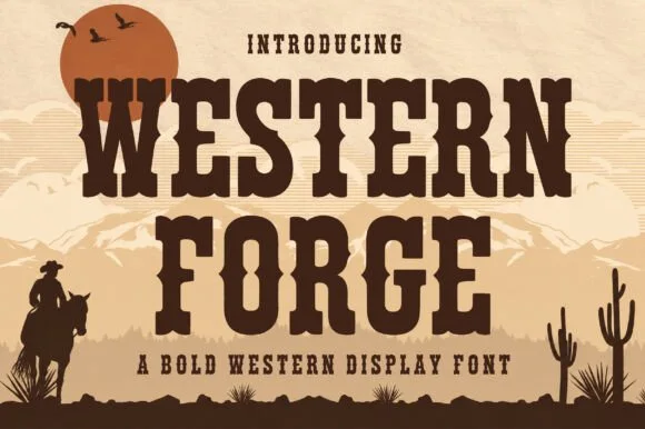
Tuscan western slab display
Western Forge is a tuscan western slab in dark brown on tan: bifurcated serifs, spurred stems, a notched crossbar on the F, and heavy bracketed slabs, set against a desert scene with a low sun, mountains and a rider, so the pair reads as a wood-type poster.
Condensed western display with heavy distress
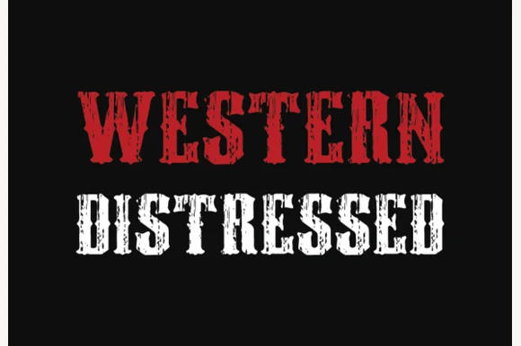
Western Distressed is a condensed western display in red and white on black: tall narrow caps with wedge serifs, thick stems, and a heavy distress that eats vertical streaks out of the letters so the word reads as a painted sign that has been outdoors for years.
Ideas for this font
Heavily weathered Wild-West woodtype & saloon slab serif
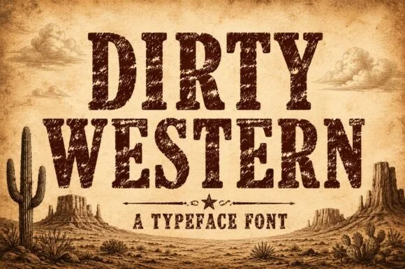
Dirty Western is a rugged frontier slab serif stamped with coarse woodblock grain, pitted distress, and classic 1880s wanted-poster authority.
Ideas for this font
Distressed western slab in a ruled frame
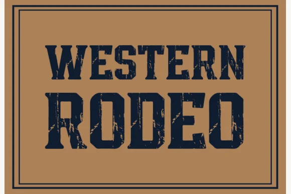
Western Rodeo is a distressed western slab in navy on tan: heavy condensed capitals with flat serifs and worn edges, printed inside a double rule frame, with the first line in a lighter weight than the second.
Ideas for this font
Same independent foundry
Allow optional Google Analytics to measure visits and catalogue actions. Your search words and notes are not included. Privacy & storage