Editorial Serif Anchor

Weekly Planner + Mewah
Anchors Weekly Planner's fluid strokes with crisp Roman proportions on wedding suites, headers and packaging.
Inspect Mewah specimenDisclosure: MakerFileHub may earn a commission from qualifying purchases via paid links on this page. How our links work.
Tall quirky rounded sans
Weekly Planner is a tall rounded sans in grey on pink: narrow upright letters with rounded terminals, an open R leg, a bowed W and a curled L, presented in two stacked lines with a tracked caption beneath, so the pair reads as a planner cover rather than a neutral sans.
Paid link
Get this fontProject & layout blueprintsAt-a-glance maker compatibility
Weld or Unite overlapping script joins into one continuous vector path before sending to the blade.
Visual anatomy & craft review
The two words are stacked and the drawing is a rounded sans pushed narrow: the stems are even, the terminals are soft, and several letters carry a drawn gesture — the W bows, the R's leg curls, the L hooks at the base — which keeps the face from reading as a generic rounded grotesque. The height is what makes it suited to planners and lists: each letter is narrow enough to fit a column while the x-height keeps the words readable at small sizes. Spacing is even and slightly loose, so the pair does not crowd, and the ground is a plain pink with two brush marks at the edges. The captions above and below are set in the same family at small size, which shows that the face works below display scale.
Rounded, tall, quirky, friendly
Two-font hierarchy recipes
Tested contrast partners — pairing Weekly Planner with grounded secondary typography.
Weekly Planner + Mewah
Anchors Weekly Planner's fluid strokes with crisp Roman proportions on wedding suites, headers and packaging.
Inspect Mewah specimen
Weekly Planner + Bargain Condensed
Keeps small-scale dates, URLs, nutrition facts and care instructions crisp and legible below script titles.
Inspect Bargain Condensed specimenPractical applications
Concrete hierarchy, scale and production guidance tailored to Weekly Planner’s stroke geometry.
A tall rounded sans reads as a planner cover rather than a corporate report, and the narrow letters fit a long title into a column without wrapping.
Hierarchy & layout recipe
Set the title at 34 pt on an A5 cover, the year in a 9 pt tracked caption, and the strapline at 8 pt. Keep 18 mm margins, print one ink plus one accent on a pale ground, and keep the title to two lines.
Pre-production check
Check the 34 pt title on an uncoated cover, where a rounded stroke can fill; keep the counters open. Confirm the 8 pt strapline reads at arm's length and that the title survives a matte lamination.
A tall rounded sans fits long subject names into narrow timetable columns, and the soft terminals keep a school sheet from looking bureaucratic.
Hierarchy & layout recipe
A4 timetable: the subjects at 11 pt, the times at 9 pt, and the days at 10 pt in caps. Keep 10 mm margins and print one ink on white so the small sizes stay crisp when photocopied.
Pre-production check
Check the 11 pt subjects in a photocopy, where a rounded stem can fill; keep the size above 9 pt. Confirm the 9 pt times read at arm's length and that the columns still align after a copy at 90 percent.
A friendly rounded sans gives a relaxed wedding menu a plain voice, and the narrow letters keep a long dish description on a single line where a wide face would wrap.
Hierarchy & layout recipe
A5 menu: the heading at 20 pt, the courses at 10 pt with 15 pt leading, and the date at 8 pt. Keep 20 mm margins and print one ink on a cream card so the soft terminals read as printed.
Pre-production check
Check the 10 pt courses at table distance, where a light grey can fade under candlelight; deepen the ink. Confirm the heading reads across the table and that the date clears the trim by 10 mm.
Technical & licence verification
Confirm included OTF/TTF/WOFF formats, full glyph tables and licence coverage on the live store page before batch production.
Closest visual alternatives
Matched across letterform anatomy, stroke behaviour and craft applications.
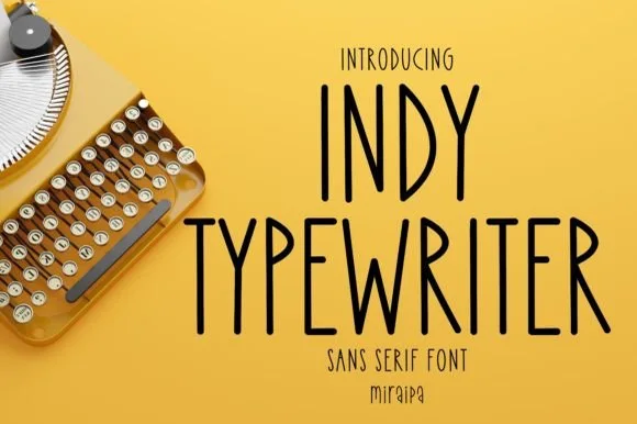
Tall condensed handwritten monoline sans serif (NOT a serif typewriter!)
Indy Typewriter is actually a tall, friendly monoline handwritten sans serif—zero serifs or mechanical slabs despite the 'Typewriter' name!
Ideas for this font
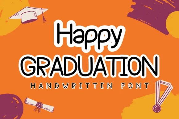
Neat rounded marker print sans with sticker-ready clarity
Happy Graduation (by Sirinart) is a plump, neat rounded marker print sans (NOT a slab serif!) wrapped cleanly for stickers, banners, and cards.
Ideas for this font
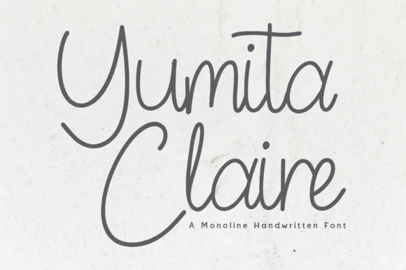
Monoline cursive handwriting
Yumita Claire is a monoline cursive in charcoal on speckled paper: tall looping capitals, low connected lowercase, even strokes and long entry and exit tails, so the two words read as a name written with a fine pen rather than a calligraphic display.
Ideas for this font
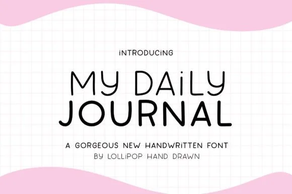
Neat geometric monoline bullet-journal print sans
My Daily Journal is a crisp, even-weight monoline print sans pairing wide geometric 'O/D/U' bowls with friendly rounded pen tips.
Ideas for this font
Same independent foundry
Allow optional Google Analytics to measure visits and catalogue actions. Your search words and notes are not included. Privacy & storage