Editorial Serif Anchor

Yumita Claire + Mewah
Anchors Yumita Claire's fluid strokes with crisp Roman proportions on wedding suites, headers and packaging.
Inspect Mewah specimenDisclosure: MakerFileHub may earn a commission from qualifying purchases via paid links on this page. How our links work.
Monoline cursive handwriting
Yumita Claire is a monoline cursive in charcoal on speckled paper: tall looping capitals, low connected lowercase, even strokes and long entry and exit tails, so the two words read as a name written with a fine pen rather than a calligraphic display.
Paid link
Get this fontProject & layout blueprintsAt-a-glance maker compatibility
Set Cricut or Silhouette operation to Pen, Foil Quill, or Laser Score — not Basic Blade Cut.
Visual anatomy & craft review
The drawing is a monoline script: the stroke never varies, the lowercase sits low and wide, and the joins are drawn as flat links, which keeps the phrase readable at any size. The capitals carry the height, rising into tall loops, and the exits run past the words without ornament, which is what gives the lockup its calm. Spacing is loose and the angle is steady, so the pair reads as handwriting rather than as decoration. Because the stroke is fine, the face needs a generous size and a plain ground, and the specimen uses a speckled cream paper with the words set large and a small tracked caption beneath. Nothing else appears on the page, which suits a face whose whole character is the drawing.
Monoline, cursive, handwriting, gentle
Two-font hierarchy recipes
Tested contrast partners — pairing Yumita Claire with grounded secondary typography.
Yumita Claire + Mewah
Anchors Yumita Claire's fluid strokes with crisp Roman proportions on wedding suites, headers and packaging.
Inspect Mewah specimen
Yumita Claire + Monure
Keeps small-scale dates, URLs, nutrition facts and care instructions crisp and legible below script titles.
Inspect Monure specimenPractical applications
Concrete hierarchy, scale and production guidance tailored to Yumita Claire’s stroke geometry.
A monoline cursive looks like a hand-written name on a place card, and the even stroke stays consistent when a couple prints thirty cards from one template.
Hierarchy & layout recipe
Print A4 sheets of eight: each name at 22 pt, the table number in an 8 pt roman, and 8 mm between cards. Keep 8 mm inside the trim so the entry loop is never cut, and print one ink on cream card.
Pre-production check
Check the 22 pt names, where a tall loop can run into the trim; centre each name on its widest letter. Confirm the 8 pt number reads across a table and that the sheet cuts cleanly.
A monoline mark reads as a signature, which suits a stationery studio, and the even stroke reduces to a small logo where a contrasted script would clot.
Hierarchy & layout recipe
Set the mark at 20 pt on a card and 10 pt on a sticker, with an 8 pt roman descriptor at 200 units tracking. Keep one colour and leave clear space equal to the capital loop on every side.
Pre-production check
Check the 10 pt sticker, where a fine stroke can fade; keep the size above 9 pt. Confirm the mark reads on kraft and that the descriptor does not crowd the exit tail.
A gentle cursive gives a thank-you card a personal voice, and the light stroke leaves space for a written message without crowding the page.
Hierarchy & layout recipe
A6 folded card: the greeting at 26 pt, the message in a 9 pt roman at 13 pt leading, and the signature line at 16 pt. Keep 14 mm margins and print one ink on a soft white card.
Pre-production check
Check the 26 pt greeting, where a loop can touch the message block; keep 10 mm clear. Confirm the 9 pt message reads comfortably and that the signature line leaves room for a pen.
Technical & licence verification
Confirm included OTF/TTF/WOFF formats, full glyph tables and licence coverage on the live store page before batch production.
Closest visual alternatives
Matched across letterform anatomy, stroke behaviour and craft applications.
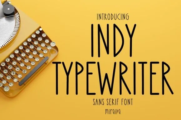
Tall condensed handwritten monoline sans serif (NOT a serif typewriter!)
Indy Typewriter is actually a tall, friendly monoline handwritten sans serif—zero serifs or mechanical slabs despite the 'Typewriter' name!
Ideas for this font
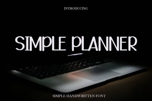
Tall thin handwritten capitals
Simple Planner is a tall thin handwritten face in white on a dark photograph: narrow capitals with gentle wobble, uneven heights, a high waist on the E and a rounded S, so the phrase reads as pen lettering written on a planner page rather than as a drawn display.
Ideas for this font
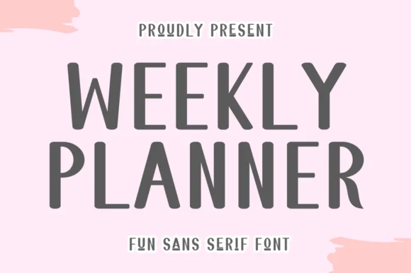
Tall quirky rounded sans
Weekly Planner is a tall rounded sans in grey on pink: narrow upright letters with rounded terminals, an open R leg, a bowed W and a curled L, presented in two stacked lines with a tracked caption beneath, so the pair reads as a planner cover rather than a neutral sans.
Ideas for this font
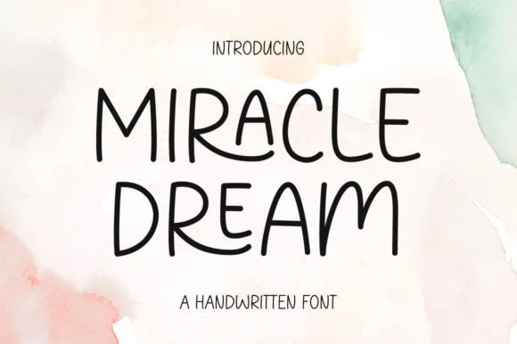
Rounded handwritten capitals with playful variants
Miracle Dream is a handwritten face in black on watercolour washes: rounded monoline capitals with playful variants, a tall waist, uneven heights and no joins, set as two stacked words with a tracked line beneath.
Ideas for this font
Same independent foundry
Allow optional Google Analytics to measure visits and catalogue actions. Your search words and notes are not included. Privacy & storage