Modern Grotesque Body

Cromons + Noar
Creates crisp high-hierarchy contrast beneath Cromons headlines across menus, websites and labels.
Inspect Noar specimenDisclosure: MakerFileHub may earn a commission from qualifying purchases via paid links on this page. How our links work.
Heavy wide battle-ready medieval wedge serif
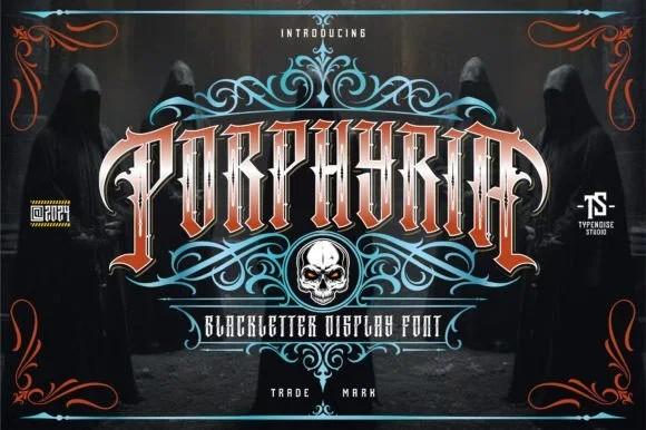
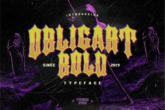
Cromons is a brawny, heavy-weight medieval wedge serif built to punch stark white fantasy, gaming, and esport headlines through dark backgrounds!
Paid link
Get this fontProject & layout blueprintsAt-a-glance maker compatibility
Sturdy stroke walls and open counters weed cleanly on adhesive vinyl, HTV apparel film, and cut cardstock.
Visual anatomy & craft review
Cromons is a heavy wide medieval wedge serif: broad flat stems, triangular wedge serifs that flare at the foot, a low crossbar on the A and a squared counter that keeps the word solid at distance. The width makes words long and the wedge serifs grow the base, so a centred line needs side and bottom clearance. It needs roughly 32 mm for the wedge serif and the squared counter to read, and it is best in one dense ink on cream and stone, or a single white on a dark ground where the wedges print as clean triangles.
Heavy-wedge-serif · Wide-armor-stance · High-impact
Two-font hierarchy recipes
Tested contrast partners — pairing Cromons with grounded secondary typography.
Cromons + Noar
Creates crisp high-hierarchy contrast beneath Cromons headlines across menus, websites and labels.
Inspect Noar specimen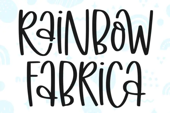
Cromons + Rainbow Fabrica
Adds a warm human signature touch for 1-to-3-word callouts without competing against structured serif capitals.
Inspect Rainbow Fabrica specimenPractical applications
Concrete hierarchy, scale and production guidance tailored to Cromons’s stroke geometry.
A wide medieval wedge serif reads as a carved inscription rather than a modern headline, which is what a feature about the middle ages wants. The wedge feet give the title weight at 64 pt, and the squared counters survive one-ink print on an uncoated sheet.
Hierarchy & layout recipe
Opener 210 x 297 mm, title 64 pt with 10 mm wedge clearance, standfirst 11/15 pt, body 9/13 pt in two columns, 18 mm margins. Pull quote 40 pt. Section rule 180 mm wide.
Pre-production check
At 40 pt on the pull quote the squared counter fills and the quote reads as a heavy bar with white slits. Keep the face at 52 pt and above, set pull quotes in the body serif, and proof one spread.
A wedge serif reads as a cast plaque rather than a modern logo, which is what a metal workshop wants over its door. The flared feet hold at 40 mm on a plate, and one ink prints the plate and the crate mark from one file.
Hierarchy & layout recipe
Sign plate 600 x 300 mm, word 90 mm with 12 mm wedge clearance, 25 mm margins. Crate mark 300 x 150 mm, word 60 mm, 15 mm margins. Card 85 x 55 mm, word 14 mm, 5 mm margins.
Pre-production check
At 14 mm on the card the wedge feet touch each other and the word reads as a solid carved bar. Keep the card word at 20 mm, and check one card before the run.
A wide wedge serif gives a winter feast the weight of a printed bill, which is what a long table wants on the wall. The heavy stems hold at 110 mm, and one dark ink on cream prints the poster, the menu and the place cards in a single order.
Hierarchy & layout recipe
Poster A2, word 110 mm with 12 mm wedge clearance, details 34 mm, 20 mm margins. Menu 120 x 210 mm, header 22 pt, courses 9/12 pt. Place card 90 x 50 mm, name 12 mm, 4 mm margins.
Pre-production check
A 90 x 50 mm place card at 12 mm closes the counter and the name reads as a black block on the cloth. Use a lighter cut on place cards or raise them to 18 mm, and proof one card before the set.
Technical & licence verification
Confirm included OTF/TTF/WOFF formats, full glyph tables and licence coverage on the live store page before batch production.
Closest visual alternatives
Matched across letterform anatomy, stroke behaviour and craft applications.
Rugged ornamental display serif
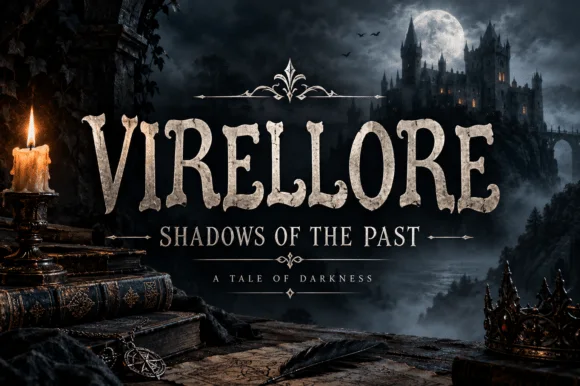
Virellore is an ornate display serif in weathered cream on a dark gothic scene: heavy bracketed serifs, split terminals, small thorns along the strokes, and rules with diamond finials between the lines, so the plate reads as a fantasy title card rather than as an editorial serif.
Ideas for this font
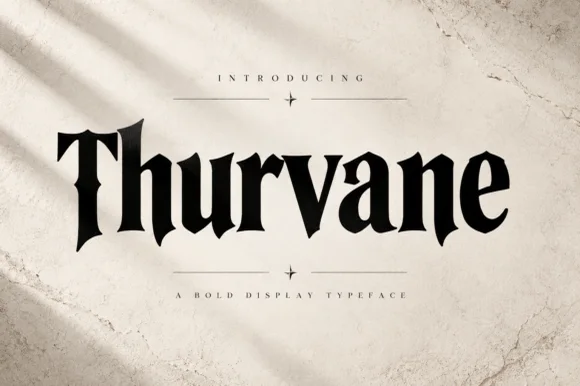
Heavy blade-spurred gothic wedge serif (OTF)
Thurvane is a bold hybrid gothic-wedge serif merging heavy Roman readability with sharp medieval diamond spurs and blade hooks (OTF).
Ideas for this font
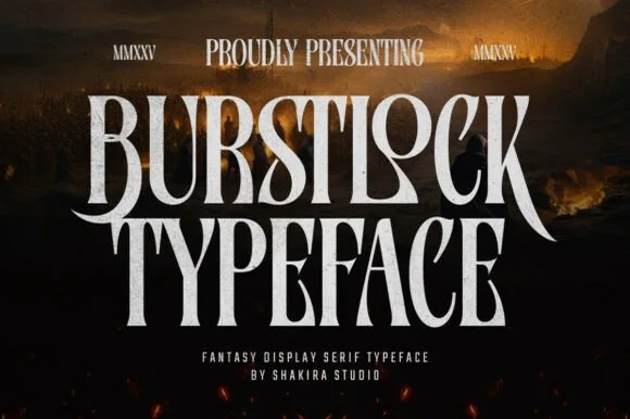
Tall condensed sword-winged dark-fantasy display serif
Burstlock is a dramatic, tall condensed fantasy serif whipping sweeping sword-blade legs off 'R' and 'K' for game titles and dark-fantasy covers!
Ideas for this font
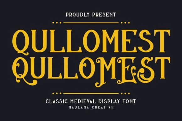
Medieval display serif with flourishes
Qullomest is a medieval display serif in gold on near-black: tall capitals with sharp, slightly curved stems, long entry and exit flourishes on several letters, hairline serifs and a diamond divider, with a small tracked label above and a two-line caption beneath.
Ideas for this font
Same independent foundry
Allow optional Google Analytics to measure visits and catalogue actions. Your search words and notes are not included. Privacy & storage