Editorial Serif Anchor

Vintage Comic + Glofi
Anchors Vintage Comic's fluid strokes with crisp Roman proportions on wedding suites, headers and packaging.
Inspect Glofi specimenDisclosure: MakerFileHub may earn a commission from qualifying purchases via paid links on this page. How our links work.
Comic handwriting with fat rounded strokes
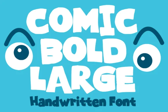
Vintage Comic is a handwritten comic face in cream on a flat blue panel: fat rounded letters with uneven strokes, a slight tilt and blunt terminals, set unjoined as two lines with a smaller line beneath.
Paid link
Get this fontProject & layout blueprintsAt-a-glance maker compatibility
Weld or Unite overlapping script joins into one continuous vector path before sending to the blade.
Visual anatomy & craft review
Two words are stacked on a flat blue ground and the face is comic lettering rather than type: the strokes are thick and slightly uneven, the ends are blunt, the letters lean a little and vary in width, the a is single-storey, and nothing joins, so the words read as something lettered by hand on a poster. The unevenness is the style: a stroke here is a touch thicker than the one beside it, which is what makes the block look drawn rather than set, and the letters stay simple enough to read at a distance. A third line beneath, in the same hand at a much smaller size, names the product, and the illustration behind is a flat graphic scene of snow, a tree and a building in two blues. The palette is cream, mid blue and a darker blue. Vintage Comic is a handwritten face for posters, packaging, cards and children's products, and it needs short words at a large size and a plain ground.
Comic, rounded, friendly
Two-font hierarchy recipes
Tested contrast partners — pairing Vintage Comic with grounded secondary typography.
Vintage Comic + Glofi
Anchors Vintage Comic's fluid strokes with crisp Roman proportions on wedding suites, headers and packaging.
Inspect Glofi specimen
Vintage Comic + Bielchon
Keeps small-scale dates, URLs, nutrition facts and care instructions crisp and legible below script titles.
Inspect Bielchon specimenPractical applications
Concrete hierarchy, scale and production guidance tailored to Vintage Comic’s stroke geometry.
Comic lettering gives a heading a drawn, printed feel, and the fat strokes hold up against a flat illustrated background.
Hierarchy & layout recipe
Print a 210 by 280 mm page: set the heading at 44 pt over one line, keep 16 mm of clear ground beneath before the standfirst at 11 pt, and hold 20 mm of margin on all four sides.
Pre-production check
A comic face beside body type can look unserious; keep the heading large and proof the page before the run.
A friendly comic face draws families to a school event, and the simple shapes stay readable on a noticeboard seen from a corridor.
Hierarchy & layout recipe
Print an A3 poster at 297 by 420 mm: set the title at 100 pt over two lines, keep 28 mm of clear ground beneath before the date at 20 pt, and hold 22 mm of margin on all four sides.
Pre-production check
A flat illustrated ground can make cream type look faint; proof one sheet and check the contrast.
A comic label gives a sweet a nostalgic character, and the fat letters stay readable at the size of a jar lid on a counter.
Hierarchy & layout recipe
Print a 55 mm round label: set the name at 14 pt over two lines, keep 6 mm of clear ground inside the die, and hold the artwork 4 mm clear of the circle edge.
Pre-production check
A round die trims words that run wide; centre the block and cut one label before the sheet.
Technical & licence verification
Confirm included OTF/TTF/WOFF formats, full glyph tables and licence coverage on the live store page before batch production.
Closest visual alternatives
Matched across letterform anatomy, stroke behaviour and craft applications.
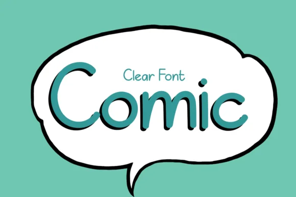
Crisp clean speech-balloon handwritten print sans
Comic (by el hotcig — 'Clear Font Comic') is a neat, ultra-legible handwritten print sans built for crisp speech bubbles, worksheets, and everyday labels!
Ideas for this font
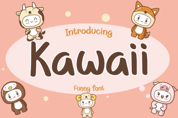
Neat disconnected rounded kawaii marker print sans
Kawaii (by AquariiD) is a clean, friendly disconnected marker print sans (compare with connected #1099!) built for cute stickers, comics, and kid labels.
Ideas for this font
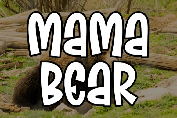
Chunky comic-outlined cartoon bubble display (not a script)
Mama Bear is actually a chunky, bouncy cartoon block display font (NOT a delicate wedding script!) built for bold family camp tees and decals.
Ideas for this font
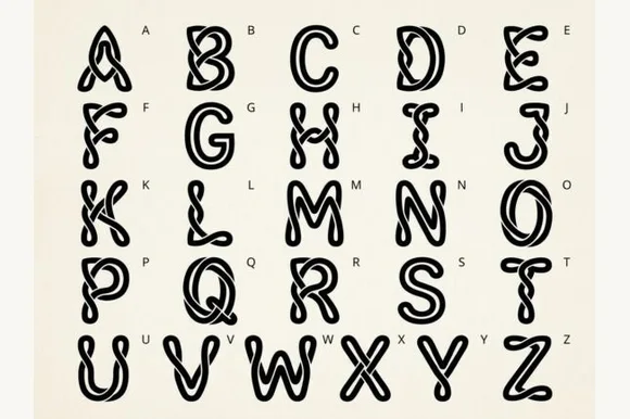
Wiggly liquid-jelly cartoon bubble alphabet
Kale is a bouncy, wavy-contoured cartoon bubble display font with glossy interior shine highlights across all 26 capitals.
Ideas for this font
Same independent foundry
Allow optional Google Analytics to measure visits and catalogue actions. Your search words and notes are not included. Privacy & storage