Neutral Sans Workhorse

Dripping Halloween + Hermano
Lets Dripping Halloween own the focal silhouette while handling secondary copy, sizing and subheads cleanly.
Inspect Hermano specimenDisclosure: MakerFileHub may earn a commission from qualifying purchases via paid links on this page. How our links work.
Rough horror lettering with hanging drips and uneven outlines
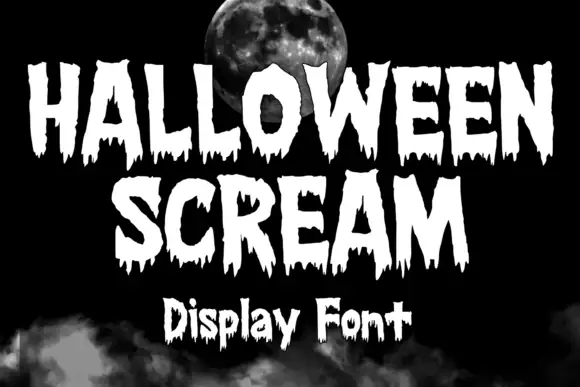
Dripping Halloween is rough display lettering in which every stroke ends in a hanging drip, the outlines are uneven and the letters vary in height, so a phrase reads as painted on a wall.
Paid link
Get this fontProject & layout blueprintsAt-a-glance maker compatibility
Sturdy stroke walls and open counters weed cleanly on adhesive vinyl, HTV apparel film, and cut cardstock.
Visual anatomy & craft review
The capital D is drawn as a heavy vertical with a bloated bowl, and each stroke finishes in a drawn drip that hangs below the baseline by a varying amount, which gives the phrase a wet, unsettled edge. The letters vary in height and weight within the same word, the outlines are wobbly rather than clean and the counters are irregular, so nothing in the phrase looks machined. The r and the o both carry drips from their lower curves, and the second word repeats the same treatment at a slightly smaller size, which keeps the two lines from fighting. Nothing tapers and nothing is refined. The black ground, the chalk speckle and the small caption beneath are presentation; the lettering is the words.
Rough · Dripping · Uneven
Two-font hierarchy recipes
Tested contrast partners — pairing Dripping Halloween with grounded secondary typography.
Dripping Halloween + Hermano
Lets Dripping Halloween own the focal silhouette while handling secondary copy, sizing and subheads cleanly.
Inspect Hermano specimen
Dripping Halloween + Augler
Grounds bold display lettering with classic typographic authority on posters, badges and apparel.
Inspect Augler specimenPractical applications
Concrete hierarchy, scale and production guidance tailored to Dripping Halloween’s stroke geometry.
The hanging drips read as a painted warning at the end of a driveway, and the rough weight stays visible in low light where a tidy display face would disappear.
Hierarchy & layout recipe
Set the first word at 90 pt on an A3 poster, set the date and time in a plain 24 pt sans, and hold 30 mm between the drips and the details so the two do not merge.
Pre-production check
Home printers drop the drips under 0.5 mm; check a print at final size and simplify the shortest drip rather than enlarging the whole line.
The uneven outlines cut with character and the drips read at small scale against a dark cake, which is what a party table needs.
Hierarchy & layout recipe
Set the word at 40 mm tall across a 120 mm acrylic topper, cut every drip at least 2 mm thick, and leave 5 mm of clear material around the longest drip.
Pre-production check
A drip under 2 mm snaps in acrylic; check the vector at full size and thicken or remove the thinnest drips before cutting.
The horror weight gives a printed invitation its tone without an illustration, and the uneven letter heights keep a small card from looking tidy.
Hierarchy & layout recipe
Set the greeting at 40 pt on a 105 by 148 mm card, set the address and time in a plain 8 pt sans, and hold 14 mm below the longest drip so nothing collides.
Pre-production check
A rough lettered card printed in one colour on cream looks like a mistake; keep the ground dark and check the proof against the intended stock.
Technical & licence verification
Confirm included OTF/TTF/WOFF formats, full glyph tables and licence coverage on the live store page before batch production.
Closest visual alternatives
Matched across letterform anatomy, stroke behaviour and craft applications.
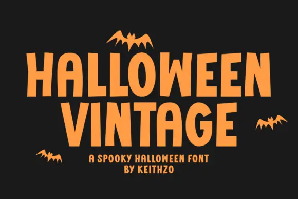
Plain Halloween capitals with irregular vertical rhythm and flat terminals
Halloween Vintage is a plain capital alphabet in which the letters are condensed, the vertical rhythm shifts slightly and the terminals stay flat, so a word reads as cut paper lettering rather than as a decorated seasonal face.
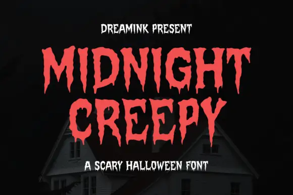
Display
Midnight Creepy is a horror display face in which every stroke melts: the caps are heavy and irregular, and the bottoms of the letters run down into long drips that end in rounded drops.
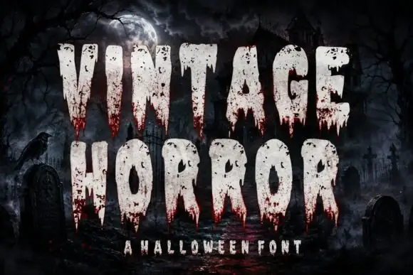
Tall dripping horror caps
Vintage Horror is a tall condensed horror display in bone white with blood-red drips on a moonlit graveyard: narrow heavy caps, chipped edges, and a wet red run from the bottom of every letter, so the pair reads as a film title rather than as a seasonally decorated sans.
Ideas for this font
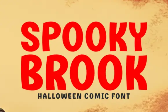
Bold comic caps
Spooky Brook is a bold comic display in red on aged yellow paper: heavy rounded caps with flat tops, a slight bounce, an R with a straight leg and a K whose arm meets the stem at a sharp angle, with a tracked caption beneath in a small bold sans.
Ideas for this font
Same independent foundry
Allow optional Google Analytics to measure visits and catalogue actions. Your search words and notes are not included. Privacy & storage