Modern Grotesque Body

Vintage Boston + Lemon Milk Pro FTR
Creates crisp high-hierarchy contrast beneath Vintage Boston headlines across menus, websites and labels.
Inspect Lemon Milk Pro FTR specimenDisclosure: MakerFileHub may earn a commission from qualifying purchases via paid links on this page. How our links work.
Rounded classic slab
Vintage Boston is a moderate rounded slab in orange and dark brown on an aged cream sheet: two lines of capitals with softly blunted terminals, open bowls and a warm even stroke, with a small line above between two rules and a plain line beneath.
Paid link
Get this fontProject & layout blueprintsAt-a-glance maker compatibility
Sturdy stroke walls and open counters weed cleanly on adhesive vinyl, HTV apparel film, and cut cardstock.
Visual anatomy & craft review
The plate is a printed label from the middle of the last century, and the two rules, the star and the aged ground all support that reading. The drawing is a moderate slab with blunted terminals, so the face reads as warm rather than as technical, and the open bowls mean it holds at moderate sizes rather than only at display. That construction gives a low size floor and makes the face usable for a heading and a short label from one file, which is the practical reason to buy a classic slab. The small line above and the plain line beneath are product copy that name the face and the designer. It suits a package, a sign and a menu.
Slab, rounded, classic, warm
Two-font hierarchy recipes
Tested contrast partners — pairing Vintage Boston with grounded secondary typography.
Vintage Boston + Lemon Milk Pro FTR
Creates crisp high-hierarchy contrast beneath Vintage Boston headlines across menus, websites and labels.
Inspect Lemon Milk Pro FTR specimen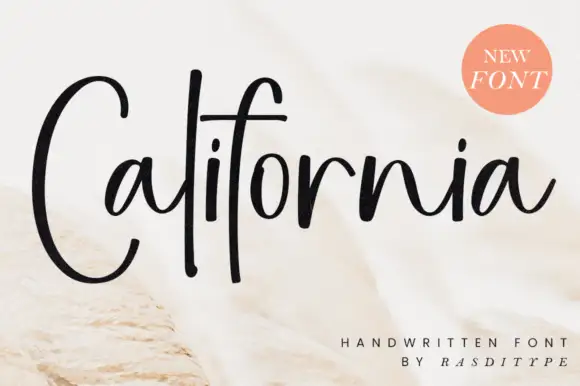
Vintage Boston + California
Adds a warm human signature touch for 1-to-3-word callouts without competing against structured serif capitals.
Inspect California specimenPractical applications
Concrete hierarchy, scale and production guidance tailored to Vintage Boston’s stroke geometry.
A classic slab reads as a long-established roaster, and the blunted terminals hold on a kraft label where a sharp slab would chip.
Hierarchy & layout recipe
Print a 60 by 90 mm label: the roaster at 13 pt, the blend at 8 pt, and the weight at 7 pt. Keep 5 mm inside the die and keep the brackets above 0.4 mm.
Pre-production check
Check the 13 pt roaster on kraft, where a bracket can fill; keep it above 0.4 mm. Confirm the 7 pt weight reads on the shelf and that the label takes a fold.
A warm slab suits a diner menu, and the open bowls keep a long dish name readable at list size. The open bowls stay readable.
Hierarchy & layout recipe
A4 menu: the headings at 18 pt, the dishes at 10.5 pt, and the prices at 10 pt. Keep 18 mm margins, print one ink on a cream card stock and set the headings in small caps.
Pre-production check
Check the 10.5 pt dishes in a proof, where a bowl can close; keep the size at 10.5 pt or above. Confirm the prices align and that the menu reads under a low light.
A classic slab reads as a farm shop, and the blunted terminals hold on a painted board in all weather. It holds in all weather.
Hierarchy & layout recipe
Paint a 900 by 320 mm board: the shop at 110 mm cap height, the hours in a 24 mm slab, and a 5 mm rule. Keep 24 mm margins and paint two colours on a primed board.
Pre-production check
Check the board at 110 mm, where a bowl can fill with paint; keep it open. Confirm the 24 mm hours read at three metres and that the rule survives rain.
Technical & licence verification
Confirm included OTF/TTF/WOFF formats, full glyph tables and licence coverage on the live store page before batch production.
Closest visual alternatives
Matched across letterform anatomy, stroke behaviour and craft applications.
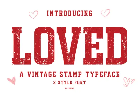
Vintage stamp slab
Loved is a vintage stamp slab in deep red on white: heavy caps with block serifs, a chipped, uneven outline that reads as a rubber stamp, and small open hearts in the corners, with a tracked line beneath naming the category and the two styles.
Ideas for this font
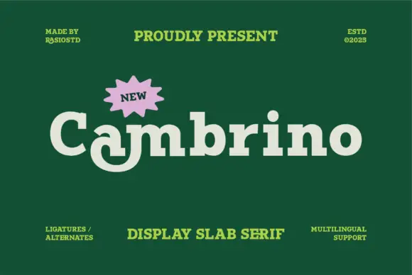
Soft mixed-case slabs with a curled descending a form
Cambrino sets a fat display slab in cream on green, its serifs bulbous, its bowls round and its g built from a loop that crosses itself below the baseline.
Ideas for this font
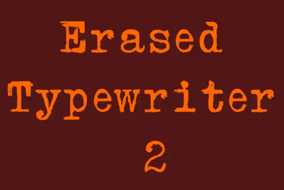
Rough typewriter serif with broken rounded feet and uneven contours
Erased Typewriter 2 is a distressed typewriter serif in which the rounded slab feet break at the edges, small patches go missing from the bowls and the contours stay uneven, so a line reads as an old typed impression rather than a clean slab.
Ideas for this font
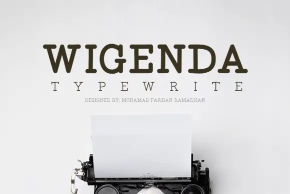
Typewriter slab serif
Wigenda Typewrite is a typewriter slab in dark brown on an off-white wall: heavy unbracketed serifs, a large x-height and generous spacing, with a wide-tracked line beneath and a third line in tiny caps, set above the keys and paper of a vintage machine.
Ideas for this font
Same independent foundry
Allow optional Google Analytics to measure visits and catalogue actions. Your search words and notes are not included. Privacy & storage