Modern Grotesque Body

Cambrino + Borsen
Creates crisp high-hierarchy contrast beneath Cambrino headlines across menus, websites and labels.
Inspect Borsen specimenDisclosure: MakerFileHub may earn a commission from qualifying purchases via paid links on this page. How our links work.
Soft mixed-case slabs with a curled descending a form
Cambrino sets a fat display slab in cream on green, its serifs bulbous, its bowls round and its g built from a loop that crosses itself below the baseline.
Paid link
Get this fontProject & layout blueprintsAt-a-glance maker compatibility
Sturdy stroke walls and open counters weed cleanly on adhesive vinyl, HTV apparel film, and cut cardstock.
Visual anatomy & craft review
The name fills the width of the card, the C and the b almost touching, and the serifs swell at the ends rather than staying square, which makes the word look pressed rather than cut. A starburst badge sits above the word and small tracked notes run along the edges, naming the foundry, the classification and the alternates. There is no contrast in the strokes, so the shape carries the character, and the round bowls keep the face good-natured at large sizes. At small sizes the fat strokes and the tight spacing merge, which limits the face to headings, labels and packaging rather than text.
Soft mixed-case slabs with a curled descending a form
Two-font hierarchy recipes
Tested contrast partners — pairing Cambrino with grounded secondary typography.
Cambrino + Borsen
Creates crisp high-hierarchy contrast beneath Cambrino headlines across menus, websites and labels.
Inspect Borsen specimen
Cambrino + Autography
Adds a warm human signature touch for 1-to-3-word callouts without competing against structured serif capitals.
Inspect Autography specimenPractical applications
Concrete hierarchy, scale and production guidance tailored to Cambrino’s stroke geometry.
The fat slab gives a snack pack a shelf voice, and the short product name fits the round bowls on a small front panel of the carton.
Hierarchy & layout recipe
Print a 100 by 140 mm pack face: set the product at 26 pt on one row, keep 11 mm of clear ground beneath before the flavour at 8 pt, and keep 8 mm of margin so the serifs are not trimmed.
Pre-production check
Bulbous serifs crowd at small sizes; check a printed pack sample before the run. Request a proof on the actual stock before signing off.
The heavy slab reads from across a shop floor, and the warm cream on green keeps a seasonal cover line friendly rather than shouty.
Hierarchy & layout recipe
Print a 210 by 280 mm cover: set the cover line at 92 pt on one row, keep 22 mm of clear ground beneath before the standfirst at 11 pt, and keep 18 mm of margin from the trim edge.
Pre-production check
Two slabs side by side can merge; check the letter spacing at final size before the proof.
The chunky lettering reads at a distance on a noticeboard, and the plain shapes stay legible for children reading across a hall.
Hierarchy & layout recipe
Print a 500 by 700 mm board: set the fair name at 88 pt across two rows, keep 24 mm of clear ground beneath before the date at 18 pt, and keep 26 mm of border so no serif is clipped.
Pre-production check
Cheap board printing fills the counters; check a physical proof before the order. Order one sample before committing to the run.
Technical & licence verification
Confirm included OTF/TTF/WOFF formats, full glyph tables and licence coverage on the live store page before batch production.
Closest visual alternatives
Matched across letterform anatomy, stroke behaviour and craft applications.
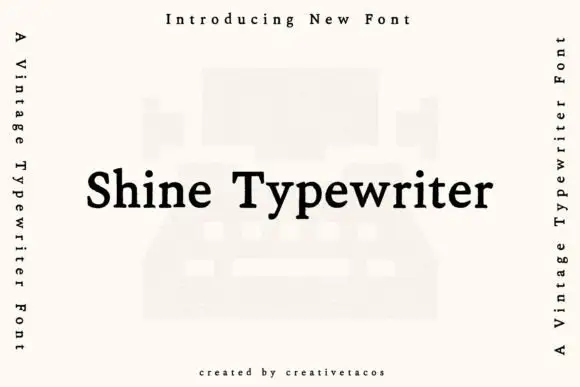
Typewriter serif with a warm even stroke
Shine Typewriter is a vintage typewriter serif in black on white: slab serifs, a moderately heavy even stroke, mixed case and a wide set, shown over a faint illustration of a typewriter with vertical labels down both sides.
Ideas for this font
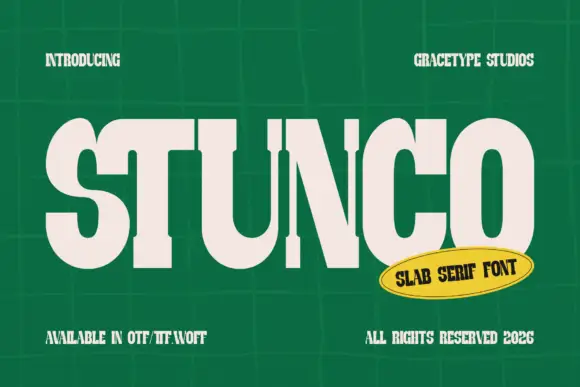
Compressed high contrast slab
Stunco is a compressed slab display in cream on a green tiled wall: very narrow capitals with heavy stems, high contrast, rounded outer curves and slab serifs, set as one large word with a credit above and three notes at the foot, beside a yellow oval naming the style.
Ideas for this font
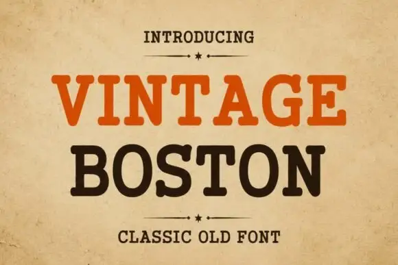
Rounded classic slab
Vintage Boston is a moderate rounded slab in orange and dark brown on an aged cream sheet: two lines of capitals with softly blunted terminals, open bowls and a warm even stroke, with a small line above between two rules and a plain line beneath.
Ideas for this font
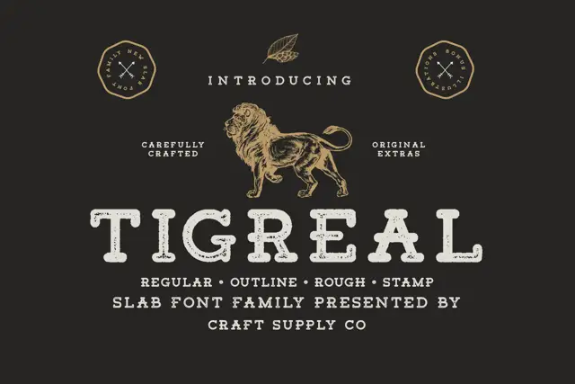
Worn letterpress slab family
Tigreal Family is a letterpress slab in cream on a dark ground: wide rounded slabs with a dotted worn fill and open bowls, shown as one word with an engraved lion above, two badge seals at the sides and a line beneath listing the four cuts.
Ideas for this font
Same independent foundry
Allow optional Google Analytics to measure visits and catalogue actions. Your search words and notes are not included. Privacy & storage


