Modern Grotesque Body

Wigenda Typewrite + Nyxar
Creates crisp high-hierarchy contrast beneath Wigenda Typewrite headlines across menus, websites and labels.
Inspect Nyxar specimenDisclosure: MakerFileHub may earn a commission from qualifying purchases via paid links on this page. How our links work.
Typewriter slab serif
Wigenda Typewrite is a typewriter slab in dark brown on an off-white wall: heavy unbracketed serifs, a large x-height and generous spacing, with a wide-tracked line beneath and a third line in tiny caps, set above the keys and paper of a vintage machine.
Paid link
Get this fontProject & layout blueprintsAt-a-glance maker compatibility
Sturdy stroke walls and open counters weed cleanly on adhesive vinyl, HTV apparel film, and cut cardstock.
Visual anatomy & craft review
The word is set once in caps and the drawing is a typewriter slab: the serifs are flat and unbracketed, the stems are uniform, and the terminals are blunt, which gives the face the mechanical rhythm of a machine rather than the finish of a book face. The tracking is loose enough that the letters read individually, which is what makes a typewriter face feel like struck type, and the two shorter lines beneath use the same structure at a fraction of the size. Because the machine in the photograph sits below the type, the plate shows the source of the form, and the paper roll gives context for the intent. The palette is one warm brown on a light ground, which keeps the letterforms legible without any decoration.
Typewriter, slab, warm, editorial
Two-font hierarchy recipes
Tested contrast partners — pairing Wigenda Typewrite with grounded secondary typography.
Wigenda Typewrite + Nyxar
Creates crisp high-hierarchy contrast beneath Wigenda Typewrite headlines across menus, websites and labels.
Inspect Nyxar specimen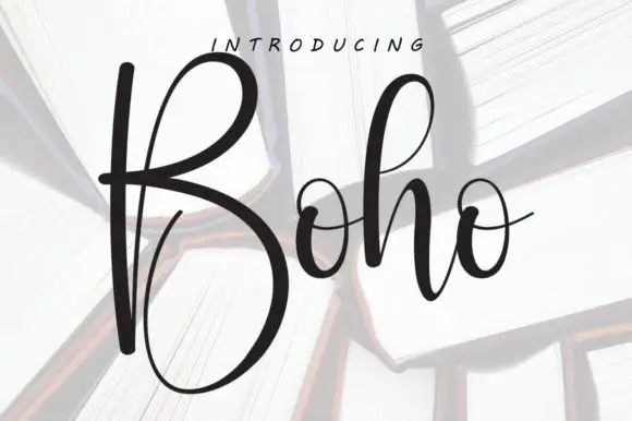
Wigenda Typewrite + Boho
Adds a warm human signature touch for 1-to-3-word callouts without competing against structured serif capitals.
Inspect Boho specimenPractical applications
Concrete hierarchy, scale and production guidance tailored to Wigenda Typewrite’s stroke geometry.
A typewriter slab reads as a hand-typed tag, and the uniform stems survive on an uncoated label where a high-contrast serif would fill with fibre.
Hierarchy & layout recipe
Print a 60 by 90 mm label: the roastery at 14 pt, the origin in a 7 pt slab, and the roast date at 6 pt. Keep 4 mm inside the die and print one ink on kraft so the blunt serifs stay sharp.
Pre-production check
Check the 14 pt name on kraft, where a 1 pt serif can thicken; keep the size above 11 pt. Confirm the 6 pt date reads at arm's length and that the label survives a damp wipe.
A typewriter slab carries a manuscript flavour at text size, and the large x-height keeps a long essay readable in a narrow measure.
Hierarchy & layout recipe
B-format interior: the body at 10.5 pt with 15.5 pt leading, the chapter heads at 20 pt, and 60 characters per line. Print one ink on a cream stock and keep the running head at 7.5 pt.
Pre-production check
Check a full page at 10.5 pt, where the loose spacing may overrun the measure; adjust the tracking. Confirm the 15.5 pt leading holds the column and that the running head stays distinct.
A typewriter slab gives a small wedding a typed note, and the loose tracking lets a date and a place read as a line from a letter.
Hierarchy & layout recipe
A6 card: the names at 20 pt, the date at 11 pt caps with wide tracking, and the venue at 8 pt. Keep 16 mm margins and print one ink on a textured card so the blunt serifs hold.
Pre-production check
Check the 11 pt date, where wide tracking can push the line past the margin; count the characters first. Confirm the 8 pt venue reads at arm's length and that the card takes a stamp cleanly.
Technical & licence verification
Confirm included OTF/TTF/WOFF formats, full glyph tables and licence coverage on the live store page before batch production.
Closest visual alternatives
Matched across letterform anatomy, stroke behaviour and craft applications.
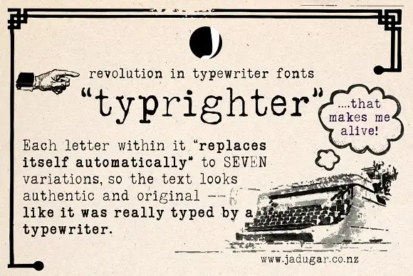
Typewriter face with alternates
Typrighter is a typewriter face in black on aged newsprint, shown inside a period advertisement: a monospaced slab with light uniform strokes and blunt serifs, surrounded by hand-lettered display copy and a printed illustration of a machine.
Ideas for this font
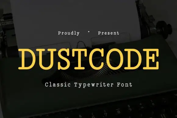
Light even slabs with broad rounded typed bowls
Dustcode shows a yellow uppercase title with thin, fairly even strokes and short rounded slab ends, where the U and O keep open round bowls and the lighter weight contrasts with darker typewriter-style text set beside it on the same cover.
Ideas for this font
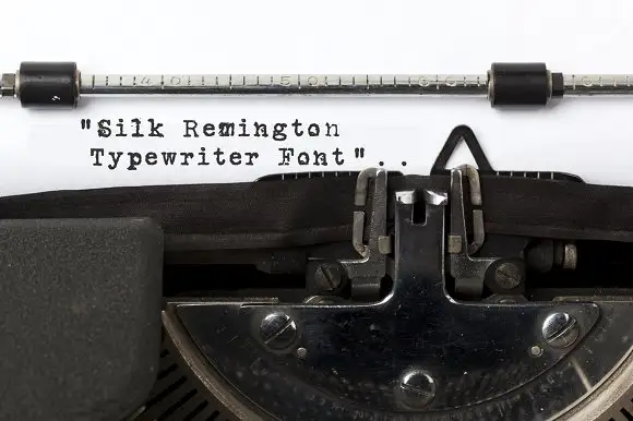
Typewriter slab lettering
Silk Remington is a typewriter face photographed on paper in a machine: uneven letter spacing, dark slab ends, broken ink texture and a few misaligned characters, shown as three short lines in black on a white sheet.
Ideas for this font
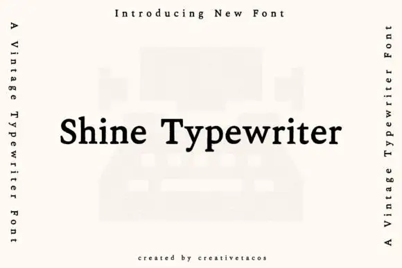
Typewriter serif with a warm even stroke
Shine Typewriter is a vintage typewriter serif in black on white: slab serifs, a moderately heavy even stroke, mixed case and a wide set, shown over a faint illustration of a typewriter with vertical labels down both sides.
Ideas for this font
Allow optional Google Analytics to measure visits and catalogue actions. Your search words and notes are not included. Privacy & storage