Modern Grotesque Body

Erased Typewriter 2 + Swaraga
Creates crisp high-hierarchy contrast beneath Erased Typewriter 2 headlines across menus, websites and labels.
Inspect Swaraga specimenDisclosure: MakerFileHub may earn a commission from qualifying purchases via paid links on this page. How our links work.
Rough typewriter serif with broken rounded feet and uneven contours
Erased Typewriter 2 is a distressed typewriter serif in which the rounded slab feet break at the edges, small patches go missing from the bowls and the contours stay uneven, so a line reads as an old typed impression rather than a clean slab.
Paid link
Get this fontProject & layout blueprintsAt-a-glance maker compatibility
Fine grain and micro-texture excel in 300 DPI print, sublimation, and screen print rather than small vinyl weeding.
Visual anatomy & craft review
The E sets three uneven arms, the r carries a short ragged shoulder, the a closes a worn bowl and every foot ends in a rounded slab that loses a corner here and there, with the wear spread thinly rather than clustered. The thin wear is the character: it looks like a tired ribbon instead of a filter, which is why the sample spaces three short parts wide on a dark ground. Because the marks are small, the face wants 30 pt before they read as intent and not as print failure, and it is best printed rather than cut small in vinyl. The red ground and the numeral are presentation; the orange lettering is the face.
Typewriter · Distressed · Slab
Two-font hierarchy recipes
Tested contrast partners — pairing Erased Typewriter 2 with grounded secondary typography.
Erased Typewriter 2 + Swaraga
Creates crisp high-hierarchy contrast beneath Erased Typewriter 2 headlines across menus, websites and labels.
Inspect Swaraga specimen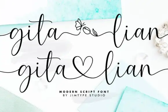
Erased Typewriter 2 + Gita Lian
Adds a warm human signature touch for 1-to-3-word callouts without competing against structured serif capitals.
Inspect Gita Lian specimenPractical applications
Concrete hierarchy, scale and production guidance tailored to Erased Typewriter 2’s stroke geometry.
The worn slab suits a letterpress card, and the ragged feet stay legible at 20 pt on an 80 mm label printed in one dark ink.
Hierarchy & layout recipe
Print an 80 by 50 mm label: set the shop name at 20 pt, keep 6 mm of border so the ragged edges are not trimmed, and set the service line at 8 pt beneath.
Pre-production check
Wear printed at 14 pt reads as a dirty plate; check the proof and keep the name at 18 pt or above.
The typewriter tone suits a documentary feature, and the even stroke keeps a three-word title readable at 42 pt across a column.
Hierarchy & layout recipe
Print a 210 mm page: set the title at 42 pt across two rows, set the standfirst at 11 pt in a serif beneath with 12 mm of clear ground, and keep the block on a plain band.
Pre-production check
Ragged edges printed against body text look like noise; check the page and keep 10 mm of clean space below the block.
The worn lettering suits a kraft tag, and the slab feet stay solid at 18 pt on a 40 mm card that carries a punched hole.
Hierarchy & layout recipe
Print a 40 by 80 mm tag: set the line at 18 pt, punch a 4 mm hole 10 mm from the top, and keep 8 mm of clear card between the hole and the tallest letter.
Pre-production check
A ragged foot printed next to a punched hole looks like a tear; check the die and keep 6 mm of clearance.
Technical & licence verification
Confirm included OTF/TTF/WOFF formats, full glyph tables and licence coverage on the live store page before batch production.
Closest visual alternatives
Matched across letterform anatomy, stroke behaviour and craft applications.
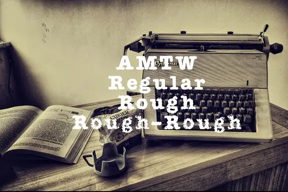
Heavy typed-looking forms shown in clean and increasingly broken treatments
AMTW is a heavy typewriter-style slab in which rounded feet and broad bowls appear in three treatments: a fairly clean regular row, a broken rough row and a much more eroded third row beneath the main initials.
Ideas for this font
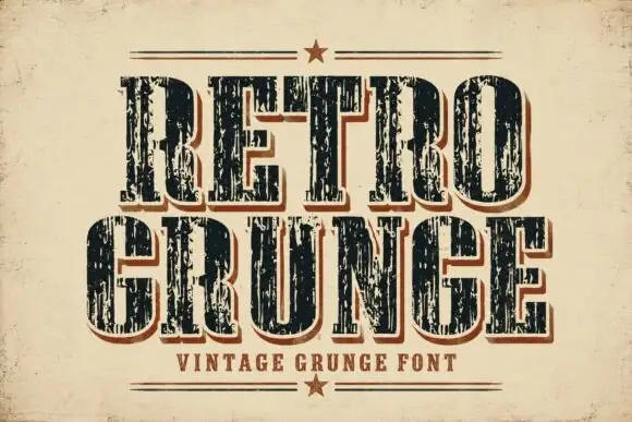
Tall worn slabs with vertical scrape texture
Retro Grunge shows tall closely spaced slab capitals with rounded bowls and deep vertical scratches, where the E and R keep heavy stems even as the surface breaks and a red-brown offset edge sits behind the black letters on aged paper.
Ideas for this font
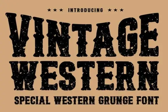
Grunge western slab
Vintage Western is a grunge western slab in black on tan: heavy bracketed serifs with deep notches, a swollen waist and thick stems, the whole surface eaten by a speckled wear, with three stars above and a tracked subtitle beneath in the same face.
College slab display
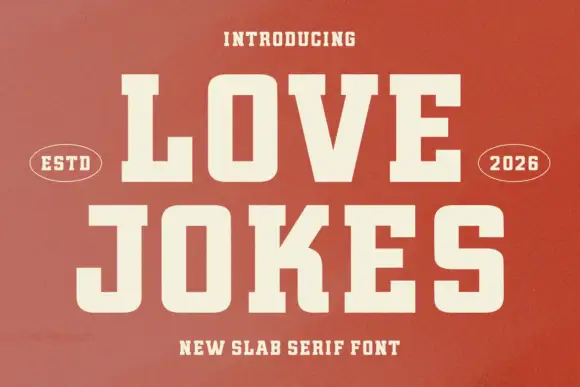
Love Jokes is a college slab in cream on a rust-red ground: heavy caps with wide block serifs, a low waist and closed counters, set on two lines between two oval badges that read ESTD and 2026, with a tracked line beneath.
Ideas for this font
Same independent foundry
Allow optional Google Analytics to measure visits and catalogue actions. Your search words and notes are not included. Privacy & storage