Neutral Sans Workhorse

Vim + Godthem
Lets Vim own the focal silhouette while handling secondary copy, sizing and subheads cleanly.
Inspect Godthem specimenDisclosure: MakerFileHub may earn a commission from qualifying purchases via paid links on this page. How our links work.
Serif-flavoured stencil with visible bridges
Vim is a stencil typeface in cream on a wood and metal mockup: heavy block letters cut into segments, with visible gaps where the bridges would hold the stencil together, and small serifs left on the outer edges of each segment.
Paid link
Get this fontProject & layout blueprintsAt-a-glance maker compatibility
Open counter bridges hold interior islands intact on laser-cut wood, acrylic, and mylar stencils.
Visual anatomy & craft review
The three letters are shown at display size and each is built from separate cut pieces: the V splits into two angled blocks, the I into three stacked segments, and the M into four, with gaps of a consistent width between them that read as the physical bridges of a stencil. Small slab-like serifs survive on the outer edges, which hints at a serif construction underneath, and the counters are square and open. Because the gaps are part of the design rather than a distressed effect, the face reads as a sign-painter's stencil rather than as a grunge treatment, and the letterforms stay crisp at small sizes as long as the gaps do not fill. The mockup sets the letters on a surface of scrap wood and metal with tools around it, which is the right context: this is a face for crates, signage and packaging that wants to look stencilled by hand.
Stencil, constructed, industrial, graphic
Two-font hierarchy recipes
Tested contrast partners — pairing Vim with grounded secondary typography.
Vim + Godthem
Lets Vim own the focal silhouette while handling secondary copy, sizing and subheads cleanly.
Inspect Godthem specimen
Vim + Cronelo
Grounds bold display lettering with classic typographic authority on posters, badges and apparel.
Inspect Cronelo specimenPractical applications
Concrete hierarchy, scale and production guidance tailored to Vim’s stroke geometry.
A stencil face reads as industrial without a distressed texture, and the clean bridges print reliably on corrugated board where fine detail would clog.
Hierarchy & layout recipe
Print a 200 by 150 mm carton face: the brand at 40 pt, the tool size in a 9 pt condensed sans, and the barcode block kept clear at the lower right. Keep the stencil gaps at least 1.5 mm wide at print size so they survive the board's texture.
Pre-production check
Check the gaps at 40 pt on corrugated board, where a 1 mm gap fills with ink; increase the gap or the size. Confirm the 9 pt size line reads on the board and that no bridge falls where the carton is scored and folded.
A stencil face on a workshop door reads as a place where things are made, and the crisp bridges stay clear even when the sign is sprayed rather than printed.
Hierarchy & layout recipe
Cut a 400 by 200 mm stencil from oiled board: the word at 60 mm cap height, the room number at 20 mm, and a 5 mm border. Keep all bridges at least 4 mm so the stencil survives repeated spraying and cleaning.
Pre-production check
Check the cut stencil at full size, where a bridge under 4 mm will tear on the first use; thicken it for the physical version. Confirm the 20 mm room number reads from three metres and that the overspray does not close the counters.
A stencil face gives a feature about manufacturing a matter-of-fact tone that a serif cannot, and the segmented letters work as a graphic element at large sizes.
Hierarchy & layout recipe
Set the section title at 140 pt across 100 mm, one word per line, with the standfirst in a 10 pt grotesque in the right column. Keep the stencil in one ink on a flat ground and let the bridges provide the texture instead of an image.
Pre-production check
Check the title at 140 pt, where the gaps read as slits from a distance and can look like a printing fault; keep them consistent in width. Confirm the 10 pt standfirst keeps a 4.5:1 contrast and that the segmented letters still parse at thumbnail size in a listing.
Technical & licence verification
Confirm included OTF/TTF/WOFF formats, full glyph tables and licence coverage on the live store page before batch production.
Closest visual alternatives
Matched across letterform anatomy, stroke behaviour and craft applications.
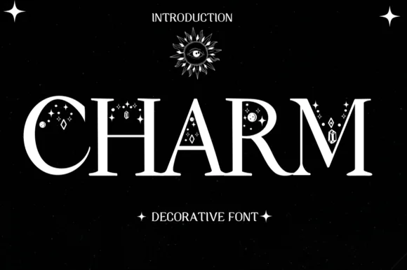
Mystical celestial serif adorned with stars, moons & gems
Charm is a refined mystical display serif embellished with dainty four-point stars, crescent dots, and diamond gems tucked around flared stems.
Ideas for this font
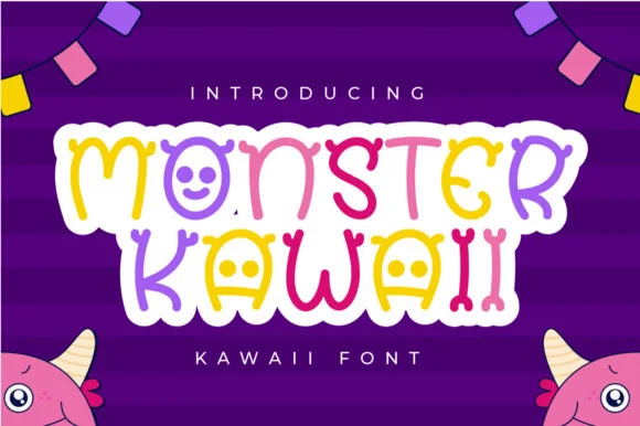
Kawaii monster display
Monster Kawaii is a kawaii display in six bright colours with a white contour inside a torn white panel: rounded letters where several bowls become simple monster faces with two eyes, small teeth or a smile, with scalloped bunting above and horned characters in the lower corners.
Ideas for this font
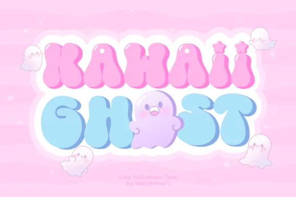
Pastel groovy ghost & star-sparkle Pinkoween bubble font!
Kawaii Ghost is a dreamy pastel-groovy Halloween font sprinkling four-point twinkle stars across puffy letters that cuddle cute little ghosts!
Ideas for this font
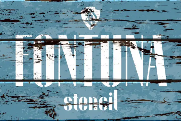
Tall high-contrast capitals shown through broad horizontal breaks and distressed wood texture
Fontuna Stencil places pale narrow capitals over heavily weathered blue boards, where fine arms meet thick vertical strokes, dark horizontal bands cross the title at several heights and a narrower mixed-case contrast repeats beneath the main row.
Ideas for this font
Same independent foundry
Allow optional Google Analytics to measure visits and catalogue actions. Your search words and notes are not included. Privacy & storage