Neutral Sans Workhorse

Mila + Inkora
Lets Mila own the focal silhouette while handling secondary copy, sizing and subheads cleanly.
Inspect Inkora specimenDisclosure: MakerFileHub may earn a commission from qualifying purchases via paid links on this page. How our links work.
Glossy graffiti bubble letters
Mila is a bold graffiti bubble display in black gloss on a concrete plinth against a graffitied wall: fat inflated letters with a heavy highlight, drips falling from the baselines, dots and specks around the block, with tracked captions above and below and file badges at the foot.
Paid link
Get this fontProject & layout blueprintsAt-a-glance maker compatibility
Sturdy stroke walls and open counters weed cleanly on adhesive vinyl, HTV apparel film, and cut cardstock.
Visual anatomy & craft review
The specimen sets the word and a short sample line beneath, which is a fair test for a graffiti face: the buyer sees the inflated alphabet and how the drips behave in a smaller line. The drawing is a bubble letter at maximum weight, with a specular highlight along the upper left of every stroke, which is what gives the letters their wet, painted look. The drips hang below the baseline at irregular lengths and the specks around the block suggest spray, so the face reads as a wall piece at any size. Because the shapes are fat and the highlights are graphic, the face works on apparel and at poster size, and the plate keeps to black and white so the gloss reads rather than a colour.
Graffiti, bubble, glossy, urban
Two-font hierarchy recipes
Tested contrast partners — pairing Mila with grounded secondary typography.
Mila + Inkora
Lets Mila own the focal silhouette while handling secondary copy, sizing and subheads cleanly.
Inspect Inkora specimen
Mila + The Bilstein Editorial
Grounds bold display lettering with classic typographic authority on posters, badges and apparel.
Inspect The Bilstein Editorial specimenPractical applications
Concrete hierarchy, scale and production guidance tailored to Mila’s stroke geometry.
A graffiti bubble face prints as two screens — fill and highlight — and the inflated shapes hold on fabric where a fine hand would break up.
Hierarchy & layout recipe
Print a 280 mm chest graphic: the word at 70 mm x-height, a 3 mm highlight, and two inks on a dark shirt. Keep the smallest counter at 4 mm and place the graphic 80 mm below the collar.
Pre-production check
Check the screen at actual mesh, where a 3 mm highlight fills; widen it. Wash-test one shirt and confirm the drips still read after five cycles.
A graffiti bubble face reads across a venue and photographs well, and the single-colour version keeps a short print run cheap.
Hierarchy & layout recipe
A2 portrait: the event at 140 mm x-height, the date in a 24 mm sans, and a 6 mm border. Keep 30 mm margins, print black on a light ground, and keep the drips away from the details block.
Pre-production check
Check the poster at five metres, where the highlight can disappear; keep it at least 8 mm wide at that scale. Confirm the 24 mm date reads at three metres and that the drips clear the border.
A bubble sticker reads at 50 mm and the glossy look carries to a small size, which is what a shop needs for a giveaway that has to survive a deck and a laptop lid.
Hierarchy & layout recipe
Die-cut a 60 mm sticker: the shop at 12 pt, the tagline in a 5 pt sans, and 2.5 mm clear to the die. Keep the smallest counter at 3 mm and print two colours on white vinyl with a gloss laminate.
Pre-production check
Check the die cut at 60 mm, where a highlight can merge into the fill; reduce it. Confirm the sticker adheres to a deck and that the drips stay inside the die.
Technical & licence verification
Confirm included OTF/TTF/WOFF formats, full glyph tables and licence coverage on the live store page before batch production.
Closest visual alternatives
Matched across letterform anatomy, stroke behaviour and craft applications.
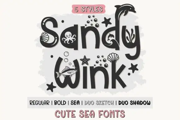
Marine-embellished rounded display
Sandy Wink Sea is a rounded display in charcoal on a soft grey wash: mixed case whose letters carry marine figures — a dolphin, an octopus, bubbles, shells, a starfish — with shell-topped strokes and a tracked line beneath that names five styles.
Ideas for this font
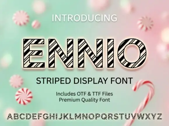
Geometric outlined capitals filled with tightly grouped diagonal black stripes
Ennio draws squat slab capitals with a heavy outline and a diagonal stripe running through each letter, so a word looks cut from a barber's pole or a fairground awning.
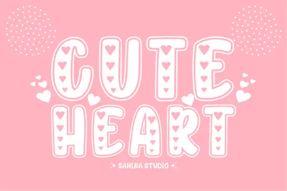
Soft tall outlined capitals with vertical rows of small heart-shaped openings
Cute Heart sets fat rounded capitals in white on pink and fills each stroke with a column of small hearts, so the word reads as a paper cut of tiny hearts rather than as letters.
Ideas for this font
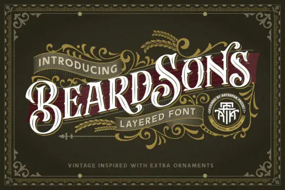
Curled high-contrast capitals with offset inline-like decoration
Beardsons rises diagonally across an ornate olive cover, where white capitals carry thin internal lines, narrow waists and extended curled terminals around the opening B and the central S, a dark red offset behind the letters adds depth and fine gold foliage frames the name.
Ideas for this font
Same independent foundry
Allow optional Google Analytics to measure visits and catalogue actions. Your search words and notes are not included. Privacy & storage