Neutral Sans Workhorse

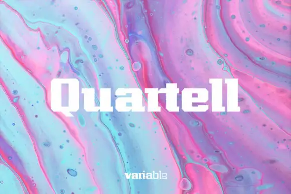
Fontuna Stencil + Memoir Slang
Lets Fontuna Stencil own the focal silhouette while handling secondary copy, sizing and subheads cleanly.
Inspect Memoir Slang specimenDisclosure: MakerFileHub may earn a commission from qualifying purchases via paid links on this page. How our links work.
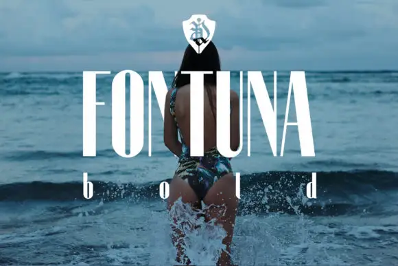
Tall high-contrast capitals shown through broad horizontal breaks and distressed wood texture
Fontuna Stencil places pale narrow capitals over heavily weathered blue boards, where fine arms meet thick vertical strokes, dark horizontal bands cross the title at several heights and a narrower mixed-case contrast repeats beneath the main row.
Paid link
Get this fontProject & layout blueprintsAt-a-glance maker compatibility
Open counter bridges hold interior islands intact on laser-cut wood, acrylic, and mylar stencils.
Visual anatomy & craft review
The stems stay thick, the arms thin, the breaks run horizontally and the texture roughens every edge. That wide break is the character: the letters look cut through a board rather than drawn with a stencil brush, which is why the cover layers a shield and a second row. The board texture hides parts of the lettering, so inspect a clean specimen before assuming every gap is a bridge, and keep 40 pt before the breaks and the texture blur together.
Stencil breaks · High contrast · Weathered
Two-font hierarchy recipes
Tested contrast partners — pairing Fontuna Stencil with grounded secondary typography.
Fontuna Stencil + Memoir Slang
Lets Fontuna Stencil own the focal silhouette while handling secondary copy, sizing and subheads cleanly.
Inspect Memoir Slang specimen
Fontuna Stencil + The Avenue Editorial
Grounds bold display lettering with classic typographic authority on posters, badges and apparel.
Inspect The Avenue Editorial specimenPractical applications
Concrete hierarchy, scale and production guidance tailored to Fontuna Stencil’s stroke geometry.
The broken high-contrast caps suit an industrial sign, and the horizontal gaps stay open at 60 mm on a painted panel, where the breaks read as cut rather than worn.
Hierarchy & layout recipe
Paint a 600 by 300 mm panel: set the name at 60 mm on one row, keep every horizontal break at 6 mm minimum, and keep 26 mm of border so no fine arm is cut by the panel edge.
Pre-production check
A break painted under 3 mm closes with the brush; check the mask artwork and hold the name at 50 mm or above.
The stencilled caps give a farm label age, and the narrow bodies hold a two-word name at 24 pt on a 60 mm panel, provided the breaks are proofed at full size.
Hierarchy & layout recipe
Print a 60 by 45 mm label: set the shop name at 24 pt, keep 8 mm of clear ground beneath before the produce line at 7 pt, and keep 5 mm of border so the fine arms stay whole.
Pre-production check
Textured edges printed at 16 pt turn into noise; check the label on a proof and keep the name at 22 pt or above.
The high-contrast breaks set an architectural heading, and the thick stems hold a two-word title at 52 pt on a page, where the thin arms still register on smooth paper.
Hierarchy & layout recipe
Print a 210 mm page: set the heading at 52 pt on one row, keep 20 mm beneath before the standfirst at 10 pt, and keep the block on a plain field so the texture is not doubled by the paper.
Pre-production check
A distressed specimen printed on textured stock doubles the noise; check the proof and use smooth paper.
Technical & licence verification
Confirm included OTF/TTF/WOFF formats, full glyph tables and licence coverage on the live store page before batch production.
Closest visual alternatives
Matched across letterform anatomy, stroke behaviour and craft applications.
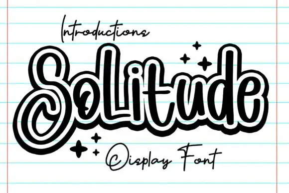
Outlined looping display script
Solitude shows connected upright script forms traced by a thick dark outer contour with a second pale inline inside it, where the S curls into a large lower loop, the tall l and d rise over a compact rounded body and four spark marks sit at the right.
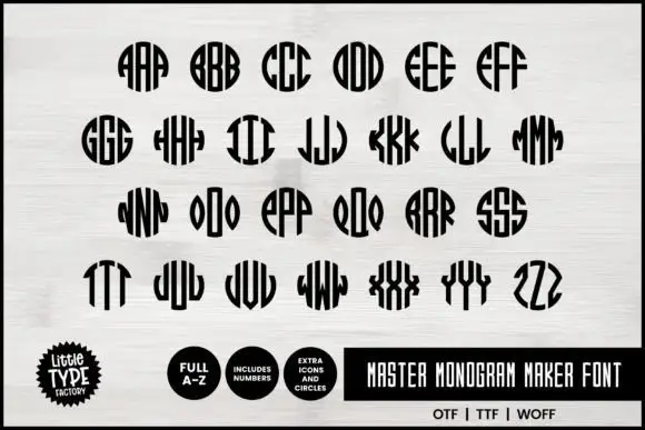
Narrow monogram letters fitted into circles
Master Monogram is a monogram set in black on white: narrow capitals drawn to be repeated and mirrored inside a circular silhouette, so each pair of letters fills a disc with stripes, plus digits and circle icons in the same weight.
Ideas for this font
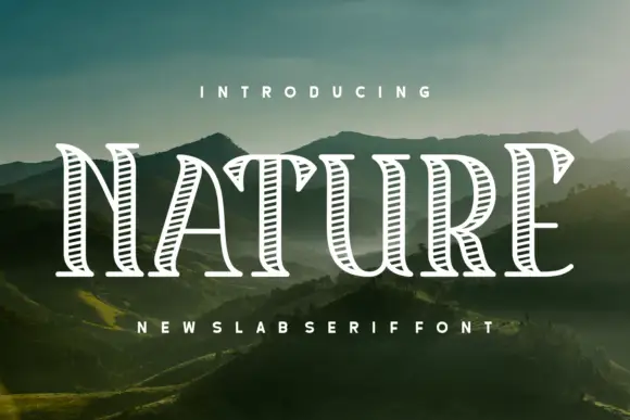
Hatched outdoor slab
Nature Reserve is a hatched slab display in white over a mountain landscape: tall caps with heavy bracketed serifs, a high waist, and an interior filled with fine parallel hatch lines that follow the stroke direction, with a tracked subtitle beneath in the same construction.
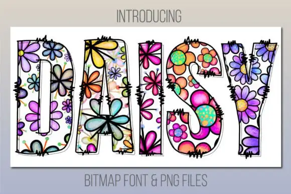
Tall patch-like capitals filled with colourful outlined flowers
Daisy is a bitmap colour face in which every letter is a bold outlined shape filled edge to edge with painted flowers — pansies, daisies, petals and dots — in purple, pink, orange and lime.
Ideas for this font
Same independent foundry
Allow optional Google Analytics to measure visits and catalogue actions. Your search words and notes are not included. Privacy & storage