Neutral Sans Workhorse

Monster Kawaii + Noar
Lets Monster Kawaii own the focal silhouette while handling secondary copy, sizing and subheads cleanly.
Inspect Noar specimenDisclosure: MakerFileHub may earn a commission from qualifying purchases via paid links on this page. How our links work.
Kawaii monster display
Monster Kawaii is a kawaii display in six bright colours with a white contour inside a torn white panel: rounded letters where several bowls become simple monster faces with two eyes, small teeth or a smile, with scalloped bunting above and horned characters in the lower corners.
Paid link
Get this fontProject & layout blueprintsAt-a-glance maker compatibility
Sturdy stroke walls and open counters weed cleanly on adhesive vinyl, HTV apparel film, and cut cardstock.
Visual anatomy & craft review
The words are set in two lines and the drawing is a rounded display in which a few letters turn into characters: the counters become eyes, the bowls become faces, and the terminals become small feet, which turns the block into a cast without breaking the word. The white contour and the torn panel edge give the composition its sticker-sheet quality, and the colours are applied so that no two adjacent letters match. Because the faces need room, the letters are spaced generously, and the specimen sets the block large on a striped ground. The tracked caption beneath names the category, and the bunting and characters at the edges belong to the product styling rather than the letterforms.
Kawaii, playful, characters, seasonal
Two-font hierarchy recipes
Tested contrast partners — pairing Monster Kawaii with grounded secondary typography.
Monster Kawaii + Noar
Lets Monster Kawaii own the focal silhouette while handling secondary copy, sizing and subheads cleanly.
Inspect Noar specimen
Monster Kawaii + Medvilea Editorial
Grounds bold display lettering with classic typographic authority on posters, badges and apparel.
Inspect Medvilea Editorial specimenPractical applications
Concrete hierarchy, scale and production guidance tailored to Monster Kawaii’s stroke geometry.
Kawaii monster letters read as friendly rather than frightening, which is what a younger child's party needs, and the faces are visible at card size.
Hierarchy & layout recipe
A6 card: the greeting at 30 pt, the details in a 9 pt sans, and two stars. Keep 14 mm margins, keep the eyes above 1.5 mm so they survive at card size, and print three colours on a white card.
Pre-production check
Check the 30 pt greeting, where a facial feature can blur at 300 dpi; simplify the face for small sizes. Confirm the 9 pt details keep a 4.5:1 contrast and that the stars clear the trim.
A character sticker is the favour itself, and the contour lets each letter be cut as a single sticker with a clean edge.
Hierarchy & layout recipe
Die-cut 45 mm stickers: one letter per sticker at 30 mm, a 2 mm contour, and 2 mm clear to the die. Keep the facial features at 2 mm and print four colours on white vinyl.
Pre-production check
Check the 30 mm letters, where a small foot can snap at the die edge; thicken it. Confirm the stickers peel cleanly and that the faces stay registered across the set.
A character label makes a brand memorable to children, and the flat version prints on a round label without a special process.
Hierarchy & layout recipe
Print a 50 mm round label: the shop at 12 pt, the product in a 6 pt sans, and one small face. Keep 4 mm inside the die and print three colours on a white stock so the contour stays crisp.
Pre-production check
Check the 12 pt shop name, where a face can close into a blob; enlarge the eyes. Confirm the 6 pt product reads on the shelf and that the label sits flat on a jar.
Technical & licence verification
Confirm included OTF/TTF/WOFF formats, full glyph tables and licence coverage on the live store page before batch production.
Closest visual alternatives
Matched across letterform anatomy, stroke behaviour and craft applications.
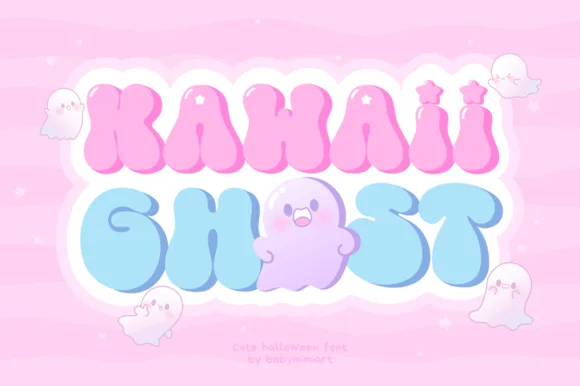
Pastel groovy ghost & star-sparkle Pinkoween bubble font!
Kawaii Ghost is a dreamy pastel-groovy Halloween font sprinkling four-point twinkle stars across puffy letters that cuddle cute little ghosts!
Ideas for this font
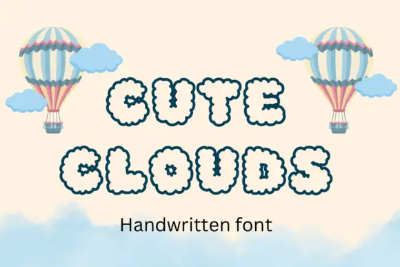
Puffy outlined capitals with repeated small scallops around outer edges and counters
Cute Clouds draws every capital as a puffy cloud with scalloped edges and a hand-dotted outline, set in a soft cream on a pale sky with hot-air balloons.
Ideas for this font
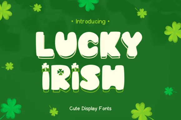
Chunky 3D display with offset shadow layer
Lucky Irish is a chunky display in cream with a solid green offset behind it: fat rounded caps, irregular letter heights, a clover tucked into the I, and a hard-edged shadow layer that steps down and right to give the word thickness.
Ideas for this font
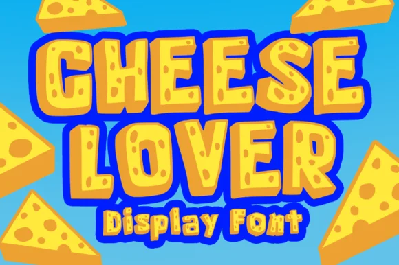
Chunky cartoon Swiss-cheese-hole novelty display!
Cheese Lover Outline sculpts chunky cartoon block capitals packed with playful Swiss-cheese holes and bubbly outlined wedges!
Ideas for this font
Allow optional Google Analytics to measure visits and catalogue actions. Your search words and notes are not included. Privacy & storage