Editorial Serif Anchor

Monday + The Simple Editorial
Anchors Monday's fluid strokes with crisp Roman proportions on wedding suites, headers and packaging.
Inspect The Simple Editorial specimenDisclosure: MakerFileHub may earn a commission from qualifying purchases via paid links on this page. How our links work.
Tall script with an oversized narrow M
Monday is a tall script in black over a photograph of a desk: a very tall narrow capital M drawn as two long strokes with a shallow valley between, a compact connected body and a y whose descender curls below the word.
Paid link
Get this fontProject & layout blueprintsAt-a-glance maker compatibility
Weld or Unite overlapping script joins into one continuous vector path before sending to the blade.
Visual anatomy & craft review
The word runs across the frame, and the face is built on the first letter: the M is drawn as two tall stems that reach well above the rest of the word, the o and the n are small and round, the d carries a short ascender, the a closes into a loop and the y drops a thin descender that curls beneath the line, so a single letter supplies the height and the rest of the word stays low and quick. The stroke is even and medium with rounded ends, the slant is slight and the joins are short, which is what keeps a six-letter word legible against a busy photograph. The ground is a pale office scene with a laptop and a notebook, and two tracked lines beneath name the face and its style. Monday is a display script for covers, signage and packaging, and it works best in one short word at a large size.
A script carried by one very tall letter
Two-font hierarchy recipes
Tested contrast partners — pairing Monday with grounded secondary typography.
Monday + The Simple Editorial
Anchors Monday's fluid strokes with crisp Roman proportions on wedding suites, headers and packaging.
Inspect The Simple Editorial specimen
Monday + Prime Nordic
Keeps small-scale dates, URLs, nutrition facts and care instructions crisp and legible below script titles.
Inspect Prime Nordic specimenPractical applications
Concrete hierarchy, scale and production guidance tailored to Monday’s stroke geometry.
A tall first letter gives a short greeting the height a board needs, and the compact body keeps the word readable at a distance.
Hierarchy & layout recipe
Print a 500 by 350 mm board: set the greeting at 100 pt on one line, keep 24 mm of clear ground beneath before the names at 22 pt, and hold 22 mm of border on all four sides.
Pre-production check
The tall stems can look fragile when enlarged; print one at the final size and check the weight across the room before the set.
A script with one dominating letter makes a short greeting fill a card, and the low body keeps the tone light rather than formal.
Hierarchy & layout recipe
Print a 105 by 148 mm card: set the greeting at 30 pt on one line, keep 14 mm of clear ground beneath before the message at 10 pt, and hold 18 mm of margin on both sides.
Pre-production check
A wide capital plus a long word can overflow a small card; print one at the finished size and check the fitting before the batch.
A tall script with a single dominant letter reads as a designed mark, and the light stroke keeps the cover quiet beside a photograph.
Hierarchy & layout recipe
Print a 230 by 300 mm cover: set the cover word at 90 pt on one line, keep 26 mm of clear ground beneath before the cover lines at 11 pt, and hold 22 mm of margin on all four sides.
Pre-production check
A thin stroke over a bright part of the image disappears; print one cover and check every letter separates before the run.
Technical & licence verification
Confirm included OTF/TTF/WOFF formats, full glyph tables and licence coverage on the live store page before batch production.
Closest visual alternatives
Matched across letterform anatomy, stroke behaviour and craft applications.
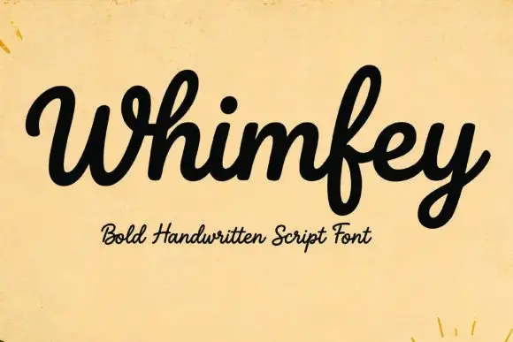
Bold handwritten script
Whimfey is a bold handwritten script in black on aged yellow paper: fat even strokes, a high x-height, short ascenders and a tight rhythm that reads as a confident everyday hand.
Ideas for this font
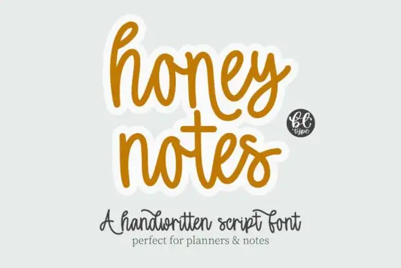
Rounded casual connected handwriting with soft arches and a plain baseline
Honey Notes is rounded casual handwriting in which the letters connect without calligraphic contrast, the arches stay soft and round and the baseline remains level across a phrase.
Ideas for this font
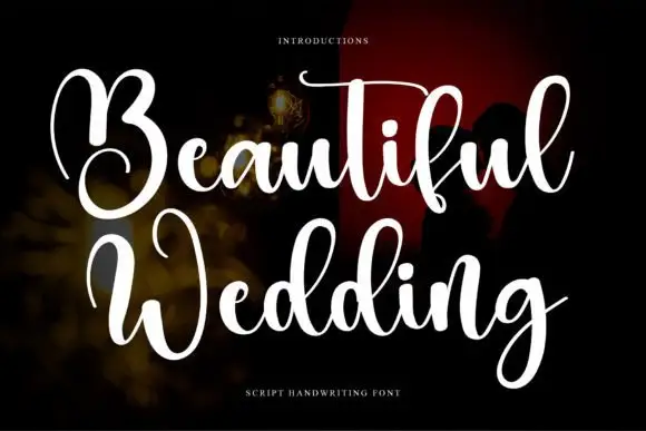
High-contrast looping wedding script
Beautiful Wedding is a formal looping script with a hard split between hairline joins and solid downstrokes, set in two stacked lines that share one wide axis.
Ideas for this font
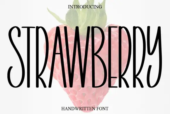
Tall narrow handwritten caps
Strawberry is a tall narrow handwritten face in black over a faded illustration of a strawberry: very condensed capitals with uneven strokes, high ascenders and a light bounce, set as one word with a small serif line above and beneath.
Ideas for this font
Same independent foundry
Allow optional Google Analytics to measure visits and catalogue actions. Your search words and notes are not included. Privacy & storage