Editorial Serif Anchor

Unicorn + Wolles Elegant Modern Serif
Anchors Unicorn's fluid strokes with crisp Roman proportions on wedding suites, headers and packaging.
Inspect Wolles Elegant Modern Serif specimenDisclosure: MakerFileHub may earn a commission from qualifying purchases via paid links on this page. How our links work.
Thin rounded handwritten sans
Unicorn is a thin rounded handwritten face in black on a watercolour pastel ground: narrow letters with wide, nearly circular bowls, a light even stroke, and a quirky lowercase that mixes straight ascenders with curved joins, so the word reads as a careful hand rather than a display face.
Paid link
Get this fontProject & layout blueprintsAt-a-glance maker compatibility
Weld or Unite overlapping script joins into one continuous vector path before sending to the blade.
Visual anatomy & craft review
The specimen sets the word large and a second line in the same hand below, and the drawing is deliberately light: the stroke is thin and constant, the o is almost circular while the n and the i stay narrow, and the U opens with a long entry that curls from below the baseline. Ascenders are straight with small hooks rather than loops, which keeps the face from tipping into a script, and the spacing is open enough that each letter reads separately. Because the stroke is fine, the face works best above about 20 pt, and the sample keeps everything large on a soft watercolour ground with a wide white margin. The ground frames the type without competing with it, and the caption beneath repeats the same hand at a smaller size.
Thin, rounded, handwritten, soft
Two-font hierarchy recipes
Tested contrast partners — pairing Unicorn with grounded secondary typography.
Unicorn + Wolles Elegant Modern Serif
Anchors Unicorn's fluid strokes with crisp Roman proportions on wedding suites, headers and packaging.
Inspect Wolles Elegant Modern Serif specimen
Unicorn + Corven
Keeps small-scale dates, URLs, nutrition facts and care instructions crisp and legible below script titles.
Inspect Corven specimenPractical applications
Concrete hierarchy, scale and production guidance tailored to Unicorn’s stroke geometry.
A light rounded hand reads as friendly to young children, and the open counters keep the letters distinguishable at the small sizes labels use.
Hierarchy & layout recipe
Print A5 labels: each title at 20 pt, the name at 14 pt, and the reading level at 9 pt in the same hand. Keep 6 mm between the lines and print on white card so the thin stroke stays clear against the surface.
Pre-production check
Check the 14 pt name at print size, where a thin stroke can fade on a school laser; print at the highest quality setting. Confirm the 9 pt level reads at arm's length and that no letter touches the label edge.
A soft handwritten face reads as gentle rather than loud, which suits a small celebration, and the light stroke leaves room for an illustration on the same card.
Hierarchy & layout recipe
A6 card: the name at 30 pt, the details in a 9 pt rounded sans, and a watercolour wash at the lower edge. Keep 12 mm margins and print on a matte stock so the thin strokes stay sharp.
Pre-production check
Check the 30 pt name at actual size, where the wide o and the narrow n can look uneven; adjust the tracking rather than the letterforms. Confirm the 9 pt details keep a 4.5:1 contrast and that the wash does not sit behind the type.
A light rounded hand reads as approachable for a children's list, and the thin stroke allows the mark to sit quietly next to an illustrated cover.
Hierarchy & layout recipe
Set the mark at 28 pt for the spine, 16 pt for the colophon and 9 mm wide for a stamp. Keep the mark one colour and leave clear space equal to the height of the U on every side.
Pre-production check
Check the 9 mm stamp, where the thin stroke breaks in rubber; thicken the mark for that process. Confirm the 16 pt colophon reads on a matte cover and that the spine version survives the cover's lamination.
Technical & licence verification
Confirm included OTF/TTF/WOFF formats, full glyph tables and licence coverage on the live store page before batch production.
Closest visual alternatives
Matched across letterform anatomy, stroke behaviour and craft applications.
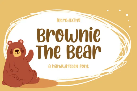
Chunky woodland-storybook mixed-case marker font
Brownie the Bear is a warm, chunky mixed-case marker font built for children's storybooks, nursery decor, and fast Cricut vinyl cutting.
Ideas for this font
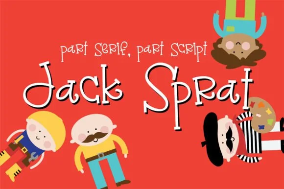
Quirky mixed-rule storybook font (part serif, part script)
Jack Sprat is a charmingly eccentric hand-drawn storybook font mixing slab-serif hooks, print bowls, and playful cursive links in one alphabet.
Ideas for this font
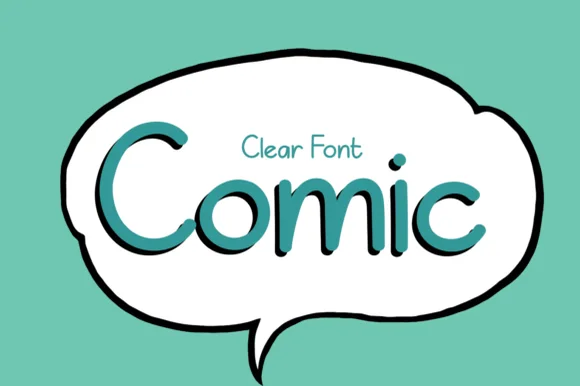
Crisp clean speech-balloon handwritten print sans
Comic (by el hotcig — 'Clear Font Comic') is a neat, ultra-legible handwritten print sans built for crisp speech bubbles, worksheets, and everyday labels!
Ideas for this font
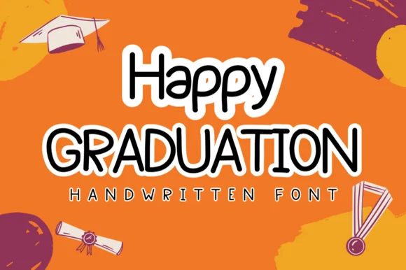
Neat rounded marker print sans with sticker-ready clarity
Happy Graduation (by Sirinart) is a plump, neat rounded marker print sans (NOT a slab serif!) wrapped cleanly for stickers, banners, and cards.
Ideas for this font
Same independent foundry
Allow optional Google Analytics to measure visits and catalogue actions. Your search words and notes are not included. Privacy & storage