Editorial Serif Anchor

Jack Sprat + The Simple Editorial
Anchors Jack Sprat's fluid strokes with crisp Roman proportions on wedding suites, headers and packaging.
Inspect The Simple Editorial specimenDisclosure: MakerFileHub may earn a commission from qualifying purchases via paid links on this page. How our links work.
Quirky mixed-rule storybook font (part serif, part script)
Jack Sprat is a charmingly eccentric hand-drawn storybook font mixing slab-serif hooks, print bowls, and playful cursive links in one alphabet.
Paid link
Get this fontProject & layout blueprintsAt-a-glance maker compatibility
Weld or Unite overlapping script joins into one continuous vector path before sending to the blade.
Visual anatomy & craft review
Jack Sprat is a deliberately mixed-rule storybook alphabet: some letters carry slab-serif hooks, others are plain print bowls, and a few connect in a loose cursive link, so a word looks drawn by an illustrator rather than set from a system. The inconsistency is the design, and it means the face needs size — about 18 mm — before the variation reads as intentional. Counters are open and the weight is even, so it prints on uncoated stock, and it is a title face for books, cards and signage where a child's book is the reference.
Storybook-quirky · Mixed-style · Playful
Two-font hierarchy recipes
Tested contrast partners — pairing Jack Sprat with grounded secondary typography.
Jack Sprat + The Simple Editorial
Anchors Jack Sprat's fluid strokes with crisp Roman proportions on wedding suites, headers and packaging.
Inspect The Simple Editorial specimen
Jack Sprat + Monure
Keeps small-scale dates, URLs, nutrition facts and care instructions crisp and legible below script titles.
Inspect Monure specimenPractical applications
Concrete hierarchy, scale and production guidance tailored to Jack Sprat’s stroke geometry.
Mixed rules read as hand lettering drawn for the cover, which is what a picture book is selling. Open counters keep the title legible when the cover is seen as a thumbnail.
Hierarchy & layout recipe
Cover 216 x 216 mm, title 42 pt, author 14 pt, 15 mm margins. Chapter opener 26 pt on a 12 mm baseline. Bookplate 90 x 60 mm, owner line 8 pt with a 1 pt rule.
Pre-production check
A mixed-rule face at 42 pt on a cover can look like several different fonts unless the line is short. Set one or two words, and check the title at 200 px wide to confirm it reads as a single voice.
An illustrated hand gives a party a bookish theme that is not licensed, which keeps the invite ownable. Even weight holds on a small A6 at 16 mm.
Hierarchy & layout recipe
Invite A6, title 18 mm, details 4.5 mm on 6 mm leading, 10 mm margins. Topper 130 x 110 mm, name 45 mm, 8 mm stick slot. Sign 400 x 300 mm, word 70 mm.
Pre-production check
A topper cut by hand through inconsistent serifs looks uneven, and the slab hooks tear first. Die-cut, or print on 2 mm card and cut with a fresh blade along a printed outline.
A storybook hand signals that a shelf is for reading rather than reference, which is what a library display needs. Even weight holds on a laminated sign in daylight.
Hierarchy & layout recipe
Sign 400 x 300 mm, word 60 mm, 30 mm margins and 20 mm clear of any fixing. Display letters 90 mm on 200 gsm, 30 mm pitch, 30 mm margins. Shelf talker 150 x 100 mm, word 16 mm, 10 mm margins with a 3 mm border.
Pre-production check
Signs near a window fade fastest and a coloured ink on white shows banding in a cheap laminator. Use UV-stable inks with a matt laminate, and check one sign after a sunny fortnight.
Technical & licence verification
Confirm included OTF/TTF/WOFF formats, full glyph tables and licence coverage on the live store page before batch production.
Closest visual alternatives
Matched across letterform anatomy, stroke behaviour and craft applications.
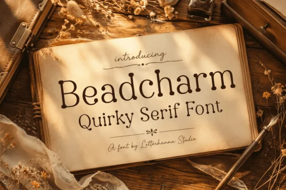
Whimsical beaded ball-terminal cottagecore serif
Beadcharm is an endearing hand-drawn serif tipping slender stems and arches with round, bead-like ball terminals!
Ideas for this font
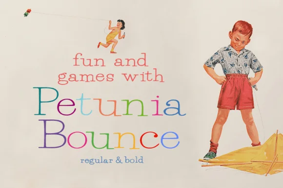
Quirky playful serif with a bounce and hand-drawn alternates
Petunia Bounce is a quirky serif in which the letters step up and down, the serifs stay soft and the alternates swap in rounder forms, so a two-word title reads as a children's book headline rather than as a text face.
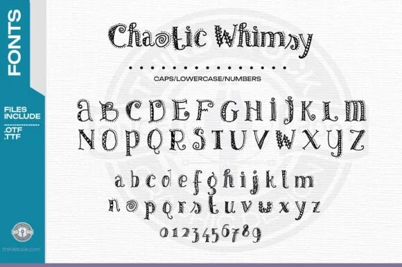
Zentangle-doodle inlaid storybook serif (OTF & TTF + 0–9)
Chaotic Whimsy is an intricate hand-doodled storybook serif packing tiny spirals, dots, and line-art flourishes inside uppercase, lowercase & 0–9 numerals (OTF & TTF)!
Ideas for this font
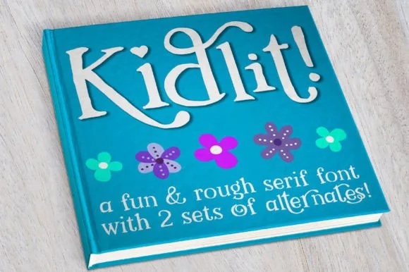
Hand-drawn bouncy storybook serif with curled ascenders
Kidlit is a lively hand-drawn serif with organic, slightly wiggly stems, curled ascender tops, and multi-set alternates.
Ideas for this font
Same independent foundry
Allow optional Google Analytics to measure visits and catalogue actions. Your search words and notes are not included. Privacy & storage