Editorial Serif Anchor

Spookella + Bulgary
Anchors Spookella's fluid strokes with crisp Roman proportions on wedding suites, headers and packaging.
Inspect Bulgary specimenDisclosure: MakerFileHub may earn a commission from qualifying purchases via paid links on this page. How our links work.
Soft rounded handwriting with three cuts
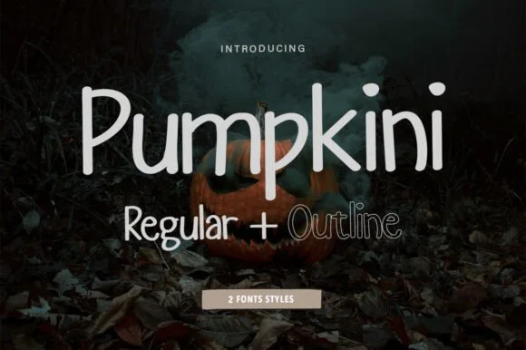
Spookella is a soft rounded handwriting face in dark grey on a white card, shown in three cuts — regular, outline and soft — with a slightly bouncy baseline, tall ascenders and blunt terminals, a tracked label above and a scalloped banner naming the three styles beneath.
Paid link
Get this fontProject & layout blueprintsAt-a-glance maker compatibility
Weld or Unite overlapping script joins into one continuous vector path before sending to the blade.
Visual anatomy & craft review
The three lines demonstrate the family honestly: the same hand at full weight, as a contour, and in a softened version with feathered edges, so a buyer can see that all three share a skeleton. The drawing is everyday handwriting at a rounded weight, with a mild bounce and uneven widths, which keeps a paragraph friendly without losing legibility. Because the stroke is moderate, the face works at card size and at label size, and the lowest of the three cuts shows how the same letters behave when the edge is softened for a cosy look. The ground is a photograph of dark leaves with the card resting on them, which sets a seasonal mood without a themed illustration, and the pale banner beneath is the only graphic element.
Handwritten, rounded, soft, playful
Two-font hierarchy recipes
Tested contrast partners — pairing Spookella with grounded secondary typography.
Spookella + Bulgary
Anchors Spookella's fluid strokes with crisp Roman proportions on wedding suites, headers and packaging.
Inspect Bulgary specimen
Spookella + Nyxar
Keeps small-scale dates, URLs, nutrition facts and care instructions crisp and legible below script titles.
Inspect Nyxar specimenPractical applications
Concrete hierarchy, scale and production guidance tailored to Spookella’s stroke geometry.
A soft handwriting face sets a friendly seasonal tone rather than a frightening one, and the outline cut gives a card a lighter look for a children's event.
Hierarchy & layout recipe
A6 card: the greeting in the regular at 26 pt, the details in a 9 pt sans, and a small leaf. Keep 12 mm margins and print one ink on a cream card so the softened edges read as drawn.
Pre-production check
Check the 26 pt greeting, where the outline cut can close at small size; use the regular below 30 pt. Confirm the 9 pt details keep a 4.5:1 contrast and that the leaf clears the trim.
A soft handwriting label reads as a hand-written batch card, and the three cuts let a shop vary the look across a range without a second font purchase.
Hierarchy & layout recipe
Print a 60 by 80 mm label: the product in the regular at 15 pt, the weight in the outline at 7 pt, and the date at 6 pt. Keep 4 mm inside the die and print one ink on a kraft stock.
Pre-production check
Check the 7 pt outline weight on kraft, where the contour can fill; use the regular. Confirm the 6 pt date reads on the pack and that the label survives a chilled cabinet.
A rounded hand reads as a friendly notice, and the moderate stroke survives the photocopier where a fine script would drop out.
Hierarchy & layout recipe
A4 print: the headline at 44 mm, the times in a 10 mm sans, and the stalls in 9 mm. Keep 20 mm margins and print one colour on a light stock so the notice reads from a corridor.
Pre-production check
Check the A4 after a copier pass, where a softened edge can blur into the paper; use the regular cut. Confirm the 9 mm stalls read at arm's length and that the headline fits the sheet.
Technical & licence verification
Confirm included OTF/TTF/WOFF formats, full glyph tables and licence coverage on the live store page before batch production.
Closest visual alternatives
Matched across letterform anatomy, stroke behaviour and craft applications.
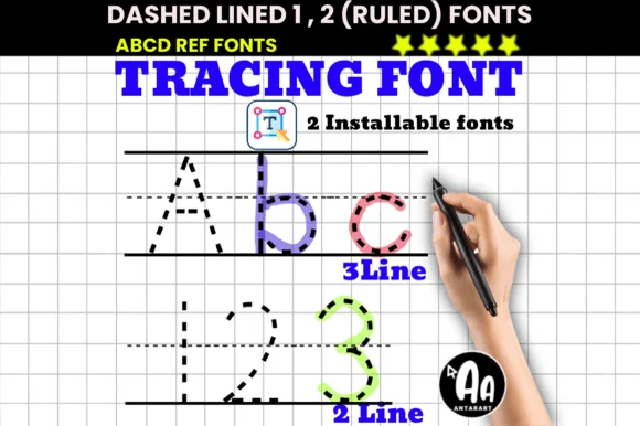
2-font dashed handwriting set with built-in 2-line & 3-line rules!
Dashed Lined Ruled Tracing is a time-saving 2-font teacher bundle where every typed letter & numeral automatically carries its own 3-line or 2-line ruled penmanship grid!
Ideas for this font
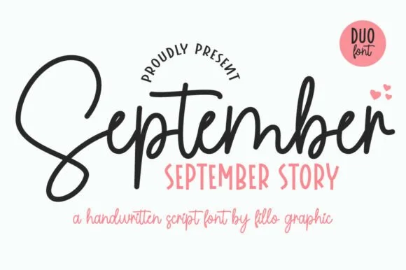
Bouncy monoline cord script + tall skinny farmhouse sans duo (Alternates)
September Story is a sweet handwritten font duo pairing a thick, looped monoline cord script (with swash alternates) and a tall narrow uppercase sans!
Ideas for this font
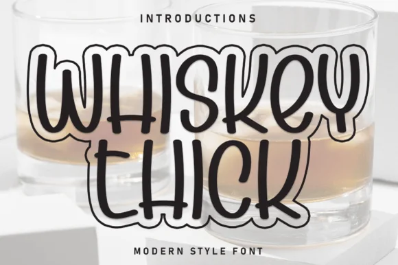
Thick outlined rounded display
Whiskey Thick is a thick outlined display in black line over a photograph of whiskey glasses: rounded skeleton with heavy double contours, open interiors, a scalloped base under the letters, and a bouncy baseline, so the pair reads as a hand-drawn outline rather than as a filled typeface.
Ideas for this font
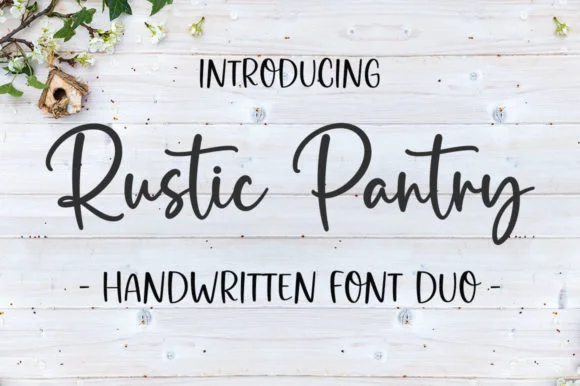
Bouncy farmhouse brush script & tall skinny marker sans duo
Rustic Pantry is a coordinated farmhouse font duo pairing a lively bouncy cursive script with a tall, narrow hand-drawn uppercase sans.
Ideas for this font
Same independent foundry
Allow optional Google Analytics to measure visits and catalogue actions. Your search words and notes are not included. Privacy & storage