High-Contrast Display Serif

Sophie + Bulgary
Pairs sculptural editorial warmth with Sophie's clean modern geometry.
Inspect Bulgary specimenDisclosure: MakerFileHub may earn a commission from qualifying purchases via paid links on this page. How our links work.
Slender solid and outline handwriting
Sophie is a slender handwriting in two cuts: a solid version and an open outline version of the same letterforms, shown stacked on a sheet of paper between two pens.
Paid link
Get this fontProject & layout blueprintsAt-a-glance maker compatibility
Cut solid base, outline, and shadow layers in separate vinyl colors and align on registration marks.
Visual anatomy & craft review
Sophie is written twice: the upper word in the solid cut and the lower word in the same letterforms drawn as an outline, which is the whole idea of the pair. The alphabet is a tall slender handwriting with narrow bowls, short ascenders and a light slant, and the outline cut keeps the same proportions so the two can be stacked or overlaid without a redraw. The strokes are thin and even in both cuts, the terminals are rounded and the joints are clean, which is what allows the outline version to stay legible at a small size. The ground is a plain sheet of paper on a dark desk beside a pen, and there is no caption beyond the two words. The bundle is for cards, labels and titles: the pair lets a designer set a name as a solid and echo it as a line, and the outline cut needs checking at small sizes because the contour closes up.
A hand shown solid and as an outline
Two-font hierarchy recipes
Tested contrast partners — pairing Sophie with grounded secondary typography.
Sophie + Bulgary
Pairs sculptural editorial warmth with Sophie's clean modern geometry.
Inspect Bulgary specimen
Sophie + Handmade Calligraphy
Introduces organic movement on pull-quotes, signatures and gift tags.
Inspect Handmade Calligraphy specimenPractical applications
Concrete hierarchy, scale and production guidance tailored to Sophie’s stroke geometry.
A solid name with the same name drawn beneath as an outline gives a simple invitation a considered layout with one purchase.
Hierarchy & layout recipe
Print a 130 by 180 mm invitation: set the names at 26 pt solid, set the outline repeat at 26 pt beneath with 4 mm of clear ground, and hold 15 mm of margin on all sides.
Pre-production check
The outline cut fills in below about eighteen points; print one invitation at the finished size and check the counters before the suite.
Two cuts of one hand let a small brand set a product name and its shadow in the same drawing, which is cheaper than two typefaces.
Hierarchy & layout recipe
Print a 55 by 40 mm label: set the name at 12 pt solid with the outline echo at 11 pt behind it, keep 5 mm of clear ground beneath, and hold 4 mm of margin.
Pre-production check
At label size the outline echo turns to noise; print one at the real size and judge it before the order.
A place card can use the solid cut for the name and the outline for the table, so two small lines read as one drawn system.
Hierarchy & layout recipe
Print a 90 by 50 mm place card: set the name at 15 pt solid, set the table at 10 pt in the outline with 5 mm of clear ground, and hold 6 mm of margin on both sides.
Pre-production check
An outline cut at ten points on a small card can disappear; print one place card with the longest name before the set.
Technical & licence verification
Confirm included OTF/TTF/WOFF formats, full glyph tables and licence coverage on the live store page before batch production.
Closest visual alternatives
Matched across letterform anatomy, stroke behaviour and craft applications.
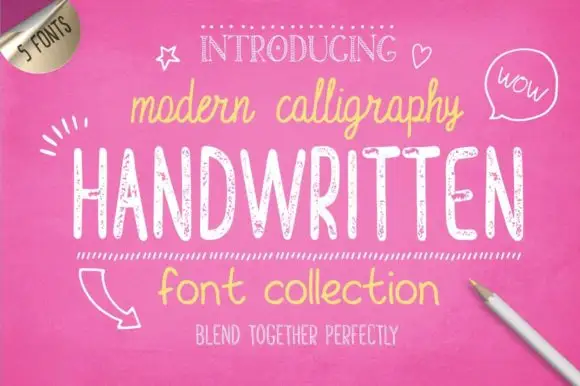
Bundle of five hand-drawn cuts with matching alternates and varied weights
Handwritten Font Collection is a five-cut hand-drawn set in which a slim script, a textured hand and a rounded print share one informal voice, and each cut arrives with an alternate style, so a document can stagger its pages without a second family.
Ideas for this font
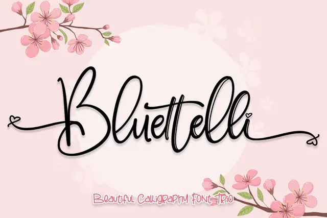
Thin decorated script with a drawable floral companion
Bluettelli is a thin script with a tall looped capital, sold as a duo with a drawn floral companion, and the sample pairs the word with cherry blossom so the script reads as part of an illustration.
Ideas for this font
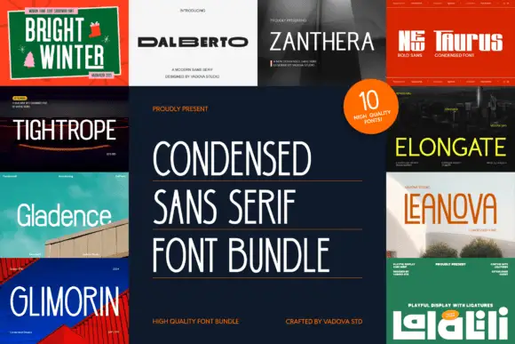
Condensed sans bundle cover with narrow, rounded and squared display specimens
Condensed Sans Serif presents a central bundle title surrounded by promotional tiles: some displayed faces are tall and light, others compact and bold, several use rounded bowls and one small example carries broad squared forms.
Ideas for this font
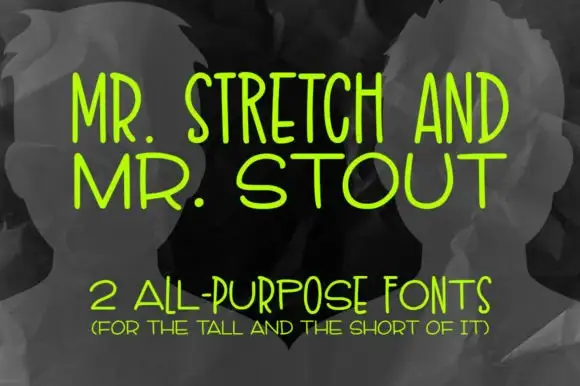
Tall and wide monoline capitals
Mr. Stretch and Mr. Stout is a pair of monoline capital faces in lime green on grey: one very tall and narrow, the other wide and short, presented as an answer to a layout problem rather than as a decorative set.
Ideas for this font
Same independent foundry
Allow optional Google Analytics to measure visits and catalogue actions. Your search words and notes are not included. Privacy & storage