Neutral Sans Workhorse

Biggie Stencil + Miniplate
Lets Biggie Stencil own the focal silhouette while handling secondary copy, sizing and subheads cleanly.
Inspect Miniplate specimenDisclosure: MakerFileHub may earn a commission from qualifying purchases via paid links on this page. How our links work.
Heavy rounded mixed case with vertical stencil splits through B and e
Biggie Stencil is a heavy rounded display in which the bodies stay thick, the counters shrink to small ovals and a straight vertical split runs down the B stem and through the e forms, so a two-word sign reads as a bridge cut out of solid lettering.
Paid link
Get this fontProject & layout blueprintsAt-a-glance maker compatibility
Open counter bridges hold interior islands intact on laser-cut wood, acrylic, and mylar stencils.
Visual anatomy & craft review
The B keeps two small counter ovals on a thick stem, the e loses its crossbar to the split, the g drops into a broad curved tail and the i dots stay as solid round marks above the line. The single vertical split is the character: it turns a rounded heavy face into a stencil without flattening the curves, which is why the sample sets two words on a pale folded sheet. Because the cut runs through the middle of a letter, the face wants 40 pt before the split reads as deliberate, and cutting vinyl under 0.85 inches of letter height lets the bridge snap. The folded paper is a background; the black lettering is the face.
Heavy · Rounded · Stencil
Two-font hierarchy recipes
Tested contrast partners — pairing Biggie Stencil with grounded secondary typography.
Biggie Stencil + Miniplate
Lets Biggie Stencil own the focal silhouette while handling secondary copy, sizing and subheads cleanly.
Inspect Miniplate specimen
Biggie Stencil + Glofi
Grounds bold display lettering with classic typographic authority on posters, badges and apparel.
Inspect Glofi specimenPractical applications
Concrete hierarchy, scale and production guidance tailored to Biggie Stencil’s stroke geometry.
The rounded stencil reads from a gate, and the thick bodies keep the split visible at 70 mm on a painted board in one flat colour. One colour keeps the cut edges from smearing into the letter.
Hierarchy & layout recipe
Paint a 600 by 250 mm board: set the words at 70 mm, keep 22 mm of border so the rounded bodies stay whole, and keep 5 mm of gap inside every split so the bridge survives. Hang the board at shoulder height.
Pre-production check
A bridge painted thinner than 4 mm cracks in weather; check the mask and thicken the bridge, not the outline. Two coats hold the bridge better than one.
The stencil cut suits a workshop label, and the heavy bodies stay legible at 40 pt on a card that will be seen from an arm's length away. The small counters stay open only while the weight holds.
Hierarchy & layout recipe
Print a 148 by 105 mm bench card: set the word at 40 pt, keep 15 mm of margin all round, and set the bench number in a 12 pt caps beneath with 10 mm of clear ground. Print one card for each bench.
Pre-production check
A bench card laminated over a stencil split fogs the gap; check the sample and matte laminate both sides. Matte laminate keeps the split visible under a shop light.
The rounded blocks suit a farm tag, and the vertical split gives a short word texture at 24 pt on an 80 mm kraft tag with a punched hole. A kraft ground also hides any edge wear along the cut.
Hierarchy & layout recipe
Print a 50 by 80 mm kraft tag: set the word at 24 pt, punch a 4 mm hole 10 mm from the top edge, and keep 8 mm between that hole and the tallest letter. Thread string through the hole rather than taping it.
Pre-production check
A hole punched beside a split leaves a thin bridge that tears in a bag; check the die and move the hole 4 mm clear.
Technical & licence verification
Confirm included OTF/TTF/WOFF formats, full glyph tables and licence coverage on the live store page before batch production.
Closest visual alternatives
Matched across letterform anatomy, stroke behaviour and craft applications.
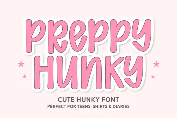
Tall rounded casual letters on a sticker ground
Preppy Hunky is a tall rounded display face in pink on a pale pink ground: fat rounded capitals with a heavy white sticker outline and a soft shadow, set over two lines with small stars at either side.
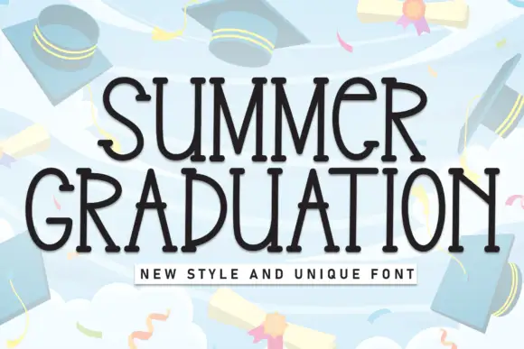
Tall quirky graduation display
Summer Graduation is a tall quirky display in near-black on a pale blue illustration: narrow letters with small flares at the stems, an open R, a curled G and a slightly irregular rhythm, set in two lines with a tracked caption beneath, so the pair reads as a graduation card rather than a formal diploma face.
Ideas for this font
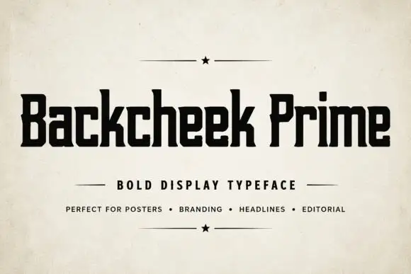
Compact squared lettering with slab-like feet and tiny clipped corners
Backcheek Prime shows heavy black mixed case on a pale paper-like cover, where the B and P have narrow rectangular counters, the c and e use squared openings, the k branches into a blunt diagonal and small clipped corners break an otherwise blocky silhouette.
Ideas for this font
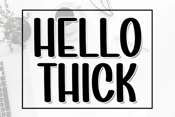
Tall heavy condensed capitals with a fine offset shadow
Hello Thick is a tall condensed capital alphabet in which the stems are fat, the width is narrow and a fine shadow sits behind each letter, so a word reads as a printed block with depth.
Ideas for this font
Same independent foundry
Allow optional Google Analytics to measure visits and catalogue actions. Your search words and notes are not included. Privacy & storage