Modern Grotesque Body

Typewriter Grunge + Bareum
Creates crisp high-hierarchy contrast beneath Typewriter Grunge headlines across menus, websites and labels.
Inspect Bareum specimenDisclosure: MakerFileHub may earn a commission from qualifying purchases via paid links on this page. How our links work.
Distressed typewriter face with stamped edges
Typewriter Grunge is a distressed serif in white on near black: wide capitals with slab serifs and worn, ink-stamped edges, shown with a full row of digits and two small tracked labels at the corners.
Paid link
Get this fontProject & layout blueprintsAt-a-glance maker compatibility
Fine grain and micro-texture excel in 300 DPI print, sublimation, and screen print rather than small vinyl weeding.
Visual anatomy & craft review
The sample sets two stacked lines of capitals, then a row of digits at the foot, and the face is a typewriter-ish serif rather than a modern one: the serifs are slabs, the stems are even, the R has a curved leg, the W is wide and the O is nearly round, while every edge is eaten away in small irregular bites so the letters look stamped with a worn ribbon. The wear is spread evenly rather than placed, which keeps the word readable and stops the texture from looking like a gimmick at small sizes. The letters are spaced wide enough that the grunge does not close the gaps between them, and the digits, which include a hyphen at each end, sit on the same weight so a number line can run under a heading. Two small tracked labels sit in the upper corners, and the ground is flat near-black. Typewriter Grunge is a display serif for posters, packaging, book covers and event graphics with an old, printed feel, and it suits short capitals at a solid size.
Distressed, stamped, classic
Two-font hierarchy recipes
Tested contrast partners — pairing Typewriter Grunge with grounded secondary typography.
Typewriter Grunge + Bareum
Creates crisp high-hierarchy contrast beneath Typewriter Grunge headlines across menus, websites and labels.
Inspect Bareum specimen
Typewriter Grunge + Stylish
Adds a warm human signature touch for 1-to-3-word callouts without competing against structured serif capitals.
Inspect Stylish specimenPractical applications
Concrete hierarchy, scale and production guidance tailored to Typewriter Grunge’s stroke geometry.
A stamped typewriter face carries the case-file mood of the subject, and the worn edges read as age rather than as an effect at cover size.
Hierarchy & layout recipe
Print a 135 by 205 mm cover: set the title at 40 pt over two lines, keep 18 mm of clear ground beneath before the author at 11 pt, and hold 12 mm of margin on all four sides.
Pre-production check
The distress disappears under a matte laminate; proof one cover in the real finish and check the texture before the run.
A worn typewriter face looks stamped on a paper bag, and the wide capitals hold a roast name on a narrow label where a script would fail.
Hierarchy & layout recipe
Print a 60 by 85 mm label: set the roast at 15 pt on one line, keep 6 mm of clear ground beneath before the weight at 5 pt, and hold 4 mm of margin on all four sides.
Pre-production check
Fine wear at fifteen points can read as a printing fault; print one label on the real kraft stock and judge it in the hand.
A stamped face suits a market that deals in sacks and crates, and the heavies hold up on a hand-written sign board read at a few metres.
Hierarchy & layout recipe
Print a 500 by 700 mm board: set the stall name at 110 pt over two lines, keep 32 mm of clear ground beneath before the prices at 30 pt, and hold 26 mm of margin on all four sides.
Pre-production check
On a wooden board the texture can merge with the grain; print one board on the actual material before repeating the set.
Technical & licence verification
Confirm included OTF/TTF/WOFF formats, full glyph tables and licence coverage on the live store page before batch production.
Closest visual alternatives
Matched across letterform anatomy, stroke behaviour and craft applications.
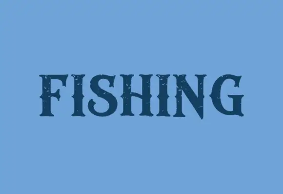
Dark contrast capitals with pointed serifs and sparse rough openings
Fishing is a contrasting display serif in which the stems run heavy, the serifs finish in points, the S turns compactly and the N takes a steep diagonal, with small rough openings near the edges, so one word reads as a bold label.
Ideas for this font
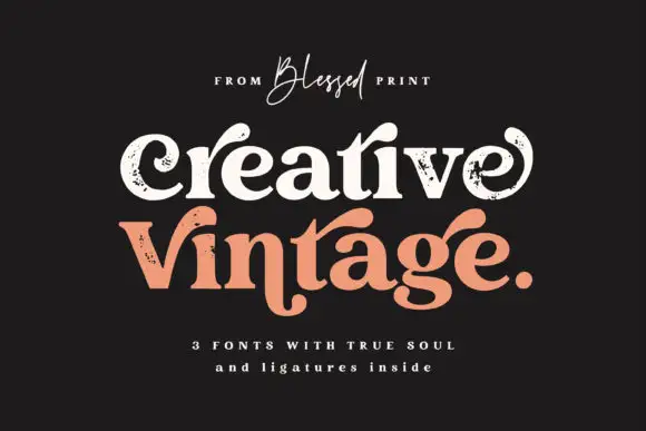
Distressed curled vintage serif
Creative Vintage is a high-contrast serif in which the terminals curl into swash shapes, the C turns inward, the t finishes in a broad low hook and scattered distressed marks break the fill, so a title reads as a worn printed label.
Ideas for this font
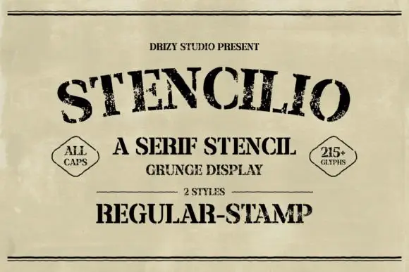
Distressed serif stencil
Stencilio is a distressed serif stencil in black on aged paper: heavy caps with interrupted bowls and rough feet, the letters set on a shallow arc, with a tracked line above, a small caps line and a two-diamond label beneath and a full second line in the stamp style.
Ideas for this font
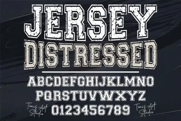
Distressed varsity slab capitals with an outline and a heavy fill
Jersey Distressed is a varsity slab capital alphabet with a heavy fill, a separate outline and a speckled wear texture, so one word reads as a shirt print that has been washed a hundred times.
Ideas for this font
Same independent foundry
Allow optional Google Analytics to measure visits and catalogue actions. Your search words and notes are not included. Privacy & storage