Modern Grotesque Body

Stencilio + Clyne Sans
Creates crisp high-hierarchy contrast beneath Stencilio headlines across menus, websites and labels.
Inspect Clyne Sans specimenDisclosure: MakerFileHub may earn a commission from qualifying purchases via paid links on this page. How our links work.
Distressed serif stencil
Stencilio is a distressed serif stencil in black on aged paper: heavy caps with interrupted bowls and rough feet, the letters set on a shallow arc, with a tracked line above, a small caps line and a two-diamond label beneath and a full second line in the stamp style.
Paid link
Get this fontProject & layout blueprintsAt-a-glance maker compatibility
Open counter bridges hold interior islands intact on laser-cut wood, acrylic, and mylar stencils.
Visual anatomy & craft review
The plate shows two cuts rather than one: the arched title carries the grunge stencil at display size, and the line beneath carries a stamp variant at the same weight, which is the honest way to present a family sold in regular and stamp styles. The drawing is a serif stencil: the serifs are heavy and rough, the bowls are interrupted by narrow gaps, and the edges are worn, so the face reads as cut card rather than as printed type. The arc is layout rather than letterform, and it demonstrates that the face can be set on a curve without the breaks lining up badly. The two diamond labels are period furniture. Because the letters are heavy, the face works at display sizes and on signage.
Serif, stencil, distressed, vintage
Two-font hierarchy recipes
Tested contrast partners — pairing Stencilio with grounded secondary typography.
Stencilio + Clyne Sans
Creates crisp high-hierarchy contrast beneath Stencilio headlines across menus, websites and labels.
Inspect Clyne Sans specimen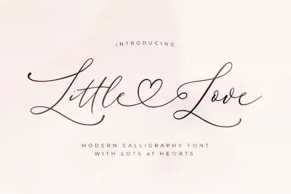
Stencilio + Little Love
Adds a warm human signature touch for 1-to-3-word callouts without competing against structured serif capitals.
Inspect Little Love specimenPractical applications
Concrete hierarchy, scale and production guidance tailored to Stencilio’s stroke geometry.
A stencil serif reads as a crate label, and the stamp cut hides the fibre variation that an uncoated stock shows anyway.
Hierarchy & layout recipe
Print a 60 by 85 mm label: the roastery at 15 pt, the origin at 8 pt, and the weight at 6 pt. Keep 4 mm inside the die and print one ink on kraft with the regular cut.
Pre-production check
Check the 15 pt name on kraft, where a stencil gap can fill; keep the gap above 0.8 mm. Confirm the 6 pt weight reads at arm's length and that the label survives a damp wipe.
A stencil face reads as a crate or a plank board, which suits a market stall where the stock is stacked in front of the sign.
Hierarchy & layout recipe
Paint a 900 by 380 mm board: the stall at 100 mm cap height, the prices at 26 mm, and a 5 mm border. Keep 25 mm margins and paint two colours on a light board.
Pre-production check
Check the board at four metres, where the stencil gaps can look like damage; keep them even. Confirm the 26 mm prices read at two metres and that the border clears the frame.
A stencil serif gives a craft book the look of a stencilled cover, and the heavy feet hold at thumbnail size where a light face would fade.
Hierarchy & layout recipe
Set the title at 85 mm cap height across 195 mm, the subtitle in a 12 pt serif, and the author at 9 pt. Print one ink on a textured stock and keep the arch shallow.
Pre-production check
Check the title at 85 mm, where the stencil gaps can clot; keep them at least 2 mm. Confirm the 9 pt author survives lamination and that the title clears the trim.
Technical & licence verification
Confirm included OTF/TTF/WOFF formats, full glyph tables and licence coverage on the live store page before batch production.
Closest visual alternatives
Matched across letterform anatomy, stroke behaviour and craft applications.
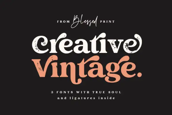
Distressed curled vintage serif
Creative Vintage is a high-contrast serif in which the terminals curl into swash shapes, the C turns inward, the t finishes in a broad low hook and scattered distressed marks break the fill, so a title reads as a worn printed label.
Ideas for this font
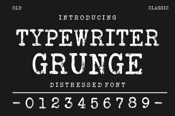
Distressed typewriter face with stamped edges
Typewriter Grunge is a distressed serif in white on near black: wide capitals with slab serifs and worn, ink-stamped edges, shown with a full row of digits and two small tracked labels at the corners.
Ideas for this font
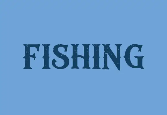
Dark contrast capitals with pointed serifs and sparse rough openings
Fishing is a contrasting display serif in which the stems run heavy, the serifs finish in points, the S turns compactly and the N takes a steep diagonal, with small rough openings near the edges, so one word reads as a bold label.
Ideas for this font
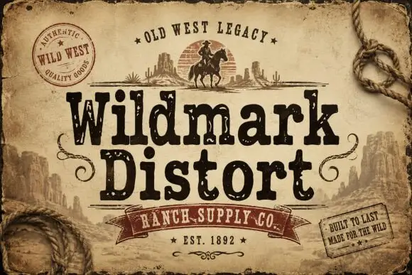
Distressed western display
Wildmark Distort is a distressed western display in black and cream on aged paper: a rounded slab with an uneven, worn outline, a swollen waist and a slight tilt, framed by a rope, a round seal, a ribbon and two small cards with period copy.
Same independent foundry
Allow optional Google Analytics to measure visits and catalogue actions. Your search words and notes are not included. Privacy & storage