Modern Grotesque Body

Bohemian Typewriter + Borsen
Creates crisp high-hierarchy contrast beneath Bohemian Typewriter headlines across menus, websites and labels.
Inspect Borsen specimenDisclosure: MakerFileHub may earn a commission from qualifying purchases via paid links on this page. How our links work.
Romantic hand-drawn curly-terminal bohemian typewriter serif
Bohemian Typewriter is a romantic, hand-drawn typewriter serif softening classic monoline stems with delicate curled ball terminals.
Paid link
Get this fontProject & layout blueprintsAt-a-glance maker compatibility
Fine grain and micro-texture excel in 300 DPI print, sublimation, and screen print rather than small vinyl weeding.
Visual anatomy & craft review
A romantic curly-terminal typewriter serif centred in crisp white on vibrant berry magenta: mixed-case letters with high-waisted bowls and gently irregular spacing read as a page typed on a machine and then softened by hand, rather than as a neo-grotesque with a grain. The curly terminals are the signature, and the irregular spacing gives the line its human wobble. Because the strokes are solid and the terminals are moderate, the face holds at label sizes and needs no welding. The magenta ground is staging. Uses are boho wedding stationery, bookstore totes, dried-flower studios and candle tins where warmth and craft are the message.
Boho-literary · Curled-serifs · Poet-chic
Two-font hierarchy recipes
Tested contrast partners — pairing Bohemian Typewriter with grounded secondary typography.
Bohemian Typewriter + Borsen
Creates crisp high-hierarchy contrast beneath Bohemian Typewriter headlines across menus, websites and labels.
Inspect Borsen specimen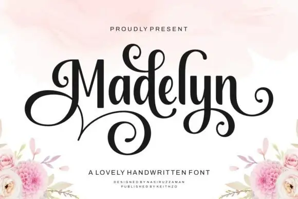
Bohemian Typewriter + Madelyn
Adds a warm human signature touch for 1-to-3-word callouts without competing against structured serif capitals.
Inspect Madelyn specimenPractical applications
Concrete hierarchy, scale and production guidance tailored to Bohemian Typewriter’s stroke geometry.
A softened typewriter reads as a hand-typed vow booklet rather than a printed programme, and the irregular spacing keeps a service order informal while staying legible for an older guest reading in low light.
Hierarchy & layout recipe
A5 booklet: the title at 26 pt, the vows at 11 pt, and one ink on a cream stock. Keep 20 mm margins, keep 14 pt leading for the body, and leave 12 mm at the foot for the date and the venue.
Pre-production check
Check the 11 pt vows at arm's length, where the wobble can blur on an uncoated sheet; keep the leading open. Confirm the booklet folds flat and that the title clears the stitch line.
The curly terminals and uneven spacing give a bookstore tote the feel of a hand-set stamp, and the solid strokes print crisply on canvas where a fine serif would sink into the weave.
Hierarchy & layout recipe
Print a 280 by 280 mm tote panel: the shop at 30 mm cap height, the tagline at 10 mm, and one ink on natural canvas. Keep 40 mm margins and keep the strokes above 2 mm.
Pre-production check
Check the print on canvas, where a 2 mm stroke can break across the weave; keep it above 2 mm. Confirm the panel is centred on the bag and that the ink survives a cold wash.
A warm typewriter band suits a dried-flower or candle box where a formal script would feel out of place, and the solid terminals hold on a narrow band that gets handled rather than framed.
Hierarchy & layout recipe
Print a 140 by 30 mm band: the studio at 12 pt, the contents at 7 pt, and one ink on a kraft board. Keep 5 mm from the fold edges and keep the strokes above 0.6 mm.
Pre-production check
Check the 12 pt studio on kraft, where a curl can fill; keep it above 0.6 mm. Confirm the band folds without cracking and that the 7 pt contents still read after the box is handled.
Technical & licence verification
Confirm included OTF/TTF/WOFF formats, full glyph tables and licence coverage on the live store page before batch production.
Closest visual alternatives
Matched across letterform anatomy, stroke behaviour and craft applications.
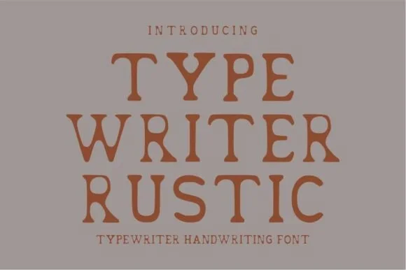
Warm hand-stamped terracotta rustic typewriter serif
Typewriter Rustic is a chunky, hand-stamped organic typewriter slab serif with soft ink-bleed curves built for cozy cottage and apothecary labels.
Ideas for this font
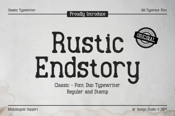
Two-cut vintage typewriter duo (Regular & Stamp)
Rustic Endstory is a two-style vintage typewriter family offering both a clean Regular cut and a weathered Stamp cut for flexible craft work.
Ideas for this font
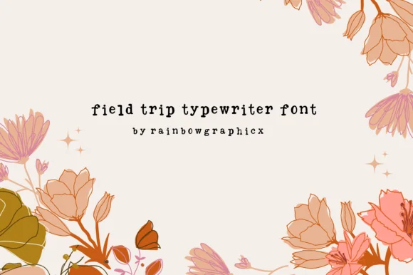
Playful uneven-baseline storybook typewriter serif
Field Trip Typewriter is a charming, slightly bouncy vintage typewriter serif mimicking sticky-key mechanical charm on nature notes and scrapbooks.
Ideas for this font
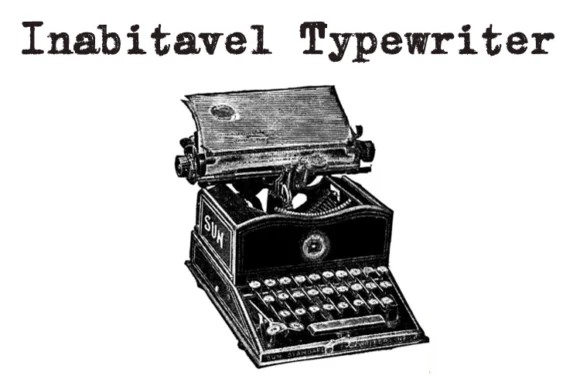
Authentic carbon-ribbon 1910 mechanical typewriter serif
Inabitavek Typewriter ('Inabitavel Typewriter') is an authentic antique mechanical-ribbon font capturing true 1910s cloth-ink strike bleed.
Ideas for this font
Same independent foundry
Allow optional Google Analytics to measure visits and catalogue actions. Your search words and notes are not included. Privacy & storage